

In this article, we will discuss how to create a basic HTML menu which can include different types of menus such as block-level menus, drop-down menus, and hamburger menus. We will also explore how to add some animation effects to the menus when they are hovered or clicked.
To create a menu, the first step is to structure the HTML markup. You will need to use the
- and tags to create a list of menu items. Each menu item can be a link, using the tag. You can also use the tag to add additional elements within the menu item, like icons or extra text.
Once the HTML structure is in place, you can use CSS to style the menu. You can set the background color, font, width, height, padding, margin, and border properties to customize the appearance of the menu. You can also change the text color, font size, and text decoration of the menu links. To create a dropdown submenu, you can use the
- and tags within a parent menu item.
To add animation effects to the menu, you can use CSS transitions or animations. The :hover selector can be used to change the background color, font color, font size, and other properties when a menu item is hovered. You can also use the transform property to scale or rotate the menu items. You can set the transform-origin property to control the origin point for the transformation. Additionally, you can use the z-index property to control the stacking order of different menu items.
Creating basic navigation menus
In this section, we will learn how to create basic navigation menus in HTML. Navigation menus are an essential part of any website as they provide a way for users to navigate through different pages or sections of a website. They typically consist of a list of links that are displayed horizontally or vertically.
To create a basic navigation menu, we can use HTML and CSS. First, let’s create the HTML structure for our menu. We’ll have a
- element to represent the menu, and each menu item will be represented by an
element. For example: Next, let’s add some basic styling to our menu using CSS. We can use the following CSS properties to style our menu:
display: block;– to make the menu items display as block-level elements.width– to set the width of each menu item.height– to set the height of each menu item.padding– to add some padding around the text of each menu item.text-align– to align the text of each menu item.font-family– to set the font family of the text.font-weight– to make the text bold.background-color– to set the background color of each menu item.border-left,border-right,border-bottom– to add borders to the menu items.color– to set the text color of each menu item.
For example:
.navbar {
list-style-type: none;
margin: 0;
padding: 0;
overflow: hidden;
background-color: #a3a1a1;
}
.navbar li {
float: left;
}
.navbar li a {
display: block;
color: rgba(0, 0, 0, 0.8);
text-align: center;
padding: 16px;
text-decoration: none;
font-family: Verdana, Geneva, sans-serif;
font-weight: bold;
}
.navbar li a:hover {
background-color: #ccc;
}
.navbar .dropdown {
display: inline-block;
}
.navbar .dropdown:hover .submenu {
display: block;
}
.submenu {
display: none;
position: absolute;
background-color: #f9f9f9;
min-width: 160px;
box-shadow: 0px 8px 16px 0px rgba(0,0,0,0.2);
z-index: 1;
}
.submenu li {
border-bottom: 1px solid #ddd;
}
.submenu li:last-child {
border-bottom: none;
}
.submenu li a {
color: #000;
}
.submenu li a:hover {
background-color: #f1f1f1;
}
With these styles, our basic navigation menu will be displayed in the normal state. When a menu item is hovered, its background color will change to a lighter shade. If a menu item has a submenu, the submenu will be displayed when the menu item is hovered.
Feel free to change the styles and colors according to your preference. This structure and styling can be used as a starting point for creating more complex navigation menus with additional features or animation effects.
2 Answers 2
Here are some basic steps to create an HTML menu:
1. Create the HTML structure:
First, create an index.php file and add the following HTML code:
2. Add CSS styles:
Add the following CSS styles to your style.css file:
.navbar {
background-color: rgba(0,0,0,0);
height: 50px;
text-align: center;
}
.menuli {
list-style: none;
display: flex;
justify-content: center;
padding: 0;
}
.menuli li {
text-decoration: none;
margin: 0 10px;
font-family: Verdana,Helvetica,Arial,sans-serif;
}
.menuli li a {
color: #a3a1a1;
text-decoration: none;
}
.menuli li a:hover {
color: #ffffff;
font-weight: bold;
}
.menuli li:hover ~ .nav-links {
display: block;
}
.nav-links {
display: none;
position: absolute;
background-color: #ffffff;
width: 100%;
left: 0;
transform: scale(1, 0);
transform-origin: top;
transition: transform 0.5s ease-in-out;
}
.nav-links li {
border-top: 1px solid #a3a1a1;
border-bottom: 1px solid #a3a1a1;
margin: 0;
padding: 10px;
}
.nav-links li:first-child {
border-top: none;
}
.menuli li:hover .nav-links {
transform: scale(1, 1);
}
.nav-links li a {
color: #a3a1a1;
text-decoration: none;
}
.nav-links li a:hover {
color: #ffffff;
}
Different styling changes can be made to achieve the desired look and functionality of the menu.
3. Add JavaScript code:
To make the menu a drop-down menu, add the following JavaScript code to your head.php file:
4. Use the menu in your HTML:
To display the menu, use the following HTML code:
This will create a menu with two answers displayed as a drop-down submenu when the “About” menu item is hovered over. The “Hamburger” icon will also be displayed when in mobile mode.
Add CSS Styling
To make your HTML menu visually appealing, you can add CSS styling to it. CSS stands for Cascading Style Sheets and allows you to control the appearance of your HTML elements. Here are some steps to add CSS styling to your menu:
1. Create a new CSS file or add the styles inside the
section of your HTML file.2. Start by targeting the
- element that contains your menu items. You can do this by adding a class or ID to the
- elements. This will make them appear next to each other.
5. To add space between the menu items, use the “margin” property. For example, you can add “margin-right” to the - elements to create a gap between them.
6. To create a drop-down menu, use nested- elements inside the main
- is hovered over.
7. Apply animations or transitions to your menu items to make them more interactive. You can use CSS animations or JavaScript to achieve this effect.
8. Use pseudo-classes like “:hover” to change the style of the menu items when they are hovered over. For example, you can change the background color or add an underline to the menu items on hover.
9. Customize the styles of the sub-menu by targeting the nested
- elements. You can add a background color, change the font, or adjust the padding and margin properties.
10. Make sure to include appropriate contrast and font sizes for accessibility purposes. Use easy-to-read fonts like Verdana or Helvetica and make sure that the text is legible for all users.
By adding CSS styling to your HTML menu, you can enhance its appearance and make it more visually appealing. Whether you want a basic navigation bar or a complex drop-down menu, CSS allows you to customize the look and feel of your menu elements.
Reintech
Add CSS
Once you have created the basic structure of your HTML menu, it’s time to add CSS to style it. CSS stands for Cascading Style Sheets, which allows you to define the appearance and layout of your HTML elements.
In this example, we will use CSS to change the colors, text alignment, transform, bold, and other styles of our menu. We will also include some changes for the sub-menu and the hamburger menu.
To add CSS to your HTML menu, you can use the
In this example, the navigation menu is displayed horizontally using the CSS
display: inline-block;property. The.navbarclass styles the entire navigation menu, while the.dropdownclass is used to create a drop-down menu. When the drop-down menu is hovered over, the.sub-menuwill be displayed over the rest of the content with a higherz-indexvalue. The.dropdown:hoverselector is used to show the drop-down menu when hovered over.Feel free to customize the styles and structure of your navigation menu to fit your website's needs. You can also add different types of animations using JavaScript or CSS transitions to make your menu more dynamic and engaging.
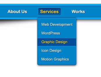
Example of creating a drop-down navigation menu with animation
In this example, we will create a drop-down navigation menu with animation using HTML and CSS. The menu will have a parent navbar with multiple menu items, and when hovered over, each menu item will display a drop-down sub-menu with different options. This drop-down sub-menu will slide down with a smooth animation.
First, let's create the HTML structure for our navigation menu:
Next, let's add some CSS styles to make our navigation menu look good:
.navbar {
height: 50px;
background-color: #a3a1a1;
}
.nav-links {
display: flex;
justify-content: space-between;
list-style: none;
padding: 0;
margin: 0;
}
.nav-item {
position: relative;
}
.menu-item {
display: block;
padding: 10px;
text-align: center;
font-weight: bold;
text-decoration: none;
color: #ffffff;
}
.menu-item:hover {
background-color: rgba(0, 0, 0, 0.2);
}
.sub-menu {
position: absolute;
top: 100%;
left: 0;
width: 200px;
background-color: #ffffff;
display: none;
z-index: 1;
}
.nav-item:hover .sub-menu {
display: block;
}
.sub-menu li {
border-left: 5px solid #a3a1a1;
}
.sub-menu a {
display: block;
padding: 10px;
text-decoration: none;
color: #000000;
}
.sub-menu a:hover {
background-color: #f2f2f2;
}
Finally, let's add some JavaScript code to handle the animation effect:
document.addEventListener('DOMContentLoaded', function() {
var menuItems = document.getElementsByClassName('menu-item');
Array.prototype.forEach.call(menuItems, function(menuItem) {
menuItem.addEventListener('mouseenter', function() {
this.parentNode.getElementsByClassName('sub-menu')[0].style.transformOrigin = 'top';
this.parentNode.getElementsByClassName('sub-menu')[0].style.transform = 'scaleY(0)';
this.parentNode.getElementsByClassName('sub-menu')[0].style.display = 'block';
var height = this.parentNode.getElementsByClassName('sub-menu')[0].offsetHeight;
this.parentNode.getElementsByClassName('sub-menu')[0].style.transform = 'scaleY(1)';
this.parentNode.getElementsByClassName('sub-menu')[0].style.height = '0';
setTimeout(function() {
this.parentNode.getElementsByClassName('sub-menu')[0].style.height = height + 'px';
}.bind(this), 10);
});
menuItem.addEventListener('mouseleave', function() {
this.parentNode.getElementsByClassName('sub-menu')[0].style.transformOrigin = 'bottom';
this.parentNode.getElementsByClassName('sub-menu')[0].style.transform = 'scaleY(1)';
var height = this.parentNode.getElementsByClassName('sub-menu')[0].offsetHeight;
this.parentNode.getElementsByClassName('sub-menu')[0].style.height = height + 'px';
setTimeout(function() {
this.parentNode.getElementsByClassName('sub-menu')[0].style.transform = 'scaleY(0)';
this.parentNode.getElementsByClassName('sub-menu')[0].style.height = '0';
setTimeout(function() {
this.parentNode.getElementsByClassName('sub-menu')[0].style.display = 'none';
}.bind(this), 500);
}.bind(this), 10);
});
});
});
Once you have added the HTML, CSS, and JavaScript code to your web page, you will have a drop-down navigation menu with animation. When you hover over a menu item, its corresponding sub-menu will slide down with a smooth animation. When you move your mouse away from the menu item, the sub-menu will slide back up and hide.
Feel free to customize the styles and animation properties to fit your own design needs. You can change the colors, font styles, sizes, and other CSS properties to match the look and feel of your website.
Video:
CSS Tutorial: Creating a Navigation Menu | Web Development Tutorials #23
- element. The nested
- will be displayed when the parent
- is hovered over.
- element.
3. Define the styles for your menu. For example, you can set the background color, font size, padding, and margin properties to customize the look of the menu.
4. To create a horizontal menu, use the CSS property “display: inline-block” for the