Creating an Effective and User-Friendly Navbar – A Comprehensive Guide

How to create navbar

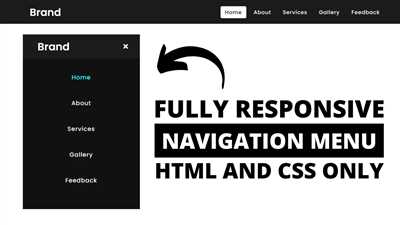
Navbar, also known as a navigation bar, is an essential component of any website or application. It allows users to easily navigate through different sections and pages of the website. In this article, we will explore how to create a responsive navbar with sub-components in HTML using various classes and utilities.

To begin creating a navbar, we need to set up the basic HTML structure. We can start by adding a nav element with the class navbar. Within this element, we will include the logo or brand name of our website or application using the a tag with the class navbar-brand.

Next, we need to add the navbar items, such as the links to different pages or sections, using the ul element with the class navbar-nav. Each navbar item should be wrapped in a li element with the class nav-item. Within each li element, we use the a tag with the class nav-link to create the actual link. For example, Home creates a link to the “Home” page.

In addition to the navbar items, we can also add other sub-components to our navbar. These sub-components can include buttons, forms, or text elements. For example, we can add a login button using the button tag with the class btn btn-primary. We can also add a search bar using the input tag with the classes form-control and mr-sm-2.

To make our navbar responsive and appealing on different devices, we can use the navbar-expand-lg class. This class ensures that the navbar will be expanded on devices with a large screen, but collapsed on devices with a smaller screen. We can also use the navbar-light class to set the background color of the navbar to white and the text color to black.

Adding subtle animations and effects to our navbar can enhance the user experience. For example, we can add a hovering effect to the navbar items using the hover class. We can also add a collapse effect to the navbar when it is opened or closed using the collapse class. To control the behavior of the collapse effect, we can use the data-toggle and data-target attributes.

In this article, we have learned how to create a responsive and professional navbar with sub-components in HTML. By adding different classes and utilities, we can customize the appearance and behavior of our navbar. Whether you are a beginner or an experienced web developer, the knowledge gained from this article will help you create an appealing and user-friendly navbar for your website or application. So, let’s get started and create our own navbar today!

How to create a responsive navbar in NEXT JS

Creating a responsive navbar in NEXT JS is essential to provide an appealing user experience on both desktop and mobile devices. In this article, we will explore the steps to create a responsive navbar using HTML and CSS in a NEXT JS project.

To make our navbar responsive, we will use the nav tag and the built-in utility classes provided by NEXT JS. We will also use JavaScript to implement some functionalities.

Here’s a basic structure for our navbar:

In the above code, we have used the navbar class to style our navbar. The navbar-brand class is used for the brand logo or app name. The navbar-toggler class is used to create a toggle button for collapsing and expanding the navbar on smaller screens.

The navbar-nav class is used to stack our navbar items vertically, and the nav-item class is used for each individual item. The nav-link class is applied to the anchor tags which represent the links in our navbar.

We can further customize our navbar by adding different sub-components such as dropdown menus, search bar, or utility buttons. For example, to add a dropdown menu, we can use the following code:

  • In the above code, the dropdown class is added to the nav-item to make it a dropdown item. The dropdown menu is created using the dropdown-menu class, and the dropdown-toggle class is used for the anchor tag that triggers the dropdown.

    By adding more CSS and customizing the utility classes, we can create a navbar that suits our specific needs. It’s important to note that the required JavaScript libraries and dependencies should be imported and included in the project for the functionalities to work properly.

    In conclusion, creating a responsive navbar in NEXT JS involves using HTML, CSS, and JavaScript to create and style different components such as the brand logo, navigation links, and dropdown menus. By utilizing the available utility classes and customizing them, we can create an appealing and functional navbar for our NEXT JS project.

    Supported content

    In order to create a responsive and appealing navbar, you need to understand the supported content and sub-components that can be used. Below are the different types of content you can add to your navbar:

    Content Description
    Bootcamp A link with the class navbar-brand and the href set to home. This is usually used as the branding/logo for the website.
    A button with the class navbar-toggler and the role set to button. This is used to toggle the navigation menu on mobile devices.
    A container for the nav links and other content. This should have the class collapse and the id set to navbarNav. The id is referenced by the navbar-toggler button.
    A list of nav items. This should have the class navbar-nav. Add the mr-auto class to align the items to the left.
    A single nav item. This should have the class nav-item. Each nav item should be inside a
      or
      with the class navbar-nav.
    Home A link for each nav item. This should have the class nav-link and the href set to the desired page.
    Welcome to our Bootcamp! A span with the class navbar-text. This is used for plain text content within the navbar, such as a welcome message.
    An inline form within the navbar. This should have the class form-inline. You can add form controls like input fields and buttons inside this form.
    Cities A link within a dropdown menu. This should have the class dropdown-item and the href set to the desired page.
    A container for the dropdown menu items. This should have the class dropdown-menu and can include additional utility classes like top to position the dropdown menu on top of the navbar.

    These are just a few examples of the supported content that can be used to create a navbar. You can customize and add additional content according to your specific needs.

    Brand

    The “Brand” component is an important part of a professional and classy navigation bar (navbar). It is typically used to display the logo or brand name of a website or application. Adding a brand to your navbar can help users quickly identify your website and create a visually appealing and consistent user experience.

    Within the navbar, the brand component is usually placed on the left side, before the navigation items. It is often positioned at the top of the page, making it easily noticeable.

    To create a brand within a navbar, you can use the “navbar-brand” class. It is recommended to use the “navbar-expand-lg” class for the navbar itself to make it responsive and stack the navigation items when needed.

    Here is an example of how to create a brand component within a navbar:


    In this example, the “navbar” class is used to define the navbar container. The “navbar-brand” class is used for the brand component, which is a link that navigates to the homepage (“index.html” in this case). The “navbar-toggler” class is used to create a toggle button for showing/hiding the navigation items on smaller screens.

    Feel free to customize the example code to suit your needs, including adding additional navigation items, changing the href values, and adding sub-components like dropdown menus or search forms.

    In summary, the brand component is a key element in creating a professional and visually appealing navbar within your webpage or application. It helps users quickly identify and navigate to your website, enhancing the overall user experience.

    The navbar, also known as the navigation bar, is a key component in creating a visually appealing website. It allows users to easily navigate through the different sections of a website, making it an important element in user experience.

    When creating a navbar in HTML, you will need to use the navbar class to define the navbar element. Within the navbar, you can include the navbar-brand class to add your brand logo or name. You can also add a link to your brand by using the href attribute.

    If you have sub-components within your navbar, you can use the navbar-text class to add additional content. For example, you could include a button or a dropdown menu.

    To create a dropdown menu, use the dropdown-toggle class on a link with the data-toggle attribute set to “dropdown”. The href attribute should point to the page or section you want the dropdown to link to. Within the dropdown menu, you can add dropdown-item class to each item.

    If you want to make the navbar full-width or add additional styling, you can use utility classes like black and spacing. You can also use the navbar-toggler-icon class to add a button that controls the opening and closing of the navbar on smaller screens.

    In a MERN stack bootcamp, we often find ourselves adding a navbar to our projects. It helps us organize our content and create a professional look. It also provides a way for users to easily navigate through the different sections of our website, making it an essential component.

    Within the navbar, you can include links using the nav-link class and the href attribute. You can also add a current page indicator by using the sr-only current class.

    What’s great about using a navbar is that it can be customized to fit the needs of your website. Whether you want a simple navbar with just a few links or a more complex one with dropdown menus and additional content, the navbar allows you to create a navigation system that is both functional and visually appealing.

    Forms

    Forms

    In web development, forms are an essential part of creating interactive and dynamic websites. Forms allow users to input and submit data, enabling them to interact with the website and its features. In this section, we will explore how to create and customize forms using HTML.

    To create a basic form, you need to use the

    element and specify the method attribute. The most commonly used method is POST, which sends form data to the server for processing. You can also use the GET method, but it has some limitations, such as data length restrictions.

    To add custom styling to your forms, you can use CSS frameworks like Bootstrap or create your own CSS styles. CSS frameworks, like Bootstrap, provide a set of pre-defined styles and utilities that you can use to create appealing and professional-looking forms.

    One of the commonly used form controls is the input field. You can create input fields for various data types, such as text, number, date, email, etc. For example, to create a basic text input field, you can use the following code:

    In addition to input fields, forms often include other controls like checkboxes, radio buttons, dropdowns, and text areas. These controls allow users to select options, make choices, and provide additional information.

    A dropdown can be created using the

    In addition to form controls, you can also add labels, text, and utility classes to your forms to enhance the user experience. For example, you can use the element to provide a text description for an input field:


    Furthermore, you can use the

    element with the class .form-text to provide additional information or instructions to users:

    Enter a valid email address.

    When working with forms, it is important to validate user inputs to ensure data accuracy and security. You can use JavaScript and other programming languages to add form validation logic. There are also built-in form validation features in HTML5 that you can leverage to make your forms more robust.

    Overall, forms are an essential component of web development, and understanding how to create and customize them is crucial for building interactive and user-friendly websites.

    Text

    Text is an essential component of any website or application. In the context of creating a navbar, text plays a crucial role in providing information and navigation options to the users.

    The navbar is a common UI element used to create a navigation menu at the top of a web page. The “navbar-expand-lg” class is used to make the navbar expandable and responsive for larger screens.

    To add text to the navbar, you can use the “nav” or “navbar-nav” class along with the “classnav-item” and “classnav-link” classes. These classes help in creating navigation links and sub-components within the navbar.

    If you want to add additional text or information within the navbar, you can use the “navbar-text” class. This class is useful for adding elements like a brief description or contact information within the navbar.

    If you want to create more complex elements like dropdown menus within the navbar, you can use the “dropdown-item” and “dropdown-menu” classes. These classes enable you to add dropdown functionality to your navbar and include sub-components within it.

    In addition to text, you can also add other components like buttons, forms, and icons to the navbar. For example, you can use the “classnavbar-brand” to add a logo or branding element to the navbar, the “classform-control” to add input forms, and the “classsr-only” to add screen reader-only text.

    When it comes to styling the navbar, you can customize its appearance by adding different classes like “navbar-light” or “navbar-dark”. These classes determine the color scheme of the navbar. Additionally, you can also use utility classes like “my-lg-0” or “mr-sm-2” to adjust the spacing and alignment of the navbar elements.

    In summary, text is an integral part of creating a navbar. It helps in providing clear navigation options to the users and can be customized to fit the design and content requirements of your website or application.

    With the basic understanding of how to add text to a navbar, you can now start implementing this knowledge to create your own navbar. Practice with examples and explore the different features and customization options available to create a navbar that best suits your project requirements.

    What are We Creating

    In this tutorial, we will learn how to create a professional and responsive navbar for a website. The navbar will have various components such as a logo, navigation links, forms, dropdown menus, and utility classes.

    To start, we will make use of the nav element with the class="navbar". This will create a basic structure for our navbar. Within the navbar, we can add the logo using the class="navbar-brand" and set its link using the href attribute.

    Next, we will create a set of navigation links using the class="navbar-nav". Each individual link will have the class="nav-link" to style them as navigation items. The href attribute will define the link destination. If there are any sub-components or dropdown menus, we can use the class="dropdown-menu" and the class="dropdown-toggle" to indicate that there is a dropdown menu available. The aria-haspopup="true" attribute is used for accessibility purposes.

    If we want to add any additional text or information to the navbar, such as a description or a search bar, we can use the class="navbar-text". For forms, we can utilize the class="form-inline" and class="form-control" to create responsive and full-width form controls within the navbar.

    To make our navbar responsive and collapse on smaller screens, we need to add the class="navbar-toggler-icon" and the class="collapse". This will ensure that the navbar components are hidden and can be toggled when the navbar button is clicked.

    Now that we know what components we will be using, let’s dive into the examples and see how to create each one. Whether you’re a beginner or a professional, this tutorial will help you navigate through the process of building a custom navbar for your website or online application. If you’re in need of some inspiration, you can find many different types of navbar examples online to help guide you.

    Within this tutorial, we will be using the MERN stack as an example, but the principles and techniques can be applied to any web development stack or program. So let’s get started and learn how to create a professional and responsive navbar!

    Find our Professional Certificate Program in Full Stack Development – MERN Online Bootcamp in top cities

    Our program is supported by a dedicated team of experienced instructors who will guide you through the various concepts and technologies needed to become a successful full stack developer. Whether you’re a beginner or have some experience in web development, this bootcamp is a great way to enhance your skills and build a strong foundation in full stack development.

    To make it easier for you to navigate through the content and resources provided in this article, we have included a responsive navbar. The navbar includes a logo or brand name using the “navbar-brand” class, a button to toggle the navigation menu, a search bar, and various navigation links.

    Within the navbar, you can find a dropdown menu using the “data-toggle” and “dropdown-toggle” attributes. This dropdown menu can be customized to fit your specific needs and can contain different types of navigation items, such as links to other pages or dropdown items.

    To create the navbar, you can use the “navbar” class to define the main container of the navbar. Within this container, you can add the “navbar-nav” class to create a container for the navigation links. If you need to add any additional controls, such as a search bar, you can use the “navbar-text” class to define a container for these elements.

    To add the search bar, you can use the “form-inline” class to create a form within the navbar, and add the “form-control” class to the input field to style it accordingly.

    If you want to add a dropdown menu, you can use the “dropdown-item” class to define the items within the dropdown. Remember to include the necessary attributes, such as “aria-haspopup” set to “true”, to indicate that the dropdown has a menu.

    In addition to adding functionality and interactivity to the navbar, you can also customize its appearance by adding classes such as “navbar-light” to make it visually different from other sections of your website. You can also add spacing classes to control the spacing between the elements within the navbar.

    So, now that you know how to create a navbar and what classes to use, you can easily find our Professional Certificate Program in Full Stack Development – MERN Online Bootcamp by adding a navbar to your website. This will make it easier for your visitors to navigate through the different sections of your website and find the information they’re looking for.

    Create a Navbar

    Create a Navbar

    To create a responsive navbar for your website, you can use Bootstrap’s built-in classes. Start by adding the necessary classes to the HTML elements to achieve the desired functionality.

    The top-level structure of the navbar typically includes a div element with the class navbar, which holds all the navbar content. Within this div, you can add a nav element with the class="navbar-nav". This will create a container for the navbar items to be displayed in a row.

    The first item in the navbar is often a brand or logo, which can be added using the class="navbar-brand". You can specify the URL for the brand’s link by using the href="something" attribute.

    Next, you can add the navbar items by using the class="nav-item" on an li element. Inside each li, you can add an a element with the class="nav-link". This will create a clickable item in the navbar.

    If you want to include dropdowns in your navbar, you can use the class="dropdown" on the parent li element. Inside the li, add a link element with the class class="dropdown-toggle" and the data-toggle="dropdown" attribute. This will create a dropdown menu with the specified submenu items.

    For more complex sub-components within the navbar, you can use the class="collapse navbar-collapse" on a div element. Inside this div, you can add additional navbar items or forms.

    To make your navbar more appealing, you can add additional classes such as class="navbar-text" or class="utility". These classes can be used to style and position different elements within the navbar.

    Lastly, remember to add the necessary JavaScript files, such as Bootstrap and jQuery, to enable the dropdown functionality. You can include them by adding the corresponding

    Verified by MonsterInsights