
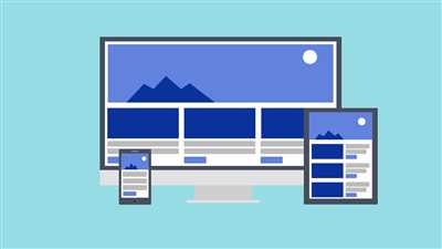
In today’s digital world, it is more important than ever to create a website that is responsive and can adapt to different screen sizes and devices. When building a website, you might start with a cool design idea and create a beautiful layout that looks great on your computer screen. But have you ever noticed that when viewing your project on other devices, such as mobile phones or tablets, things don’t look quite as cool as you expected?
That’s where responsive web design comes in. Responsive design is a set of principles and techniques that allow websites to adapt and respond to the user’s viewing environment, ensuring a seamless user experience across all devices. By using CSS media queries, you can set different breakpoints for your design, which determine how the content is displayed based on the width of the viewport.
One of the most important aspects of responsive design is making sure that the content is fluid and can adapt to different screen sizes. This means that the layout and font sizes should automatically adjust to fit the user’s screen. By using relative units like percentages instead of fixed units like pixels, you can create a design that adapts to any screen size.
Another key element of responsive design is the navigation menu. On larger screens, you might have a traditional horizontal menu, but on smaller screens, a vertical menu might be more appropriate. By using CSS and JavaScript, you can create a menu that changes its layout and appearance depending on the user’s screen size. This way, your website will always look great, no matter what device it’s being viewed on.
An Easy Guide to Creating a Responsive Website
Creating a responsive website is an important thing to consider in today’s digital age. With so many people using different devices to browse the web, it’s crucial to make sure your website looks and functions well on all of them. In this guide, we will walk you through the steps of creating a responsive website using Mobirise, a free and easy-to-use website builder.
1. Start by downloading and installing Mobirise on your computer. It’s a free software that will make the process of creating a responsive website much easier for you.
2. Once you have Mobirise installed, open the program and start a new project. You can choose from many different templates and layouts, so pick the one that best fits the kind of website you want to create.
3. After selecting a template, you can begin building your website by adding blocks. Mobirise offers a wide range of pre-designed blocks that you can drag and drop onto your page. These blocks include things such as headers, navigation menus, text blocks, images, videos, and more.
4. To make your website responsive, look for the media options within Mobirise. You can easily set different layouts for mobile, tablet, and desktop devices. This way, your website will adapt to the screen size it’s being viewed on, ensuring a smooth and fluid user experience.
5. Another important aspect of creating a responsive website is using responsive fonts. Instead of using a fixed font size, Mobirise allows you to select a font size range. This way, the font will adjust accordingly to the screen size, maintaining readability on all devices.
6. When it comes to navigation, make sure your menu is responsive as well. You don’t want your users to struggle to navigate through your site on smaller screens. Mobirise provides easy-to-use navigation options that will automatically adapt to different devices.
7. It’s always a good idea to preview your website on different devices to see how it looks and functions. Mobirise has a built-in preview feature that allows you to view your site on mobile, tablet, and desktop screens. This way, you can make any necessary adjustments to ensure a seamless user experience across all devices.
8. Once you’re satisfied with the look and functionality of your website, it’s time to publish it. Mobirise makes it easy to publish your site to a hosting provider or save it to a local folder on your computer. Simply click on the “Publish” button and follow the on-screen instructions.
In conclusion, creating a responsive website doesn’t have to be difficult. With tools like Mobirise, you can easily build a website that will adapt to different devices and screen sizes. By following this tutorial, you’ll be able to create an entire website without losing design or functionality. So, start your journey to responsive web design today!
Set the viewport
When creating a website, it’s important to consider how it will adapt to different viewing devices, such as mobile phones and tablets. One way to ensure that your website looks good on all devices is by setting the viewport.
The viewport is an important part of creating a responsive website. It’s the area of the web browser where your website is displayed. By default, web browsers set the viewport to a fixed width, usually around 980 pixels. This means that when someone visits your website on a mobile device, they have to scroll left and right to see the entire page.
To fix this issue, you can set the viewport to be a responsive width. This means that the width of the viewport will adapt to the width of the device, whether it’s a small mobile screen or a large desktop monitor. This ensures that your website looks great and is easy to navigate on all devices.
There are a few options for setting the viewport. One option is to use a meta tag in the head section of your HTML code. You can include the following meta tag to set the viewport:
| Option | Description |
|---|---|
| This option sets the viewport width to the width of the device and sets the initial zoom level to 1.0. |
Another option is to use CSS media queries to set the viewport width. This method allows you to set different viewport widths for different devices. For example, you can set a different width for mobile devices and a different width for desktop devices. Here’s an example of how you can do this:
| Option | Description |
|---|---|
| @media only screen and (max-width: 600px) { } This CSS media query sets the viewport width to 600 pixels or less. You can add more media queries to set different widths for different devices. |
By setting the viewport, you ensure that your website is responsive and adapts to different devices and screen sizes. This is important for a better user experience and can help drive more traffic to your website.
Principles of responsive web design
Responsive web design is an important aspect of modern web development. It allows websites to adapt and respond to different devices and screen sizes, ensuring that users have a great experience no matter what device they are using. Here are some principles to keep in mind when creating a responsive website:
1. Use a responsive grid system: A responsive grid system allows you to create flexible layouts that can adapt to different screen sizes. It helps in organizing your content and ensures that it looks good on all devices.
2. Prioritize content: When designing a responsive website, it’s important to think about what content is most important and ensure that it is treated as such. By prioritizing content, you can ensure that users always see the most important information first, regardless of the device they are using.
3. Optimize fonts and typography: Fonts play a crucial role in web design. Using responsive fonts can ensure that they look good on all devices and screen sizes. Consider using font extensions or web-safe fonts to ensure consistent typography across different devices.
4. Keep navigation simple: Navigation is an important element of any website. In a responsive design, it’s crucial to keep navigation simple and easy to use, especially on smaller screens. Consider using hamburger menus or collapsible menus to save space and provide easy access to navigation options.
5. Use media queries: Media queries allow you to specify different styles based on the characteristics of the device. By using media queries, you can create different layouts and styles for different devices, ensuring that your website looks great on all screens.
6. Optimize page load times: Page load times are crucial for user experience. Make sure to optimize your code and compress images to ensure fast loading times. This is particularly important for mobile devices, where slower load times can lead to a higher bounce rate.
7. Test on different devices: Always test your website on different devices to ensure that it looks and functions correctly. This will help you identify any issues or inconsistencies and make necessary adjustments.
8. Start with mobile-first: When starting a responsive design project, it’s recommended to begin with the mobile version first. This allows you to prioritize the most important content and ensure a smooth transition to larger screens.
9. Consider touch and mouse interactions: While designing for mobile devices, remember to consider touch interactions. Ensure that buttons and links are big enough to be easily tapped with a finger. On the other hand, for desktop devices, optimize interactions for mouse usage.
10. Be mindful of space: Space is an important design element. Ensure that your design has enough white space so that content is not crowded. Also, consider how content will adapt when the screen size changes and plan accordingly.
By following these principles, you can create a responsive website that meets the needs of your users across different devices. Always keep in mind that responsive web design is an ongoing process and requires continuous improvement and adaptation.
1 Fluid Grids
When designing a responsive website, one of the most important things you’ll need to consider is the use of fluid grids. A fluid grid is a layout system that allows elements on your website to adapt and adjust according to the size of the viewport or window that they are being viewed in.
Fluid grids are generally ordered in columns and rows, and they allow your website to be flexible and look good on different devices, such as desktop computers, tablets, and mobile phones. A fluid grid ensures that no matter what size screen your user is using to view your website, it will always look great and be easy to navigate.
One of the easiest ways to build a fluid grid is by using a responsive web design framework, such as Bootstrap or Foundation. These frameworks provide you with pre-designed fluid grids that you can simply set up and edit to fit your website’s needs.
If you want something more customizable, you can also use a website builder tool like Mobirise. Mobirise allows you to create fluid grids and design your website using a drag-and-drop interface. You can add blocks, buttons, images, and more, and easily edit them to ensure your website looks the way you want it to.
When using fluid grids, it’s important to ensure that your website is responsive and adapts well to different devices. There are a few key things to keep in mind:
- Use media queries to apply different styles and layouts based on the size of the viewport.
- Always test your website on different devices to ensure it looks good and functions properly.
- Include options for users to easily navigate your website, such as a navigation panel or hamburger menu.
- Ensure that your fonts, buttons, and images are all responsive and will adapt to different screen sizes.
By using fluid grids and responsive design techniques, you can make sure that your website looks great and functions well on any device. Whether your user is on a desktop computer, tablet, or mobile phone, they will always have a positive experience when visiting your site and be able to find the information they are looking for.
If you haven’t already, it’s also a good idea to make sure your website is mobile-friendly. Google now prioritizes mobile-friendly sites in its search rankings, so ensuring your website is responsive will not only provide a better user experience, but it will also increase your visibility in search engines.
In the next section, we’ll dive deeper into fluid grids and how to create them using CSS. Stay tuned!
2 Media queries
When creating a responsive website, one of the most important principles is using media queries. Media queries allow you to apply different styles to your web pages based on the screen size or device being used to view the website. This ensures that your website looks good and functions well on different devices, from desktop computers to mobile phones.
Media queries work by setting breakpoints in your CSS code, which are specified by the width of the viewport, or the area of the screen where your website is displayed. There are many different screen sizes and resolutions, so it’s important to use multiple breakpoints to cover a wide range of devices.
For example, you may want to create a media query that applies specific styles to your website when the viewport width is less than a certain value, such as 600 pixels. This allows you to make adjustments to the layout, font sizes, background images, and other design elements to ensure they are optimized for smaller screens.
Another media query could be used when the viewport width is between two specific values, such as 600 pixels and 900 pixels. This allows you to create responsive layouts that adapt to different screen sizes, such as displaying a three-column grid on larger screens and switching to a single-column layout on smaller screens.
There are various ways to include media queries in your CSS code. You can write them directly in the CSS file, or use a CSS preprocessor like Sass or LESS to make it easier to manage and build responsive websites. Some website builders and frameworks, such as Mobirise or Grid System, also include built-in options for creating responsive layouts using media queries.
When using media queries, it’s important to keep in mind that they are based on the viewport width and not the physical device width. This means that if a user resizes their browser window, the website will respond to the new viewport width. It’s also important to consider different devices and their specific viewport sizes when defining breakpoints for media queries.
Overall, media queries are an essential tool for creating responsive websites that adapt to different devices and screen sizes. By utilizing media queries effectively, you can ensure that your website always looks great and functions well, whether it’s being viewed on a desktop computer, a mobile phone, or anything in between.
3 Images and media
In order to ensure that your site is responsive and looks great across various devices, it’s important to pay attention to how you handle images and media. Here are some principles and tips to consider when working with images and media in your responsive design:
1. Optimize your images:
Images can greatly impact the speed and performance of your website, especially on mobile devices. Make sure to optimize your images for web viewing by compressing them to reduce file size without sacrificing quality. This will help your site load faster and improve the overall user experience.
2. Use appropriate image formats:
When choosing image formats, consider the content and purpose of the image. For photographs or images with complex details, JPEG is generally a better choice, as it provides good quality with a smaller file size. For images with transparent backgrounds or simple illustrations, use PNG or SVG formats.
3. Implement responsive images:
Responsive images allow the browser to download the most appropriate image for the user’s device and screen size. Using HTML5’s srcset and sizes attributes, you can set different image sources and sizes based on viewport or pixel density. This ensures that your images will look great on any device and load efficiently.
4. Use media queries to adapt media content:
Media queries are a powerful tool for controlling the layout and behavior of media elements like images and videos. You can use media queries to adjust the size, position, or visibility of media content based on the viewport size. This way, you can offer the best viewing experience to users on both desktop and mobile devices.
5. Consider lazy loading:
If your page contains a lot of images or media content, consider implementing lazy loading. This technique allows the browser to only load images and media when they are within the user’s viewport, improving the page load speed and saving bandwidth. There are many libraries and plugins available that make it easy to implement lazy loading in your project.
6. Provide alternative text for images:
When using images in your design, it’s important to provide alternative text (alt text) that describes the content of the image. This is especially important for visually impaired users who rely on screen readers or for cases when the image fails to load. Alt text helps improve accessibility and ensures that all users can understand the context of the image.
By following these principles and best practices, you can create a visually appealing and user-friendly responsive design that looks great and functions well on all devices.
4 Web fonts vs system fonts
When creating a responsive website, one important consideration is the choice between using web fonts or system fonts. Both options have their pros and cons, and understanding them will help in making an informed decision for your website.
Web fonts:
Using web fonts is easy and allows for greater customization. You can choose from a wide range of fonts and styles to give your website a unique and professional look. Web fonts are downloaded from the internet and loaded onto the user’s computer when they visit your website.
However, web fonts might slow down the load time of your website, especially if you use multiple fonts or have a lot of text content. This can be a concern for users with slower internet connections or when viewing the website on mobile devices.
System fonts:
System fonts are pre-installed on the user’s operating system, which means they don’t need to be downloaded. This can result in faster load times and better performance. System fonts also ensure consistent appearance across different devices and operating systems.
However, system fonts might limit your options when it comes to design. They might not provide the same level of customization as web fonts, and you might have to rely on generic fonts that may not align with your website’s branding or design.
In conclusion, the choice between web fonts and system fonts depends on the specific needs and goals of your website. If customization and unique design are important, web fonts might be the better option. However, if speed and performance are your top priorities, system fonts might be the way to go.
It’s always a good idea to test different font options and view them on different devices and screen sizes to ensure they look good and load quickly. You can also consider using a combination of both web fonts and system fonts to achieve the best of both worlds.
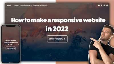
How To Make a Website Responsive Video Tutorial
In today’s digital age, more and more people are using mobile devices to browse the internet. That’s why it’s important to make sure your website is responsive and adapts to different screen sizes. In this video tutorial, we will walk you through the steps of making your website responsive using Mobirise, an easy-to-use website design software.
First, you need to set the root folder of your website. This is where all the files and images will be stored. Creating a separate folder for your website will make it easier to manage and edit in the future.
Next, you’ll want to design your website. Mobirise offers a wide range of pre-designed layouts and blocks that you can use to create your website. You can choose from different categories, such as business, portfolio, or blog, depending on the kind of website you want to build.
Once you’ve selected a layout, you can start adding content to your website. Mobirise allows you to easily add text, images, videos, and other media to your web pages. You can simply drag and drop elements from the side panel to the desired location on your page.
One important thing to keep in mind when creating a responsive website is the use of breakpoints. Breakpoints are specific screen widths at which your website’s layout will change to fit the screen size. You can set breakpoints in Mobirise and adjust the layout accordingly.
Another key principle of responsive web design is fluid images. By setting the width of your images to a percentage instead of a fixed pixel value, you can ensure that they will resize according to the screen size without losing their aspect ratio.
The navigation of your website also needs to be user-friendly on all devices. You can use a hamburger menu, which is a common practice for mobile websites, or a traditional navigation bar. Make sure that the navigation is easy to access and intuitive for the user.
One thing to note is that a responsive website might have different backgrounds or elements that are hidden on smaller screens to improve loading speed. This is done using media queries, which allow you to specify different CSS rules based on the screen size.
Finally, always test your website on different devices to ensure that it looks and functions as intended. You can use tools like Google’s Mobile-Friendly Test or simply resize your browser window to see how your website responds to different screen sizes.
By following these principles and using tools like Mobirise, you can create a responsive website that looks great on all devices and provides an optimal user experience.
So, if you’re ready to make your website responsive, let’s start the video tutorial!


