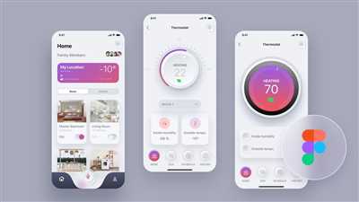
When it comes to designing an app UI, there are several key principles that every designer should keep in mind. Whether you’re creating an app for Apple or Android devices, the overall goal is to deliver a user experience that is visually appealing, easy to use, and intuitive. In this article, we’ll explore the differences between the two platforms and delve into the essential tools and practices that designers should embrace.
First and foremost, it’s important to understand the differences in the design landscape between Apple and Android. While both platforms have their own specifications and guidelines, there are noticeable variations in terms of visual aesthetics and design principles. Apple’s design system, for example, focuses more on creating a cohesive and unified experience across all devices, while Android embraces a more adaptive and flexible approach.
When designing for Apple devices, it’s important to pay attention to the smallest details. Apple users tend to be more discerning and are likely to notice even minor differences in how an app looks and functions. On the other hand, Android users are more accustomed to a wide range of visual styles and layouts due to the platform’s flexibility.
Another important aspect of app UI design is typography. Typography is an essential component of any digital interface, as it helps establish hierarchy and enhances the overall user experience. Whether you’re designing for Apple or Android, it’s vital to choose fonts that are easily readable and visually appealing. For Apple devices, Apple’s own San Francisco font is a popular choice, while Android designers may opt for Google’s Roboto font.
Moreover, it’s crucial to embrace the principles of material design. Material design is a set of guidelines and practices introduced by Google that aim to create a visually pleasing and intuitive user experience. By embracing material design principles, designers can create interfaces that are consistent, responsive, and easy to navigate. Material design also encourages the use of realistic shadows, transitions, and animations to make the app feel more alive and interactive.
In the process of designing an app UI, it’s important to take into account the specific target audience and their needs. Conducting user research and gathering feedback from users can provide valuable insights that can inform the design decisions. By understanding the journey and pain points of the target users, designers can create designs that are tailored to their specific needs and expectations.
In conclusion, designing an app UI requires attention to detail, adherence to best practices, and a deep understanding of the target audience. Whether you’re creating an app for Apple or Android devices, focusing on creating a visually appealing, intuitive, and user-friendly experience is key. By embracing the principles of material design, leveraging the right tools and software, and staying updated with the latest design trends, designers can create app UIs that are both stunning and functional.
Top 6 Android UI Design Tools in 2023
While designing mobile apps, creating visually appealing and user-centric user interfaces (UI) is essential. Designers need to embrace the Android platform-specific design guidelines and maintain consistency across their app designs. However, they also notice some differences between Android devices, like variations in screen sizes, aspect ratios, and software versions.
To help designers easily create UI/UX designs for Android apps, there are several tools available in the market. In this article, we will highlight the top 6 Android UI design tools that can enhance the designing experience and support usability and engagement.
1. Adobe XD: Adobe XD is a popular UI/UX design tool that allows designers to create interactive prototypes and designs. It has an intuitive interface and helps designers make their designs adaptive and responsive for different screen sizes and orientations.
2. Figma: Figma is another widely used design tool that offers collaborative features, making it easier for designers to work within a team. It supports the creation of platform-specific designs and provides a seamless integration of design and development workflows.
3. Sketch: Sketch is a macOS-based design tool that enables designers to create detailed and pixel-perfect UI designs for Android apps. It offers a wide range of plugins and integrations, making it a powerful tool for UI/UX designers.
4. InVision Studio: InVision Studio is a design tool that focuses on creating dynamic and engaging user interfaces. It allows designers to bring their designs to life with animations, transitions, and micro-interactions, providing users with a more interactive experience.
5. Proto.io: Proto.io is a prototyping tool that helps designers transform their static designs into interactive and clickable prototypes. It enables designers to gather user feedback and test the usability of their designs before development.
6. Marvel: Marvel is a user-friendly design tool that allows designers to create prototypes and wireframes with ease. It offers a wide range of pre-built components and templates, saving designers time and effort in the design process.
In conclusion, these top 6 Android UI design tools in 2023 provide designers with the necessary tools and features to create visually appealing and user-friendly app interfaces. Whether it’s Adobe XD, Figma, Sketch, InVision Studio, Proto.io, or Marvel, each tool has its own unique features and advantages. Designers can choose the tool that best suits their workflow and the specific requirements of their Android app projects.
What is app design

App design refers to the process of creating a visually appealing and user-friendly interface for a mobile application. It involves following certain rules and principles to make the app easy to use and engaging for users.
App design hierarchy is important for organizing content and features in a way that makes sense to users. This includes placing important elements at the top or front and center of the app, using visual cues such as color, size, and placement to guide users’ attention, and ensuring that the app’s search functionality is easily accessible.
App design also involves considering the different needs and limitations of various mobile operating systems (OS). For example, Apple and Android have different design guidelines and specifications that app designers must follow to ensure their app looks and functions well on each platform.
App design involves creating components and UI patterns that can be reused across different screens and sections of the app. This includes designing buttons, images, tabs, and other interactive elements that are consistent in their appearance and behavior.
In addition to the visual aspects of app design, it is also important to consider the overall user experience. This includes factors such as load time, transition effects, and the overall flow and navigation of the app. Designers should aim to create designs that are intuitive and easy to navigate, minimizing frustration and maximizing user engagement.
App design can be done using various tools and software, both ready-to-use and custom solutions. It is essential to spend time exploring different design concepts and prototypes to find the best solution for the app’s specific needs.
Overall, app design is a concept that embraces the principles, practices, and guidelines for creating visually appealing and user-friendly interfaces for mobile applications. It is an opportunity to create engaging and intuitive experiences for users while following established design patterns and principles.
To create your own app design, you should first decide on the visual style and scheme that best fits your app’s purpose and target audience. Typography, color schemes, and layout should all be considered to create a cohesive and visually appealing design.
Moreover, app design is not just about how the app looks, but also about how it supports the functionality and usability of the app. It should take into consideration the needs of the users and provide a seamless and enjoyable experience.
In conclusion, app design is an essential and detailed process that requires attention to bottom-level specifications and attention to the overall user experience. Following best practices and design principles is crucial in creating an app that looks good and functions well for its users.
MODERN DESIGN PATTERNS FOR VARIOUS OS
When designing applications for different operating systems (OS), it is important to understand the differences between them. Each OS has its own unique design principles and best practices, which can greatly affect the user’s experience and engagement with the app. In this blog post, we will explore some modern design patterns for various OS, focusing on Apple’s iOS and Google’s Android.
One of the key differences between iOS and Android is their visual design. iOS follows a more adaptive and intuitive approach, with a flat design that emphasizes simplicity and hierarchy. On the other hand, Android embraces a more visually rich and detailed interface, using shadows, gradients, and animations to create a sense of depth and engagement.
Another key difference is in the use of tabs and navigation. iOS typically uses a bottom tab bar for navigation, while Android follows the top tab bar approach. This difference can affect the user’s interactions and how they navigate within the app.
Taking a closer look at specific design elements, such as buttons and icons, can also help emphasize the differences between the OS. iOS tends to use rounded buttons with no outlines, while Android uses more rectangular buttons with visible outlines. Similarly, iOS icons have a more uniform shape and style, while Android icons can be more diverse and expressive.
Typography is another area where the OS have differences. iOS typography is generally more uniform and consistent, using Apple’s specific font choices. Android typography, on the other hand, is more flexible and allows for a wider range of font choices, giving designers more freedom to experiment.
When it comes to usability and user experience, both iOS and Android have their own best practices. iOS apps tend to focus on simplicity and ease of use, with a strong emphasis on human interface guidelines. Android apps, on the other hand, have a more open-ended approach, giving developers more flexibility to create unique experiences that cater to specific needs.
While there are many differences between iOS and Android, it’s important to remember that the end goal is to create the best possible experience for the users. Understanding these differences and using the right tools and design principles can help your team create intuitive and engaging apps on both platforms. Whether you decide to follow a more iOS-centric design or an Android-centric approach, the key is to adapt your design to the specific needs and target audience of your app.
| OS | Key Design Differences |
|---|---|
| iOS | Adaptive and intuitive design with a focus on simplicity and hierarchy. Rounded buttons and uniform icons. |
| Android | Visually rich and detailed interface with shadows, gradients, and animations. Rectangular buttons and diverse icons. |
In conclusion, designing apps for different OS can be a challenging but rewarding process. By understanding the differences between iOS and Android, and following the best practices and design patterns for each platform, you can create apps that are visually appealing, easy to use, and engaging for your users.
Unique design development
When it comes to creating an app UI, having a unique visual design can set your app apart from others in a saturated market. A unique UI design helps your app stand out and makes it more visually engaging for users.
Within the realm of UI design, there are different aspects that have evolved over time. The concept of UI design for digital products such as apps has gone through significant changes, especially in the past decade. The designs of Android and iOS apps, for example, have followed different trends, with Android embracing a more modern flat design scheme while iOS has maintained a more adaptive and realistic design.
One of the essential tenets of creating a unique UI design for your app is to make sure it looks and feels different from other apps on the same platform. While there may be similarities in terms of functionality and overall design needs, finding ways to incorporate unique visual elements can help your app stand out.
One way to achieve uniqueness in UI design is by exploring different color schemes, icon designs, and loading screen images. These visual elements can make a significant difference in how your app looks and give users a unique first impression when they access your app for the first time.
Another aspect of unique UI design is to pay attention to the overall user journey and how users interact with your app. This includes considering the loading times, feedback, and overall performance of the app. By following industry best practices and incorporating user feedback, you can create a unique and user-friendly app interface.
Design tools and ready-to-use UI elements can also help in the process of designing a unique UI for your app. By utilizing these tools, you can maintain a consistent and visually engaging design throughout your app.
In summary, creating a unique UI design for your app is an opportunity to deliver a visually engaging and user-friendly experience. By following the top three principles mentioned above – exploring unique visual elements, considering the overall user journey, and utilizing design tools and principles – you can develop a unique UI design that stands out in a crowded landscape of mobile applications.
Design development with ready-to-use patterns
In the ever-evolving world of app design, it can be challenging for teams to consistently create visually engaging and user-centric interfaces for their products. However, using ready-to-use patterns can help maintain a cohesive design scheme across different applications and platforms.
These ready-to-use patterns provide a base for teams to follow, saving them time and effort that would otherwise be spent on creating interface components from scratch. Moreover, these patterns are platform-specific, meaning they are tailored to support the unique needs and preferences of users on different devices.
By using ready-to-use patterns, teams can explore different UI/UX tenets and deliver a visually dynamic and engaging experience to their users. These patterns often include top navigation bars, tabs, loading indicators, and detailed icons, among others. They can be easily integrated into the overall design and help create a consistent look and feel across the app.
One major benefit of using ready-to-use patterns is that they come with detailed specifications and guidelines. This means that teams don’t have to spend time figuring out the best way to design specific components or interact with different user interface elements. Instead, they can focus on the overall design and usability of the app.
Ready-to-use patterns also provide a means for teams to gather feedback and make improvements. By using these patterns, teams can quickly iterate and make changes based on user feedback, ensuring that the app meets the needs and expectations of its target audience.
It’s important to note that while ready-to-use patterns provide a solid foundation for design development, it doesn’t mean that all apps should look the same. Teams can still incorporate their own unique visual and branding elements, such as color schemes and images, to differentiate their app from others.
In conclusion, ready-to-use patterns are a valuable tool for app design and development. They provide teams with a starting point for creating visually appealing and user-friendly interfaces, while still allowing room for customization and differentiation. By following these patterns, teams can save time, maintain a consistent design scheme, and deliver a compelling user experience within the fast-paced world of app development.
How to design a Mobile App
Designing a mobile app is a complex process that requires careful consideration of various factors to ensure a successful user experience. In this blog post, we will explore some essential guidelines and best practices to follow when designing a mobile app UI.
1. Decide on the main patterns: When designing a mobile app UI, it is important to decide on the main patterns to follow. One popular approach is to use tabs for easy navigation between different sections of the app. By using tabs, users can quickly access the information they need and maintain an overall understanding of the app’s structure.
2. Follow platform-specific guidelines: Mobile devices have different operating systems, each with its own set of design guidelines. It is crucial to follow these guidelines to create a visually appealing and intuitive UI. By following platform-specific guidelines, you can ensure that your app is ready-to-use and compatible with different devices.
3. Pay attention to typography: Typography plays a significant role in mobile app design. By using appropriate fonts, sizes, and spacing, you can create a visually appealing and easy-to-read UI. Spend time exploring various typography options and choose the ones that best suit your app’s concept and target audience.
4. Create visually engaging icons: Icons are a crucial part of mobile app design as they help users navigate and interact with the app. Use visually engaging icons that represent the app’s functionality clearly. Ensure that the icons are easily recognizable and follow the overall UI design scheme.
5. Embrace a user-centric approach: When designing a mobile app, always prioritize the needs and preferences of your users. Conduct thorough user research to understand what they expect from your app and tailor the design accordingly. By creating a user-centric UI, you can enhance user engagement and usability.
6. Optimize performance and loading time: Mobile app performance is essential for user satisfaction. Ensure that your app is fast and responsive, even on lower-end devices. Optimize loading times and minimize the use of heavy graphics to improve overall performance.
In conclusion, designing a mobile app requires careful planning and consideration of various factors. By following these guidelines, you can create a visually appealing, intuitive, and engaging UI that meets the needs of your target audience. Remember to always prioritize the user experience and continuously gather feedback to improve your app.
Sources
When it comes to designing app UI, there are several sources you can turn to for inspiration and guidance. Here are some of the best sources for UI design:
- Apple Human Interface Guidelines: Apple provides comprehensive guidelines for designing UI on their devices, such as iPhones and iPads. Following these guidelines ensures that your app meets the specifications and best practices set by Apple.
- Material Design by Google: Google’s Material Design provides guidelines for creating a visually appealing and user-friendly interface for Android applications. It covers various aspects of UI, including typography, color scheme, and icon designs.
- UI/UX blogs: There are several blogs and websites dedicated to UI/UX design that offer valuable insights and tips. Some popular ones include Smashing Magazine, UX Collective, and A List Apart.
- UI design software: There are numerous software tools available that can help you create and maintain your app’s UI. Some popular options include Adobe XD, Sketch, and Figma.
- Design patterns and principles: Studying and understanding common design patterns and principles can be very beneficial. This allows you to leverage well-established solutions and concepts to create a more user-friendly and intuitive interface.
- Dynamic and adaptive UI: Modern app UI needs to be dynamic and adaptive, especially with the evolving landscape of various devices and screen sizes. Designing an adaptive UI ensures that your app can easily be used across different devices without compromising usability.
By exploring these sources and incorporating their principles and guidelines into your design process, you can create a unique and engaging UI that meets the needs of your users.

