
In today’s competitive market, creating a strong and unique brand is simply crucial. Brands that have a clear and consistent visual identity are more likely to stand out from the crowd and leave a lasting impression on their target audience. But how can you achieve that? The answer lies in creating a brand book.
A brand book is a comprehensive guide that outlines the visual, verbal, and strategic elements of your company’s brand. It serves as a playbook for your brand, providing everyone in your organization with a clear understanding of how to present your brand to the world. From fonts and colors to copy and voice, a brand book ensures that all your brand’s elements are used consistently across all materials, be it print, web, or social media.
One of the most important elements of a brand book is the color palette. Color is a powerful visual element that can evoke specific emotions and create a certain mood. By defining a set of colors to be used consistently, you can ensure that your brand’s visuals always look harmonious and create the desired impact. Whether it’s the vibrant hues of your logo or the clean whites of your website, each color should have a specific meaning and purpose.
Another crucial element of a brand book is typography. The fonts you choose for your brand will help create a visual identity that is unique to your business. Different font types can convey different moods and emotions, so it’s important to choose fonts that align with your brand’s personality and values. Whether you opt for bold and confident or elegant and refined, your font choices should reflect your brand’s essence.
Creating a brand book isn’t just about visuals, though. It’s also about defining your brand’s voice. Your brand’s voice is the personality and tone of your communication. It’s how you speak to your audience, whether it’s through a marketing campaign, a social media post, or a customer service email. A consistent brand voice helps build trust, establishes credibility, and creates a strong connection with your target audience.
So, why is a brand book so important? Firstly, it gives everyone in your organization a clear picture of what your brand stands for and how it should be communicated both internally and externally. When every team member is on the same page, it ensures that your brand’s messaging is cohesive and aligned with your company’s values. Secondly, a brand book allows you to communicate your brand’s essence to external partners, such as agencies or designers, who need to understand your brand in order to create relevant and effective materials.
In conclusion, a brand book is an essential tool for any business that wants to create a strong and unique brand. By defining your brand’s visual and verbal elements, as well as its overall strategy, you can ensure that your brand stands out from the competition and resonates with your target audience. So don’t underestimate the power of a well-crafted brand book – it’s the cornerstone of successful branding.
- How To Create Brand Guidelines in 2024
- How to create brand guidelines
- What Is a Brand Book
- Why you should definitely create your own brand book
- Key elements of a brand book
- 0 moodboard
- 1 Strong Logo
- 2 logo usage guidelines
- 3 Color Palette
- 4 brand color usage guidelines
- 5 fonts and typography
- 6 Imagery
- 7 usage restrictions do’s and don’ts
- 8 other design elements
- 9 Usage Examples
- 10 brand tone and voice
- 11 icon and watermark usage
- 12 content usage permissions
- 13 social media guidelines
- 14 social media cover templates
- 15 Advertising Templates
- 16 site and app screenshots
- 17 company core values
- 18 Usage Example Print
- 19 usage example web
- 20 Copyright Information
- How to create a brand book Visual guidelines
- Logo usage
- Color palette
- Videos:
- Five Essentials for Brand Style Guides – NEW Resource Promo!
How To Create Brand Guidelines in 2024
Creating brand guidelines is a core part of branding for any business. It ensures that everyone in the company is on the same page when it comes to the usage of visual elements, tone of voice, and values. In this article, we will discuss the steps to create brand guidelines for your business in 2024.
1. Start with a brand book: A brand book is a comprehensive document that outlines all the visual and tonal elements of your brand. It includes information on the logo, colors, fonts, icon usage, and more. The brand book should be created in a format that is easy to reference, such as a PDF or an online website.
2. Define your brand identity: Before you start creating the brand guidelines, it’s important to have a clear understanding of your brand’s identity. This includes your mission statement, values, target audience, and unique selling points. Knowing who you are as a brand will help you create guidelines that are specific to your business.
3. Determine the visual elements: The visual elements of your brand include the logo, colors, fonts, and icon usage. Decide on the approved variations of your logo, the specific colors to be used, and the fonts that should be used in different contexts. You may also want to include examples of how the visual elements should be used, such as logo placement on different materials or screens.
4. Establish the tone of voice: The tone of voice is an important part of your brand’s identity. Think about how you want your brand to sound and convey its message. Consider using adjectives to describe the tone, such as friendly, professional, or authoritative. Include examples of appropriate and inappropriate language usage to provide clear guidance to your team.
5. Include usage guidelines: A brand guideline should provide clear instructions on how the visual and tonal elements should be used. This may include rules on logo placement, color usage, icon placement, and more. Ensure that the guidelines are easy to understand and follow, so that everyone in your company knows how to use your brand effectively.
6. Get creative with examples: To help your team better understand the guidelines, provide examples of how the visual and tonal elements can be used. This could be in the form of screenshots from your website, social media accounts, or advertising materials. By showing real-life examples, you can demonstrate how the guidelines can be applied in different contexts.
7. Review and approve: Before finalizing the brand guidelines, make sure to review them with your team and get their input. This will ensure that everyone is on the same page and that the guidelines meet their needs. Once approved, the guidelines should be made available to everyone in the company.
8. Create a reference section: In addition to the core guidelines, it’s helpful to include a reference section in your brand guidelines. This can include a list of external sources for fonts, icons, and other visual elements. It can also include a list of approved materials and spell out permissions for using the brand’s assets.
9. Keep it up-to-date: Brand guidelines should not be set in stone. As your business evolves, your branding might need to change as well. Make sure to revisit and update your brand guidelines periodically to ensure they remain relevant and cohesive with your brand’s identity.
In conclusion, creating brand guidelines in 2024 is an essential part of establishing and maintaining a cohesive brand identity. By following these steps, you can ensure that everyone in your company understands and uses your brand in the best possible way.
How to create brand guidelines
When you want to create brand guidelines, there are a few key things you should know. Brand guidelines are a set of rules and instructions that help ensure consistency in your brand’s visual and creative identity. These guidelines will serve as a guide for anyone who works with your brand, whether it’s internal team members or external partners.
The first thing you’ll need to do is create a brand mission and description. This will help you in communicating your brand’s mission, values, and objectives. It’s important to have a clear and strong brand message that will resonate with your target audience.
Next, you’ll need to think about the visual elements of your brand. This includes the logo, colors, fonts, and icons that will be used in your creative materials. You’ll want to create a cohesive and visually appealing brand presence that accurately reflects your brand’s identity.
One of the most important elements of brand guidelines is the color palette. You should create a list of approved colors that can be used in your brand’s materials. This will help ensure that your brand’s visuals are consistent across all channels.
The next thing you’ll want to think about is the typography. You should choose two or three fonts that will be used in your brand’s materials. Make sure that these fonts are easy to read and reflect your brand’s tone and voice.
Another important aspect of brand guidelines is the usage of your brand’s elements. This includes the placement of your logo, usage of icons, and the overall design and layout of your materials. Create templates and examples to help guide others on how to properly use these elements.
When it comes to content, you should create guidelines on what is acceptable and what isn’t. This includes guidelines on tone of voice, copyright information, and how to spell and style certain words. This will help ensure that your brand’s copy is consistent and error-free.
One thing to remember when creating brand guidelines is that they should be accessible to everyone who needs them. Whether it’s your internal team or external partners, make sure that they have easy access to the guidelines and understand how to use them.
Creating brand guidelines can be a time-consuming process, but it’s an important step in ensuring that your brand is represented consistently across all channels. It will help establish a strong and cohesive brand identity that will resonate with your target audience.
In conclusion, brand guidelines are an essential part of any business’ branding strategy. They provide a clear and consistent set of rules and instructions that help guide the creation of your brand’s visual and creative materials. By following these guidelines, you’ll be able to create a strong brand presence and effectively communicate your brand’s message to your target audience.
What Is a Brand Book
A brand book, also known as a brand guidelines or brand manual, is a document that provides a comprehensive description of a company’s brand identity. It outlines the key elements that make up a brand, such as the logo, colors, fonts, and imagery, and provides instructions on how to use them in various contexts. The brand book serves as a reference guide for anyone involved in creating advertising, marketing materials, or other brand communications.
A brand book is essential for maintaining consistency in branding. It ensures that everyone in the company, from design teams to social media accounts, understands how to use the brand elements correctly, whether it’s for print, web, or other media. By following the guidelines in the brand book, teams can create cohesive and impactful communication materials that reflect the company’s mission and values.
One of the key components of a brand book is the brand’s color palette. It includes a clear description of the approved colors and their specific usage. For example, it might define primary and secondary colors, as well as guidelines for using the colors in different contexts. The brand book may also include examples of incorrect color usage to avoid and ensure consistency.
In addition to color guidelines, a brand book might also cover typography, including approved fonts and how to use them. It could provide guidelines for logos and icons, such as their placement and size. The brand book may also define the tone and language to be used in brand communications, ensuring that the company’s messaging is consistent across all channels.
A brand book is not just about visual elements. It can also include a description of the brand’s mission, values, and personality. This helps communicate the brand’s identity and provides guidance on how to represent it effectively. The brand book might also include examples of branded imagery, such as photographs or illustrations, to demonstrate how the brand should be visually represented.
Creating a brand book is not always easy, especially for companies with a diverse range of products or services. However, having a brand book is vital for consistent and effective branding. It serves as a reference guide for everyone involved in creating brand communications, ensuring that they adhere to the brand’s guidelines and reinforce its identity.
Without a brand book, companies may face challenges such as using inconsistent colors, fonts, or logos, which can weaken the overall brand and confuse customers. Having a brand book helps companies avoid these pitfalls and present a unified brand image to the world.
So, whether you’re a small startup or a well-established company, creating a brand book is a crucial step in defining and communicating your brand effectively. It takes time and effort to create a comprehensive brand book, but the investment is well worth it in the long run. Start by understanding your brand’s key elements and create clear guidelines that guide everything from logo usage to color palette selection. By doing so, you’ll ensure that your brand is recognized and remembered by your target audience.
Why you should definitely create your own brand book
Creating a brand book is an essential step for any company or organization. It is a comprehensive guide that helps define and showcase your brand identity, ensuring consistency across all platforms and materials. Here are some reasons why you should definitely create your own brand book:
| 1. Consistency | A brand book provides a list of guidelines that determines how your brand should be portrayed across different media and platforms. It ensures that every member of your team is on the same page and understands the right way to represent your brand. |
| 2. Cohesive brand identity | A brand book helps you define and refine your brand’s visual elements, including logo, colors, fonts, and style. It ensures that all your marketing materials and content have a consistent look and feel, making your brand easily recognizable and memorable. |
| 3. Copyright protection | A brand book includes information about the proper usage and restrictions of your brand assets. It helps protect your brand from copyright infringement and ensures that your brand is used in the right way, both internally and externally. |
| 4. Professional image | A well-designed brand book gives your brand a professional and polished image. It demonstrates that you take your brand seriously and value consistency and quality in your branding efforts, which can enhance the trust and credibility of your company. |
| 5. Clear brand message | A brand book includes your company’s mission, values, and brand message. It helps everyone in your team understand and communicate the essence of your brand, enabling them to deliver a consistent brand voice and messaging across all channels. |
| 6. Brand differentiation | In a competitive market, it’s crucial to set your brand apart from others. A brand book enables you to define what makes your brand unique and differentiate it from competitors. It helps you establish a distinctive brand identity that resonates with your target audience. |
| 7. Easy brand management | A brand book simplifies brand management by providing a centralized resource that everyone in your team can access. It saves time and effort by eliminating the need to constantly seek approval or clarify brand guidelines. |
| 8. Print and digital presence | A brand book covers all aspects of your brand, whether it’s for print materials, website, social media posts, or digital advertising. It ensures that your brand is consistently represented across different mediums and screens, delivering a unified brand experience. |
| 9. Inspire creativity | While a brand book provides guidelines and restrictions, it also allows room for creative expression within the defined brand identity. It gives your team a foundation to build upon and encourages them to think outside the box while staying within the brand parameters. |
| 10. Brand scalability | As your company grows, a brand book becomes even more valuable. It ensures that your brand can be easily scaled and adapted across new products, services, and markets, maintaining a consistent and recognisable brand presence. |
A brand book is a powerful tool that every company or organization should have, regardless of its size or industry. It sets the foundation for a strong and cohesive brand identity and plays a key role in shaping how your brand is perceived by others. So don’t wait any longer – start creating your own brand book today!
Key elements of a brand book
Creating a brand book is an important part of developing a cohesive brand strategy for your business. It serves as a reference guide that outlines the core elements and guidelines for using your brand identity across various mediums, including print and digital.
One of the key elements of a brand book is the brand description. This is where you can define the mission, values, and target audience of your company. It’s important to be clear and concise in describing what your brand stands for and what makes it unique.
The logo is another essential element that should be included in your brand book. The logo is a visual representation of your brand and should be consistent across all platforms and materials. It’s important to specify the correct usage and placement of the logo, as well as any rules for resizing or altering it.
Color usage is also a vital part of a brand book. It’s important to define the primary and secondary colors that should be used in your brand’s materials. This includes not only the colors used in your logo, but also in your website, social media accounts, and advertising materials. Consistency in color usage helps create a strong and recognizable brand identity.
Typography and icon usage are also key elements to consider. Your brand book should specify the types of fonts and icons that are acceptable for use in your brand materials. This ensures that all text and images associated with your brand have a consistent style and tone.
Another important element to include in your brand book is the usage permissions and guidelines for other parties. It’s important to clearly outline which elements of your brand can be used by external sources, such as partners or affiliates, and under what conditions. This helps protect your brand and ensures that it is used in a way that aligns with your values and image.
Lastly, it’s important to create a section in your brand book that includes examples and dos and don’ts. This helps guide others in understanding how to use your brand consistently and professionally. It can include examples of correctly branded social media posts, web copy, and advertising materials, as well as examples of incorrect usage that should be avoided.
Remember, a brand book isn’t just a text document. It’s a comprehensive guide that helps ensure consistent branding across all aspects of your business. By including these key elements in your brand book, you can create a strong and cohesive brand identity that resonates with your target audience.
0 moodboard
Creating a moodboard is an essential step in the process of making a brand book. It is where many professionals start when it comes to branding because it helps define the visual style and voice of the brand.
A moodboard includes different types of visuals, such as images, screenshots, logos, and fonts, that represent the desired look and feel of the brand. For example, if your brand is open and friendly, you may choose bright colors and playful fonts. If your brand is professional and serious, you may opt for muted colors and sleek, modern fonts.
A moodboard is not only used for branding purposes, but it also helps define the target audience and placement of the brand. By visually representing the brand’s mission, tone, and style, a moodboard spells out what the brand is all about.
When creating a moodboard, it is important to follow some guidelines to ensure the best results:
| Do’s | Don’ts |
| 1. Gather visuals that align with your brand’s mission and values. | 1. Don’t include random images that don’t reflect your brand. |
| 2. Use images that evoke the desired emotions and feelings. | 2. Don’t use images that contradict your brand’s message. |
| 3. Mix and match different visuals to create a cohesive look. | 3. Don’t stick to only one type of image or style. |
| 4. Experiment with different color palettes and typography. | 4. Don’t limit yourself to the same colors and fonts. |
| 5. Ensure that the moodboard looks visually appealing. | 5. Don’t create a cluttered or unorganized moodboard. |
A good moodboard ensures that everyone on the team knows and understands the visual direction of the brand. It serves as a reference point for designers, copywriters, and other members involved in creating branded materials.
By following the guidelines and creating a visually captivating moodboard, you’ll be able to create a brand book that not only looks good but also communicates the essence of your brand.
Remember, a brand book is not just a collection of images and colors. It is a document that defines the brand’s visual identity and ensures consistency across all touchpoints, both online and offline. It is the key to creating a strong brand presence and building brand loyalty.
1 Strong Logo
A strong logo is an essential element of a brand book. It is the visual representation of your brand and will be used across all platforms, whether it’s on your website, social media accounts, or external creative posts.
The logo needs to be clear and cohesive, symbolizing the essence of your brand and reflecting its mission and values. It should be unique and easily recognizable, setting your brand apart from others.
When designing a strong logo, consider the following elements:
- Color palette: Choose a color palette that best represents your brand and ensures consistency throughout your brand book and other digital and print materials.
- Typography: Use fonts that are both visually appealing and easily readable. Different fonts can communicate different tones, so choose the ones that align with your brand’s message and style.
- Iconography: Consider whether your logo needs any icons or images to enhance its visual appeal and communicate the type of product or service you offer.
- Placement: Determine where your logo will be placed on your website, social media accounts, and any other digital platforms. Ensure that it is always visible and well-positioned.
- Size and restrictions: Know the acceptable sizes and restrictions for your logo. It should be legible and recognizable, whether it’s as small as a social media profile image or as large as a billboard.
When creating a brand book, it’s important to have guidelines and do’s and don’ts for the use of your logo. This will help everyone who works with your brand understand how to use it properly and consistently.
For example, you may have restrictions on altering the color or size of the logo, or you may provide guidelines on the appropriate use of the logo in different contexts.
Remember, a strong logo is a key component of your brand identity. It should effectively communicate your brand’s message and instantly convey who you are and what you’re about. So, take the time to think creatively and ensure that your logo represents your brand in the best possible way.
Here’s an example of a strong logo:
SociallyInfused
2024
This logo combines a modern and clean typography style with a bold color palette. The word “SociallyInfused” represents the brand’s mission of integrating social media strategies into digital marketing, while the numbers “2024” add a touch of uniqueness and memorability.
By having a strong logo that speaks to your brand’s identity, you can ensure that your brand stands out and leaves a lasting impression on your audience.
2 logo usage guidelines
When it comes to creating a brand book, logo usage guidelines are one of the most important elements. A well-designed and well-executed logo can communicate your company’s core values, product or service, and brand strategy. Whether it’s for your own website, social media posts, or any other type of content, the logo is the visual image that gives everyone access to what your brand stands for.
Logo usage guidelines ensure that your logo is consistently used across all materials, both online and offline. They include guidelines on logo size, placement, color palette, typography, and other elements that are important for visually communicating your brand identity. For example, you may want to create a brand book that includes templates for creating social media posts, where the logo is always placed in the same spot and with the right size.
One of the key guidelines for logo usage is to never alter the logo in any way without the right reference to the brand book or style guide. This means that you cannot change the color, shape, or design of the logo at your own will. The logo should always be used as created and not digitally altered.
Another important aspect of logo usage guidelines is copyright and watermark placement. It is important to understand that you can’t use the logo without the company’s permission. It is also important to know if the logo can be used in an open and free manner or if there are any restrictions. Some brands may have copyright restrictions on logo usage, while others may allow open usage.
Logo usage guidelines also specify where and how the logo should be used on different platforms. For example, there may be different guidelines for using the logo on a website compared to social media posts. This ensures that the logo looks and feels consistent across all platforms and materials.
Here are some logo usage guidelines to keep in mind:
- Always use the logo created by the company and never create your own version.
- Understand the copyright and watermark placement rules for the logo.
- Ensure that the logo is used consistently across all platforms and materials.
- Follow the size and placement guidelines for the logo on your website.
- Use the logo appropriately in social media posts and other content.
- Do not alter the logo in any way without the right reference to the brand book or style guide.
- Know the color palette and typography guidelines for the logo.
- When creating templates for social media posts, include the logo in the right size and placement.
- Use the logo in a way that aligns with the company’s core values and brand strategy.
- Ensure that everyone in your organization understands and follows the logo usage guidelines.
- Refer to the brand book or style guide for any questions or uncertainties regarding logo usage.
By following these logo usage guidelines, you can create a strong and consistent brand identity that everyone recognizes and understands. It ensures that your brand is visually infused into everything you create, whether it’s a website, social media posts, or other marketing materials.
Examples: Here are some examples of logo usage guidelines from well-known brands:
Example 1:
Brand: Apple
Logo Usage Guidelines: The Apple logo should always be presented in its original form, without any distortions or alterations. The Apple logo should always be used in black or white, depending on the background color.
Example 2:
Brand: Coca-Cola
Logo Usage Guidelines: The Coca-Cola logo should always be used with the registered trademark symbol, and it should never be modified, stretched, or distorted. The Coca-Cola logo should always be used in red, or in black or white if color printing is not available.
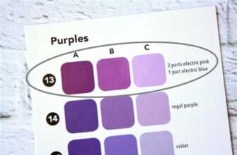
3 Color Palette

A crucial element of a brand book is the color palette. The colors you choose to represent your brand will matter and can have a clear impact on how your company is perceived. Colors can evoke different emotions and associations, so it’s important to choose them carefully.
The color palette should include three types of colors: primary, secondary, and accent. The primary colors are the main colors that will be used consistently throughout all brand materials, both online and offline. The secondary colors are complementary to the primary colors and can be used to add variety and depth to your brand’s visuals. The accent color is a pop of color that can be used sparingly to draw attention to specific elements or calls to action.
When creating a brand book, it’s important to not only specify what colors should be used but also where and how they should be used. For example, you may want to specify that the primary colors are acceptable for print materials, while the secondary colors are more appropriate for web design or social media posts.
Another key aspect is the usage of specific color codes or color values. This is especially important when creating web design materials or digital assets. Be sure to include the hex codes or RGB values for each color so that everyone knows exactly which colors to use.
It’s important to note that there may be some restrictions or guidelines in place when it comes to color usage. For example, some colors may be copyrighted or trademarked, so be sure to do your research and ensure that you aren’t infringing on any existing copyrights or trademarks.
Each color in your palette should have a clear purpose and usage. For example, you might use one primary color as the background color for your website, while another primary color is used for headings or buttons. The secondary and accent colors can be used to add visual interest and variety to different elements, such as icons, borders, or backgrounds.
Finally, it’s essential to think about the overall visual style and voice of your brand when selecting colors. The color palette should align with the other elements of your brand, such as the logo, typography, and imagery. Consistency is key to creating a cohesive and recognizable brand identity.
In conclusion, the color palette is a fundamental part of any brand book. It not only guides the usage of colors but also defines the overall visual style and tone of your brand. Take the time to carefully select colors that align with your brand’s values and appeal to your target audience. A well-designed color palette can make a significant impact on how your brand is perceived and remembered.
4 brand color usage guidelines
When it comes to creating a brand book, one of the most important elements to define is the brand color palette. The colors you choose will have a significant impact on how your brand is perceived and remembered. To ensure consistency and professionalism in your brand’s visual identity, here are 4 guidelines for using your brand colors:
| Guideline | Description |
|---|---|
| 1. Understand the why behind your brand colors | Before you start using your brand colors, it’s crucial to understand the reasoning behind their selection. Each color should have a specific meaning and convey the message or mood you want to evoke. Whether it’s to represent your company’s mission or to create a strong visual identity, knowing the purpose of your brand colors will ensure that they are used appropriately. |
| 2. Always use brand colors in digital and print materials | Consistency is key when it comes to brand colors. Make sure that your brand colors are used across all platforms, including your website, app, advertising materials, and printed materials. Using the same colors will help reinforce your brand’s visual identity and make it recognizable to your target audience. |
| 3. Create color templates and guidelines for internal and external teams | To ensure that your brand colors are used consistently by your team members, both internal and external, it’s essential to provide them with color templates and usage guidelines. These guidelines should cover everything from the specific hexadecimal codes of each color to how to use them in different types of visuals. |
| 4. Restrict the use of non-branded colors | To maintain a cohesive brand identity, it’s important to restrict the use of non-branded colors. This doesn’t mean that you should only use your brand colors exclusively, but rather that any additional colors used should complement your brand palette and not overpower it. By limiting the color choices, you can ensure that your brand remains consistent and recognizable. |
By following these brand color usage guidelines, you can ensure that your brand’s visual identity is strong and consistent across all platforms and materials.
5 fonts and typography
When it comes to creating a brand book, one of the key elements you need to consider is the selection of fonts and typography. Typography plays a crucial role in defining the overall visual identity of your brand, and it can make a huge difference in how your brand is perceived.
1. Take the time to choose the right fonts
- Don’t just settle for default fonts that everyone uses. Instead, take the time to find fonts that match your brand’s personality and values.
- Consider the emotion and mood you want your brand to convey, and choose fonts that reflect that.
- Make sure the fonts you choose are legible and readable, especially in smaller sizes.
2. Define a font hierarchy
- Establish a clear hierarchy of fonts to use in different parts of your brand book.
- Assign specific fonts for headings, subheadings, body text, and other key elements.
- This will help create consistency and coherence in your brand’s visual language.
3. Use a maximum of 3 fonts
- While it’s tempting to use a variety of fonts to make your brand stand out, it’s best to limit yourself to a maximum of three fonts.
- Using too many fonts can make your brand look cluttered and unprofessional.
- Stick to a main font for your logo and headings, and choose two complementary fonts for body text and other supporting content.
4. Consider both print and digital media
- Keep in mind that the fonts you choose may look different across different mediums.
- Fonts that look great on a website may not translate well in print materials, and vice versa.
- Make sure the fonts you choose work well in both digital and print formats.
5. Use professional fonts and avoid free templates
- While there are many free fonts and templates available, it’s important to invest in professional fonts and templates.
- Professional fonts are usually more unique and have more extensive character sets.
- They also come with better technical support and permissions for commercial use.
- Avoid using free templates, as they might be overused and not help your brand stand out.
6 Imagery
Imagery is a key element in creating a strong brand. It is the visual language that defines your company’s tone, mood, and message. In this section, we will discuss the importance of imagery in your brand book and provide examples of how to effectively use visuals to communicate your brand’s mission.
When it comes to imagery, it’s important to know what types of visuals are appropriate for your brand. For example, if your business is in the advertising industry, you may want to focus on using creative and professional images that reflect the mood and tone of your company. On the other hand, if your brand is more product-specific, you may need to use specific images that showcase your key offerings.
Instead of using generic photos or stock images, take the time to create your own visuals that align with your brand’s tone and message. This will help you stand out from others in your industry and communicate your unique value proposition to your target audience.
When creating imagery for your brand book, it’s important to define guidelines for usage. This can include information on where and how the visuals should be used, any restrictions or permissions that need to be followed, and examples of how the imagery should be incorporated into different media, such as social media posts, advertisements, or app screens.
Visual elements such as logos, icons, colors, and fonts should be consistent across all brand communications. This helps to create a cohesive visual identity and ensures that your brand is easily recognizable to your audience. Additionally, it is important to provide guidance on the usage of imagery by others, such as external teams or partners, to maintain a consistent brand image.
In order to help teams create visuals that align with your brand, it can be helpful to provide a moodboard or color palette that captures the desired look and feel. This gives everyone involved a clear understanding of the visual direction and helps to avoid any misunderstandings or inconsistencies.
When using imagery in your brand book, it is important to follow some do’s and don’ts. Do use strong and impactful images that convey your brand’s message. Don’t use images that are irrelevant or confusing. Do consider the emotional impact of your visuals and how they align with your brand’s tone. Don’t use visuals that contradict or undermine your brand’s values and mission.
A good example of effectively using imagery in a brand book is Apple. Their sleek and minimalistic visual style communicates their brand’s mission of simplicity and innovation.
Always keep in mind that imagery is a powerful tool for communicating your brand’s values and message. By following these guidelines and creating a visual language that is consistent and impactful, you’ll be able to create a strong and memorable brand identity.
7 usage restrictions do’s and don’ts

When it comes to creating a brand book, there are certain usage restrictions that you need to keep in mind. These do’s and don’ts will help you understand how to effectively use your brand elements and ensure consistent branding across all platforms. Here are 7 important restrictions to consider:
- Do define your brand values: Before creating any brand elements, it’s important to have a clear understanding of your business’s values and message. This will help guide your design choices and ensure that they align with the overall brand strategy.
- Don’t use different brand elements: Consistency is key when it comes to branding. Using different elements or variations of your logo, typography, or colors can confuse your target audience and dilute your brand identity. Stick to a cohesive brand look across all materials.
- Do use approved templates: To maintain consistency, it’s important to use approved templates for your brand materials. These templates will have predefined placements for your logo, images, and copy, ensuring a consistent look and feel throughout all communications.
- Don’t forget about typography: Typography is an essential element of your brand identity. Make sure to define and use specific fonts and font sizes for headings, subheadings, and body text. Consistent typography will give your brand a polished and professional look.
- Do use watermarks: To protect your brand’s visual assets, consider using watermarks on images and other visual content. This ensures that your brand is always associated with the content, even if it’s shared or used without permission.
- Don’t neglect your brand tone of voice: Your brand’s tone of voice is just as important as its visual elements. Clearly define the language and writing style that aligns with your brand’s values, and use it consistently across all communication channels to maintain a cohesive brand experience.
- Do spell out permissions: To avoid any misunderstandings or misuse of your brand assets, clearly define the permissions and restrictions for their usage. Provide a comprehensive list of dos and don’ts that all team members and stakeholders should adhere to.
By following these 7 usage restrictions and best practices, you’ll create a brand book that not only looks great but also ensures that your brand is consistently represented across all platforms and materials.
8 other design elements
When creating a brand book, it’s important to include a variety of design elements that help define the visual identity of your brand. Here are 8 other design elements that you should consider:
- Colors: Define a color palette that reflects your brand’s values and creates a cohesive look across all materials.
- Logo: Create a clear and professional logo that represents your business and is easily recognizable.
- Typography: Choose the right type of fonts that align with your brand’s voice and create a consistent visual identity.
- Iconography: Develop a set of icons that can be used to enhance visual communication and reinforce your brand’s message.
- Photography and imagery: Select high-quality visuals that complement your brand’s style and evoke the desired mood.
- Web design templates: Create design templates for your website that ensure consistent and professional placement of visual elements.
- Social media assets: Design templates that align with your brand’s visual style for posts on social media accounts.
- Copywriting guidelines: Establish guidelines for the tone and voice of your brand’s copy to maintain consistency across all communication channels.
By including these 8 other design elements in your brand book, you’ll ensure that everyone working with your brand understands how to use and present your brand in a consistent and professional way.
9 Usage Examples
Here are 9 usage examples to help you understand how to make a brand book:
| No. | Example | Explanation |
|---|---|---|
| 1 | Website | Define the visual elements, typography, and placement guidelines for your website. |
| 2 | Mobile App | Create templates and guidelines for the design of your mobile app, ensuring a consistent brand experience across screens. |
| 3 | Print Materials | Specify how the brand elements should be used in print materials such as brochures, flyers, and business cards. |
| 4 | Logo Usage | Provide instructions on proper logo usage, including size, positioning, and acceptable color variations. |
| 5 | Social Media | Guide how the brand should be represented on social media platforms, including profile and cover image guidelines. |
| 6 | Language and Tone | Define the appropriate language and brand voice to be used in all communications. |
| 7 | Copyright | Explain the guidelines and permissions surrounding the use of copyrighted materials. |
| 8 | Target Audience | Identify the target audience and how the brand should be tailored to resonate with them. |
| 9 | Brand Strategy | Outline the core values, key messaging, and overall brand strategy to ensure a consistent and cohesive brand identity. |
By including these usage examples in your brand book, you’ll have a comprehensive guide that covers everything from visual elements to tone of voice. It gives everyone in your business a clear understanding of how to use the brand and helps maintain a professional and consistent brand image.
10 brand tone and voice
- 1. Define your brand tone and voice: Before creating a brand book, you should define the tone and voice of your brand. Determine what type of language and style you want to use in your branding. This will help create a consistent and clear message for your target audience.
- 2. Take into account your target audience: Consider who your target audience is and what type of language and tone they will respond to. Your brand tone and voice should be tailored to your audience’s preferences and needs.
- 3. Know your brand: Make sure that you and your team deeply understand your brand and what it stands for. This will help you communicate and develop a consistent brand tone and voice.
- 4. Use a brand moodboard: Create a moodboard that represents the mood, style, and tone of your brand. This will help you visually communicate your brand’s tone and voice to your team.
- 5. Use brand colors: Choose a set of brand colors that reflect your brand’s personality and style. Make sure to consistently use these colors in all of your branding materials.
- 6. Define your brand fonts and typography: Choose a set of fonts and typography that represent your brand’s tone and voice. This will help create a consistent and cohesive look for your brand.
- 7. Create brand guidelines: Develop brand guidelines that outline how your brand should be represented in different mediums and contexts. This will ensure consistency across all platforms and touchpoints.
- 8. Use brand icons and elements: Create a set of brand icons and elements that can be used to visually represent your brand. These icons and elements should align with your brand’s tone and voice.
- 9. Avoid copyrighted content: Make sure that all content used in your branding materials, including images and text, is original or properly licensed. This will prevent any legal issues and ensure that your brand looks professional and trustworthy.
- 10. Test and iterate: Continually test and iterate your brand tone and voice to ensure that it resonates with your target audience. Gather feedback from your team and customers to make improvements and adjustments as needed.
11 icon and watermark usage
When creating a brand book, it is important to establish guidelines for the usage of icons and watermarks. Icons and watermarks can be powerful visual elements that enhance a brand’s identity and help convey its message. Here are some key considerations when using icons and watermarks:
- Understand the purpose: Know why you want to include icons and watermarks in your brand book. Are they meant to add visual interest to your materials or serve as a distinctive element?
- Choose the right icons: Select icons that align with your brand’s visual language and mission. Consider using templates or creating your own icons to ensure consistency.
- Consider the right placement: Determine where icons and watermarks should be placed on different types of materials, whether it’s print or digital. Understand that their placement can affect the overall design and the message you want to convey.
- Define acceptable colors: Establish a color palette for icons and watermarks that is consistent with your brand’s colors and moodboard. This will ensure that they always look cohesive with your brand identity.
- Always follow permission guidelines: If using icons or watermarks created by others, make sure you have the appropriate permissions or licenses to use them. This is essential to avoid any legal issues.
- Include usage examples: Provide visual examples of how icons and watermarks should be used in different contexts. This will help others understand the correct usage and alignment with your brand guidelines.
- Consider different sizes: Icons and watermarks may need to be resized depending on where they are being used. Make sure they are legible and visually appealing in both large and small sizes.
- Allow for open space: Leave enough whitespace around icons and watermarks to ensure they stand out and are not cluttered by other elements.
- Define the tone and typography: Icons and watermarks should align with your brand’s overall tone and typography. Consider the typeface, font size, and style that best complement your visual identity.
- Include usage in social media: Outline guidelines for how icons and watermarks should be used in social media platforms. This will ensure consistent branding across different channels.
- Use watermarks for content protection: Watermarks can be used to protect your digital content from unauthorized use. Clearly define when and how watermarks should be used to safeguard your brand assets.
By following these guidelines, you’ll be able to effectively utilize icons and watermarks to enhance your brand’s visual identity and create a consistent and recognizable brand presence.
12 content usage permissions
When it comes to using content for your brand, there are certain permissions and guidelines that you need to follow. It’s important to understand these permissions to ensure that your branding remains cohesive and professional across all media platforms. Here are the 12 content usage permissions you should know:
- Logo usage: Make sure that your logo is used consistently across all materials, including advertising, social media, and your website.
- Color palette: Use the company’s approved color palette for all brand visuals to maintain a consistent and recognizable look.
- Typography: Follow the company’s typography guidelines to ensure that all text is clear and easy to read.
- Imagery: Use imagery that aligns with your brand’s values and target audience.
- Watermark: If you allow others to use your branded images, make sure to include a watermark to protect your own content.
- Social media: Use your branded logo and colors on all social media platforms to create a visually cohesive presence.
- Product placement: When using your product in imagery, make sure it is placed in a way that is visually appealing and aligns with your branding.
- External media: If your brand is mentioned or featured in external media, make sure that they adhere to your branding guidelines.
- Media usage: Ensure that media outlets use your logos and visuals correctly by providing them with a brand guide.
- Usage restrictions: Clearly define any restrictions on the usage of your brand visuals to avoid any potential misuse.
- Visual elements: Maintain a consistent use of visual elements, such as icons and graphics, in all brand materials.
- Professional design: Make sure that all materials are professionally designed and reflect the high standards of your brand.
By following these 12 content usage permissions, you can ensure that your brand is represented accurately and consistently across all media platforms. It’s important to remember that your branding is the face of your company, so it’s crucial to take the time to create clear guidelines and understand the importance of cohesive visuals.
13 social media guidelines
When it comes to social media, every business needs a set of guidelines to follow to ensure consistent branding and a professional image. Here are 13 social media guidelines to help you create a strong online presence:
- Define your brand: Before you start posting on social media, define your brand’s image, tone, and visual elements. This will help you create a consistent and recognizable online identity.
- Create a brand book: Use a brand book to document your company’s branding guidelines, including colors, logos, fonts, and other visual elements that should be used in social media posts.
- Know your target audience: Understand who your target audience is and tailor your social media content to their needs and interests.
- Follow copyright permissions: Always make sure you have the right permissions to use visuals, icons, and other copyrighted elements in your social media posts.
- Use visually appealing content: Visuals, such as images, videos, and infographics, are highly engaging and can help your posts stand out on social media.
- Stick to your brand colors: When creating visual content for social media, use your brand’s colors to maintain a consistent and cohesive look.
- Keep it professional: While social media is a more casual platform, it’s important to maintain a professional tone and avoid spelling and grammar mistakes.
- Include clear descriptions: Always provide clear and concise descriptions for your social media posts to give your audience a better understanding of the content.
- Don’t be socially-infused: Be careful about sharing or posting content that isn’t relevant or in line with your brand’s values and image.
- Avoid controversial topics: Stay away from controversial topics that might alienate your audience or spark negative discussions.
- Allow access to team members: Give team members access to your social media accounts, but make sure they are aware of and follow the social media guidelines.
- Use templates: To maintain a consistent look and feel, use templates for your social media posts across different platforms.
- Balance promotional and non-promotional content: A good social media strategy includes a mix of promotional and non-promotional content to keep your audience engaged.
14 social media cover templates
When it comes to social media, having a strong visual presence is a core element of any successful branding strategy. Whether you want to create engaging content for your own company or advertising materials for external brands, having a cohesive and visually appealing brand book ensures that your social media covers look professional and on-brand.
Here are 14 social media cover templates that will help you create eye-catching visuals for your social media profiles:
- 1. Professional: This template includes clean and clear visuals with a white background, showcasing your logo and mission.
- 2. Minimalistic: If you want a simple and clean look, this template is perfect for highlighting your core brand values.
- 3. Bold typography: Use this template to make a statement with strong and impactful fonts.
- 4. Iconic: This template includes a collection of icons that represent different aspects of your company.
- 5. Watermark: Add a watermark to your cover images for added brand recognition.
- 6. Accessible: Use this template to show that your company values accessibility and inclusivity.
- 7. Storytelling: Create a visual story by showcasing key moments and milestones of your company.
- 8. Engaging: Use this template to interact with your audience by including polls or questionnaires.
- 9. Icons vs. Text: Show the difference between using icons versus text in your social media covers.
- 10. Cohesive: This template ensures that your social media covers have a consistent look and feel.
- 11. Creative: Showcase your company’s creativity with unique and imaginative visuals.
- 12. Brand voice: Use this template to visually represent your company’s specific language and tone.
- 13. Colorful: Add vibrant colors to your social media covers to make them stand out.
- 14. Typography: Focus on the typography to create visually appealing social media covers.
Remember, creating a brand book for your company is essential as it provides guidelines for the usage of logos, images, and other visual elements. It gives a clear direction on how your company looks and feels, ensuring a cohesive and unified brand presence across all platforms. By following these templates, you will be able to create social media covers that align with your company’s mission and values.
15 Advertising Templates
- When creating a brand book, it’s important to have a clear understanding of how your brand looks and sounds.
- One key part of this is developing a consistent visual style and tone.
- For many brands, digital advertising is an important part of their overall marketing strategy.
- Whether you’re creating ads for your website, social media posts, or digital campaigns, it’s crucial to have a strong visual identity.
- To help you in this process, here are 15 advertising templates that can be used as examples for your own brand.
- Product Images: Take high-quality images of your products to showcase their features and benefits.
- Social Media Ads: Use socially-infused images and catchy copy to engage your audience on social media platforms.
- Digital Billboards: Create visually appealing billboards to grab the attention of passersby.
- Website Banner Ads: Design eye-catching banner ads for your website to promote special offers or new products.
- Email Campaigns: Develop visually appealing email templates that reflect your brand’s tone and values.
- Icon Usage: Use branded icons to enhance your brand’s visual identity and provide a consistent experience across all platforms.
- Logo Usage: Clearly define how and where your logo should be used, such as on your website, in print materials, or on social media profiles.
- Color Palette: Create a color palette that reflects your brand’s personality and values, and use it consistently across all marketing materials.
- Typography Guidelines: Choose a typeface that complements your brand’s style and create guidelines for its usage, including font sizes and styles.
- Watermark: If you want to protect your images or other visual assets, consider adding a watermark with your company logo or name.
- Image Permissions: Understand the usage rights and permissions of the images you include in your advertising materials.
- Cover Images: Create branded cover images for your social media profiles, website, or other online platforms.
- Moodboards: Use moodboards to visualize the overall look and feel of your brand and create a consistent visual style.
- Apart from digital advertising, print materials may also play a significant role in your brand promotion.
- Web App: If your brand has a web app, make sure to create advertising templates that align with the app’s design and overall brand guidelines.
- Branded Templates: Develop branded templates for various marketing materials, such as brochures, flyers, and posters.
Remember, when creating advertising materials, it’s important to follow your brand book guidelines and ensure everything is approved by the appropriate parties.
By using these 15 advertising templates, you can create visually appealing and consistent ads that effectively convey your brand’s message and values.
16 site and app screenshots
Screenshots are an important element of a brand book as they help define the visual identity of a website or app. Each screenshot placement matters, and it ensures that every part of the web design is showcased properly.
When creating a brand book, it is essential to include screenshots that demonstrate how different elements of the design work together. This includes showcasing typography, icons, and imagery. By providing examples of these elements, it helps teams understand the guidelines and ensures that they’re communicating the brand’s values and mission.
Here are 16 site and app screenshots that can help guide the creation of a brand book:
- Homepage: Showcasing the main landing page of the website or app.
- About Us: Highlighting the section that communicates the business or product’s mission and values.
- Services: Showing the different types of services or products offered.
- Contact: Including a screenshot of the contact page to demonstrate how users can reach out.
- Portfolio: Displaying examples of completed projects or work.
- Team: Introducing the individuals behind the business or product.
- Testimonials: Featuring quotes or reviews from satisfied customers.
- Blog: Showcasing the blog section, if applicable.
- FAQ: Including a screenshot of the frequently asked questions page.
- Product Page: Displaying the specific page where the product or service is showcased.
- Gallery: Showing a collection of images or videos related to the business or product.
- Social Media: Including screenshots of the brand’s social media profiles.
- Advertising: Showcasing any advertising campaigns or banners used by the brand.
- Mobile App: If applicable, screenshots of the mobile app should be included.
- Typography: Demonstrating the different fonts and typefaces used throughout the design.
- Color Palette: Displaying the approved color scheme and palette.
- Logo: Including screenshots of the brand’s logo in various contexts.
By including these screenshots in a brand book, it helps ensure a cohesive and professional design across all platforms. It provides a clear visual guide for everyone involved and allows for consistent branding without any confusion. Whether for print or web, these screenshots are an important part of defining the brand’s visual identity.
17 company core values
Matter: Our company’s core values are at the heart of everything we do. They define who we are as a company and why we exist.
Professionalism: We take our work seriously and strive to maintain a high level of professionalism in all aspects of our business.
Open book: We believe in transparency and openness, both internally and externally. We are open to feedback and suggestions from our team members and clients alike.
Watermark: We understand the importance of copyright and respect intellectual property. We ensure that all materials used are created from scratch or obtained from approved sources.
Clear branding: Our brand book gives clear guidelines on how our company’s visual elements should be used, including logo placement, typography, and color scheme.
Cohesive design: We value a cohesive and consistent design across all our marketing materials, website, and social media posts. This helps create a strong and recognizable brand presence.
Unique tone: Our company has its own unique tone and voice, which sets us apart from others in the industry. We ensure that our communications reflect this tone in a consistent manner.
Target audience: When creating any marketing materials, we keep our target audience in mind. This helps us tailor our messaging and design to meet their specific needs and preferences.
Think web first: In today’s digital age, it’s important to think “web first” when creating any visual elements or marketing materials. We prioritize designs that work well on websites and digital platforms.
External assistance: We understand that we can’t do everything on our own. We are open to working with external creative professionals to help us achieve our design and branding goals.
Follow copyright: We ensure that any icons, images, or other visual elements we use in our materials are either created by us or obtained from approved sources where copyright has been properly cleared.
Define strategy: We have a clear brand strategy that guides our decision-making process when it comes to branding and design. This strategy helps ensure that our design choices align with our overall business goals.
Access to approved icons: We maintain a library of approved icons that our team members can use when creating marketing materials. This helps ensure consistency and makes it easy for everyone to access the icons they need.
No internal competition: We foster a collaborative environment where team members support and help each other. There is no competition or rivalry between individuals or teams.
Do’s and don’ts: We provide clear guidelines on what to do and what not to do when it comes to using our company’s visual elements and branding materials.
Different social media channels: We understand that each social media platform has its own specific requirements and audience. We tailor our posts and designs to fit the needs of each platform.
Helping others: We believe in giving back to the community and helping others. We support and participate in charitable initiatives and encourage our team members to do the same.
Understand your role: We expect all team members to understand their role in maintaining and promoting our company’s brand. This includes following brand guidelines and being brand ambassadors both internally and externally.
18 Usage Example Print
Print materials are a valuable tool for communicating your brand’s values, style, and consistent visual language. When creating your brand book, it’s important to include guidelines on how to use your brand elements in print media. Here are 18 usage examples for print:
| Usage Example | Description |
| 1 | Brochures: Includes your company’s core values and product information in a professional and creative layout. |
| 2 | Flyers: Gives a brief description of your products or services with eye-catching imagery and typography. |
| 3 | Business cards: Shows your brand’s logo, colors, and contact information, ensuring a consistent look across all team members. |
| 4 | Posters: Uses bold typography and imagery to create visually appealing designs that catch the viewer’s attention. |
| 5 | Magazine ads: Consistently applies your brand’s style, colors, and fonts for a professional and cohesive appearance. |
| 6 | Event banners: Follows brand guidelines for logo placement, colors, and typography to maximize brand visibility. |
| 7 | External signage: Uses your brand’s icon or logo in a prominent and easily recognizable way. |
| 8 | Product packaging: Incorporates your brand’s colors, imagery, and logo for a cohesive and appealing look. |
| 9 | Direct mail: Consistently applies your brand’s visual elements in letters, postcards, or catalogs sent to target audiences. |
| 10 | Billboards: Uses large-scale imagery and minimal text to make a powerful impact from a distance. |
| 11 | Vehicle wraps: Applies your brand’s logo and messaging on company vehicles for mobile advertising. |
| 12 | Catalogs: Showcases your products in a consistent and visually appealing layout, following your brand’s style guide. |
| 13 | Print ads: Follows your brand’s guidelines for font type, color palette, and image placement. |
| 14 | Newspaper inserts: Uses your brand’s colors and logo to catch readers’ attention and create brand recognition. |
| 15 | Menu design: Incorporates your brand’s fonts, color scheme, and imagery to create a cohesive and professional menu. |
| 16 | Book covers: Uses your brand’s visual elements to create a distinct and recognizable look for your publications. |
| 17 | Trade show booths: Uses your brand’s colors, imagery, and fonts to create an inviting and cohesive booth design. |
| 18 | Printed merchandise: Prints your brand’s logo and tagline on promotional items like t-shirts, mugs, or pens. |
Make sure to provide detailed instructions and templates for each usage example to ensure that others can easily follow the guidelines. By creating a comprehensive brand book with clear print guidelines, you’ll be able to maintain a consistent brand voice and image across all your print materials.
19 usage example web
In a brand book, it is important to include usage examples for the brand’s web presence. Here are 19 examples of how the brand can be used online:
- App icon: The brand logo can be resized and used as the app icon for the brand’s mobile application.
- Social media banners: Create visually appealing banners for the brand’s social media profiles to target and attract the right audience.
- Watermark: Use a branded watermark on images shared on social platforms or as a protection mark.
- Website design: Create a visually consistent web design that reflects the brand’s core values and mission.
- Branded templates: Design templates that can be easily customized with the brand’s colors, fonts, and logo for various promotional purposes.
- External media: Ensure consistent branding on external media platforms, such as advertisements or collaborations.
- Socially-infused content: Create content that resonates with the brand’s target audience and includes the brand’s values without sounding forced.
- Text descriptions: Use the brand’s voice and tone consistently in text descriptions on the website and other online content.
- Strong visuals: Use eye-catching imagery that aligns with the brand’s image and values.
- Professional photography: Invest in professional photography that captures the essence of the brand and its products.
- Social media posts: Create engaging and visually appealing social media posts that convey the brand’s message effectively.
- Icons: Create custom icons that represent different features or sections of the brand’s website or mobile application.
- Product images: Use professional product images that showcase the brand’s offerings in the best possible light.
- Social media ads: Design branded ads for social media platforms to reach a wider audience and promote the brand effectively.
- List of do’s and don’ts: Provide guidelines on how to use the brand’s visual elements correctly and what to avoid.
- Consistent branding: Apply the brand’s colors, fonts, and logo consistently across all web platforms and materials.
- Restrictions on usage: Specify any restrictions on how the brand’s visual assets can be used by external parties.
- Social media cover photos: Design cover photos for social media profiles that reflect the brand’s identity and values.
- Image types: Provide a variety of image types (e.g., JPEG, PNG) for different usage purposes.
These usage examples showcase the flexibility and versatility of the brand in various online scenarios. Knowing how and where to use the brand’s visual elements is crucial to creating a strong and consistent online presence.
20 Copyright Information
When creating a brand book, it is important to consider copyright restrictions and guidelines to ensure that your brand’s content is protected. Here are 20 important copyright information to keep in mind:
- Spell the companys name right – type it consistently and accurately throughout all brand materials.
- Do not use copyrighted materials from other accounts or sources without proper permission.
- Open accounts only in the companys name to avoid confusion and maintain a cohesive brand identity.
- There might be restrictions on the use of certain icons, logos, and brand elements – check the copyright guidelines.
- Copyright content shouldnt be simply copied and pasted from other sources.
- Know the companys approved color palette and use it consistently in all designs.
- Design templates and materials should align with the companys brand guidelines.
- Avoid using imagery that is not created or approved by the company.
- Ensure that the tone and description of the brand is consistent across all materials.
- Branded materials, including social media posts and advertising, should follow the companys brand guidelines.
- Do not use the companys copyrighted materials for any external business without permission.
- Use of the companys logos and icons should be approved and used according to the brand guidelines.
- Ensure that all materials, including web elements and website copy, are in line with the companys brand.
- Be aware of any copyright restrictions and do not use copyrighted materials without permission.
- Creating a cohesive and strong brand requires following the companys brand guidelines.
- Only use approved materials and designs that have been reviewed and approved by the companys brand team.
- When using externally created designs or materials, make sure they align with the companys brand guidelines.
- Avoid using copyrighted materials that have expired or will expire in the near future (e.g. in 2024).
- Take into account any advertising restrictions that may apply to the companys industry.
- Everyone in the company should be aware of the companys brand guidelines and copyright restrictions.
By following these 20 copyright information, you can ensure that your brand book is created without any copyright infringements and that your company’s content remains protected.
How to create a brand book Visual guidelines
In creating a brand book, visual guidelines play a crucial role in ensuring consistency in the visual elements used across all company materials. Here are some key points to consider when creating your brand book’s visual guidelines:
| Section | Key Points |
| 1. Define your brand strategy | Before creating visual guidelines, you should clearly understand your company’s brand strategy. Define your target audience, brand positioning, and unique value proposition. |
| 2. Choose your colors | Use a maximum of 5 primary colors and 4 secondary colors. Make sure they are cohesive with your brand identity and convey the desired emotions and tone. |
| 3. Select your typography | Choose 2-3 fonts that best represent your brand. Ensure they are clear and legible, both in print and digital materials. |
| 4. Create logo guidelines | Include approved logo variations, clear space requirements, and placement guidelines. If necessary, define whether a watermark or copyright symbol should be used. |
| 5. Define imagery guidelines | Specify the types of images that should be used, whether it’s original photography, stock photos, or illustrations. Also, define the style and tone that should be reflected in the visuals. |
| 6. Provide templates | Offer pre-designed templates for various materials, such as business cards, presentations, and social media posts. This ensures that everyone uses the correct branding elements. |
| 7. Incorporate web guidelines | Include guidelines for website and web design. This can cover aspects like layout, navigation, and the use of interactive elements. |
| 8. Create a digital assets section | Outline how digital assets, such as logos and images, should be used in various digital platforms and social media accounts. Define the proper size, format, and rules for their usage. |
| 9. Address copyright and permissions | Explain the rules and restrictions regarding the use of copyrighted materials and others’ intellectual property. Make it clear what permissions are needed and how to obtain them. |
| 10. Ensure consistency | Emphasize the importance of using the approved branding elements consistently across all materials and touchpoints. This helps establish a strong and professional brand identity. |
By following these guidelines, you’ll be able to create a brand book that effectively communicates your company’s visual identity, ensuring a cohesive and recognizable brand presence in both internal and external communications.
Logo usage
Logo usage is a critical part of a professional brand book. Understanding how to use your logo correctly is essential for maintaining a cohesive visual identity across all platforms and materials. In this section, we will discuss why logo usage is so important and provide some do’s and don’ts to help you create a strong brand presence.
Why is logo usage important?
Your logo is the visual representation of your company and its values. It is a symbol that customers and stakeholders recognize and associate with your brand. Using your logo consistently and correctly will help build brand recognition and reinforce your brand message. When your logo is used consistently, it creates a sense of trust and familiarity with your target audience.
Do’s and Don’ts of logo usage:
| Do’s | Don’ts |
|---|---|
| Use your logo in a prominent place on your website and other marketing materials. | Just use any visual that you like instead of your logo. |
| Make sure your logo is clear and legible in all sizes and colors. | Use your logo inappropriately or alter its design. |
| Stay consistent with your logo usage across different platforms (website, social media accounts, printed materials, etc.). | Use outdated versions of your logo. |
| Ensure that your logo reflects the style and mood of your brand. | Use low-quality or pixelated images of your logo. |
| Include your logo in all external communications, such as emails and newsletters. | Copy someone else’s logo or use copyrighted images. |
By following these guidelines and restrictions, you will ensure that your logo is used correctly and consistently, helping you create a strong and recognizable brand.
Examples of logo usage:
- Use your logo as the main element on your business cards and other stationery.
- Include your logo on your company’s website navigation bar.
- Use your logo on product packaging and labels.
- Utilize your logo as an icon on your web and mobile applications.
- Place your logo on your social media profiles and cover images.
- Include your logo in your email signature.
- Use your logo on promotional materials such as banners and posters.
Remember, your logo is a core part of your branding, and its usage should be consistent and thoughtful. Take the time to understand the guidelines and restrictions surrounding your logo, and you’ll be on your way to creating a strong and professional brand presence.
Color palette
In creating a brand book, one of the most essential elements to consider is the color palette. The color palette helps to establish the brand’s visual identity and sets the tone for all visual communications. It ensures that all brand-related materials, whether in print or digital, have a cohesive look and feel.
When creating a color palette for your brand, it is important to consider what the colors should communicate. Do you want your brand to appear friendly and approachable, or professional and authoritative? The colors you choose will help to convey this message.
There are many different types of color palettes you can choose from. Some brands prefer a limited palette of three to five colors, while others may opt for a more extensive palette of up to 12 colors. It ultimately depends on the brand’s style and what best aligns with their mission and target audience.
To start creating your own color palette, there are a few important steps to follow:
- Know your brand: Understand your company’s mission, values, and target audience. This will help inform the colors that will best represent your brand.
- Research competitors: Look at what other brands in your industry are doing. Take note of the colors they use and how they are communicating their message.
- Think about the moodboard: Create a moodboard with images, colors, and styles that inspire you. This will help you get a sense of the overall aesthetic you want to achieve.
- Simplify your palette: Too many colors can be overwhelming and can dilute your brand’s message. Select a few key colors that represent your brand and stick to them.
- Consider both digital and print: Make sure your color palette works well in both digital and print formats. Some colors may appear differently on different mediums, so it’s important to test them out in various contexts.
- Stay consistent: Once you have a color palette, make sure to use it consistently across all brand-related materials. This will help create a recognizable and memorable brand identity.
It’s worth noting that there may be some external restrictions when it comes to using certain colors. For example, if you’re creating a brand book for a client, they may have specific preferences or guidelines. Always clarify permissions and restrictions with the client or brand owner to ensure you’re following their guidelines.
Here are a few examples of color palettes:
- Example 1:
- Main color: #FF0000
- Secondary color: #FFFFFF
- Accent color: #000000
- Example 2:
- Main color: #00FF00
- Secondary color: #000000
- Accent color 1: #FFFFFF
- Accent color 2: #0000FF
- Example 3:
- Main color 1: #000000
- Main color 2: #FFFFFF
- Secondary color 1: #FF0000
- Secondary color 2: #00FF00
- Accent color: #0000FF
Creating a clear color palette in your brand book will help everyone involved in communicating your brand knows exactly which colors to use. Whether it’s in your logo, website, social media content, or other branding elements, a well-defined color palette ensures consistency and creates a cohesive brand identity.