
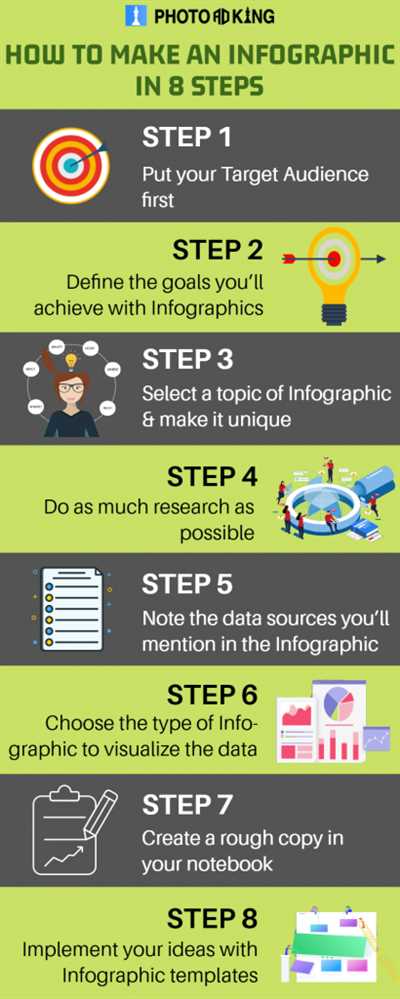
An infographic is a powerful tool that allows you to visually communicate information and present complex data in a simple and engaging way. Whether you need to create a stunning presentation, communicate your strategy, or show off your latest research findings, infographics are a great way to grab your audience’s attention and make your message stick.
Creating an infographic doesn’t have to be difficult or time-consuming. With the right tools and resources, you can easily design an eye-catching and informative infographic that will impress your audience. There are many different tools available, such as PowerPoint, CorelDRAW, and online design templates, that can help you create visually appealing infographics.
When creating an infographic, it’s important to start with a basic layout. Think about the information you want to communicate and how you want to organize it. Consider using shapes, icons, and images to make your infographic visually appealing and easy to understand. Choose colors that are not only visually appealing but also help convey your message effectively. Remember, the design of your infographic should be coherent and consistent throughout.
Not only will a well-designed infographic captivate your audience, but it will also help them understand and remember your message better. Infographics are a great way to break down complex information into bite-sized, easily digestible chunks. By using metaphors, images, and other visual tactics, you can make your data more relatable and engaging for your users.
Infographics are changing the way we communicate in the age of the internet. They are a powerful tool for engaging with your audience and starting conversations on social media platforms like Twitter and Facebook. They also have the potential to go viral and reach a wider audience. In fact, studies have shown that infographics are liked and shared on social media three times more than any other type of content.
So, if you want to make your information rock, don’t hesitate to create an infographic. It’s a fun, creative, and effective way to communicate your message and reach your goals. Start by familiarizing yourself with different infographic templates and design resources that are available for free online. Then, use a tool like PowerPoint or CorelDRAW to create your own stunning infographic. Watch as your audience engages with your infographic and shares it with others, spreading your message far and wide.
- How to Make an Infographic in PowerPoint
- Create the Basic Shapes
- A Great Infographic Is About Communication Not Design
- Examples of great infographics
- How Twitter Users Watch TV by Ipsos
- Changing Customer Conversations by CEB
- The Resilience Dividend by Rockefeller Foundation
- The Age of the Customer by Dun & Bradstreet
- Create Stunning Infographics Online for Free
- Video:
- How to Create an Infographic – Part 1: What Makes a Good Infographic?
How to Make an Infographic in PowerPoint
Creating visually stunning infographics doesn’t have to be difficult or time-consuming. With the right tools and a little creativity, you can easily create a professional infographic in PowerPoint that will grab your audience’s attention.
First, it’s important to have a clear idea of the information you want to convey. Infographics are a great way to show data and statistics in a visually appealing manner, so start by gathering all the relevant information and organizing it in a logical way.
Next, choose a color palette that will complement your data and make it visually engaging. PowerPoint offers a variety of different colors and templates to choose from, so feel free to experiment and find what works best for your infographic.
Once you have your content and colors in place, it’s time to start designing your infographic. PowerPoint has a wide range of tools and resources to help you create stunning visuals. You can use shapes, icons, images, and even different fonts to make your infographic stand out.
When designing your infographic, it’s important to keep in mind the core message you want to convey. Use visuals and metaphors to help illustrate your points and make the information more digestible for your audience.
If you don’t have much experience with graphic design, don’t worry – PowerPoint is a user-friendly tool that makes it easy to create professional-looking infographics. There are also plenty of free templates and online resources available that you can use to get started.
Once you have created your infographic in PowerPoint, it’s important to make sure it looks good on different devices and platforms. Test it on different screen sizes and resolutions to ensure it is easily readable and visually appealing.
Finally, when it comes to sharing your infographic, there are many options available. You can share it on social media platforms such as Twitter and Facebook, or email it to your target audience. You can also use it in your presentations or upload it to your website for others to download and share.
Remember, the key to a successful infographic is to make it visually appealing, easy to read, and packed with valuable information. By following these steps and using PowerPoint as your design tool, you can create stunning infographics that will grab your audience’s attention and effectively communicate your message.
Create the Basic Shapes
When it comes to creating an infographic, one of the first steps is to create the basic shapes that will serve as the foundation for your design. These shapes will help you visually organize your information and make it easier for your audience to understand.
There are several different tools that you can use to create these shapes. Some popular options include CorelDRAW, PowerPoint, and online resources like Canva and Crello. These tools often have pre-made templates and shapes that you can use as a starting point.
Start by thinking about the core message or information that you want to convey in your infographic. Then, consider what shapes would best represent that information. For example, if you want to show different age groups, you could use rectangles of different sizes to represent each age group.
Another important consideration is the color scheme of your infographic. Make sure to choose colors that are visually appealing and help to convey your message effectively. You can also use icons and images to enhance your design and make it more visually interesting.
It’s also a good idea to familiarize yourself with some common infographic shapes, such as bar charts, pie charts, and pentagon diagrams. These shapes are commonly used to present information in a clear and organized manner.
Once you have chosen your shapes and colors, you can start creating your infographic. Use the tools mentioned earlier to draw your shapes and arrange them on the page. Remember to keep your design visually appealing and easy to read.
As you work on your infographic, don’t forget about the power of metaphors and visuals to communicate your message. For example, you can use images of people to represent different customer segments or icons to represent different tactics or strategies.
Infographics are a great way to communicate complex information in a way that is easy to understand. They can be used for a wide range of purposes, from marketing and communication to educational resources and data management.
So, don’t let the daunting task of creating an infographic intimidate you. With a little bit of planning and the right tools, you can create stunning infographics that will engage your audience and help you convey your message effectively.
A Great Infographic Is About Communication Not Design
When it comes to creating an effective infographic, it’s important to remember that the focus should be on communication rather than design. While an aesthetically pleasing design can certainly catch the viewer’s attention, it is the communication of information that is the true purpose of an infographic.
Infographics are a powerful tool for presenting data and information in a visually engaging format. They allow for complex concepts to be simplified and understood by a wider audience. Infographics can be used in presentations, on websites, in email campaigns, and on social media platforms such as Twitter to effectively convey information to users.
One tactic for creating a great infographic is to start with a solid strategy. Think about the core message you want to communicate and the audience you are targeting. Understanding your audience will help you determine the most effective way to structure and present the information.
Next, gather the necessary information and data to support your message. This could include statistics, research findings, or case studies. Be sure to use reliable sources for your information to ensure accuracy.
Once you have your information, it’s time to start creating your infographic. There are many different tools and resources available to help you create stunning infographics. PowerPoint and CorelDRAW are popular options, as they offer a range of templates and shapes that can be easily customized to fit your needs.
When designing your infographic, be mindful of the visuals you use. Choose images and icons that are familiar to your audience and that help illustrate your message. Use colors and shapes to create a visually appealing layout that is easy to follow. Metaphors and visual storytelling can also be effective in conveying complex ideas.
Remember, the goal of your infographic is to communicate information, not to overwhelm your audience with design elements. Keep your text concise and to the point, and use visuals to support and enhance the information you are presenting.
Once your infographic is created, don’t be afraid to put it to work. Share it online through your website, social media channels, or in email campaigns. Consider reaching out to relevant publications or organizations that may be interested in featuring your infographic.
By focusing on communication rather than design, you can create an infographic that effectively conveys your message and engages your audience. So, don’t let the age of Rockefeller or the changing landscape of the internet intimidate you. With the right strategy and the right tools, you can create an infographic that will resonate with your audience and help you achieve your goals.
Examples of great infographics
When it comes to creating infographics, there are many different examples that can inspire you. In design, it’s important to be familiar with the basic shapes and colors that will help visually show the information you’re trying to present.
One stunning example is the infographic created by CEB and Ipsos, which shows the changing age of internet users and how it has impacted communication and online conversations. The use of metaphors and visually appealing images make this infographic stand out.
Another great resource is the Rockefeller Foundation’s infographic on the power of dividends in management strategy. This infographic not only provides valuable information but also utilizes icons and different colors to enhance the presentation.
If you’re looking for free tools to create infographics, then don’t miss out on Dun & Bradstreet’s free templates and tools. They have a wide range of options that can help you create visually appealing infographics.
CorelDRAW is a powerful tool that lets you work with shapes and images to create stunning infographics. With its wide range of features, you can create infographics that will captivate your audience.
Lastly, let’s not forget about the power of social media. Twitter is a great platform to share infographics and start conversations with your audience. Many users on Twitter are more likely to engage with visual content, so creating infographics for this platform can help you reach a wider audience.
These are just a few examples of the many great infographics out there. From the basic shapes and colors to the use of icons and images, infographics have the power to convey information in a visually appealing way. So, take inspiration from these examples and let your creativity and imagination rock your next infographic!
How Twitter Users Watch TV by Ipsos
Twitter is a powerful tool for communication, and it has also changed the way people watch TV. Ipsos, a well-known market research company, conducted a study about how Twitter users engage with television shows.
Visually stunning infographics can help present information in a more engaging way. If you are not familiar with creating infographics, there are many online tools and resources available to help. These tools provide free templates, shapes, icons, and images that you can use to create your own unique infographic.
Creating an infographic is not just about the design, but also about the content. The infographic should tell a story and provide valuable information to the audience. The design should be visually appealing and easy to understand. Using colors, icons, and metaphors can help convey the message effectively.
When creating an infographic, it is important to work with the core message. Start with a clear strategy and focus on the main points that you want to convey. Use text and images that support the message and make sure the information is concise and easy to read.
Infographics created by Ipsos show that Twitter users are highly engaged while watching TV. They have conversations about the show, share their thoughts and opinions, and even participate in live polls. This data provides valuable insights for TV networks and advertisers.
An effective infographic will grab the attention of the audience and keep them engaged. It can be used for presentations, social media posts, or as a stand-alone piece of content. It is a great tool for communication and can help convey complex information in a simple and visually appealing way.
So, if you want to rock your next presentation or impress your audience with stunning visuals, consider creating an infographic. With the right tools and resources, you can create an eye-catching infographic that will leave a lasting impression.
Changing Customer Conversations by CEB

In the age of the internet and online communication, customer conversations are changing rapidly. As more and more users are turning to digital platforms for information and engagement, it has become crucial for businesses to adapt their communication strategies accordingly.
CEB, in partnership with Ipsos and the Rockefeller Foundation, has conducted extensive research on the changing dynamics of customer conversations in the digital age. The findings highlight the need for businesses to rethink their management tactics and implement new strategies to engage with customers effectively.
One great tool that businesses can use to make their communication more visually appealing and engaging is the infographic. Infographics are a combination of text, images, and shapes that are designed to present information in a visually appealing and easy-to-understand way.
Creating infographics is not as complex as it may seem. There are several online tools, such as Canva and CorelDRAW, that offer basic templates and icons to help you get started. These tools also provide a range of colors and shapes to choose from, allowing you to create stunning visuals that will capture your audience’s attention.
When creating an infographic, it is important to have a clear strategy in mind. Think about the core message you want to convey and the key points you want to highlight. This will help you structure your infographic effectively and ensure that it delivers the intended message.
Not only do infographics help businesses present complex information in a simple and visually appealing way; they also play a crucial role in changing customer conversations. By using metaphors, visuals, and easy-to-understand language, businesses can engage customers in a more meaningful and impactful way.
Infographics can be used in a variety of contexts, from presentations to social media posts. They can be shared on platforms like Twitter, Facebook, and LinkedIn, helping businesses reach a larger audience and generate more interest in their products or services.
Furthermore, infographics can be a valuable resource to have on hand when communicating with customers via email or other forms of digital communication. Instead of sending a long, text-heavy email, businesses can use infographics to convey information in a more concise and visually appealing manner.
Infographics are not just a trendy design tool; they are a powerful way to change the dynamics of customer conversations. They allow businesses to communicate their message more effectively and engage customers on a deeper level.
So, if you want to change the way you communicate with your customers, consider incorporating infographics into your communication strategy. They have the potential to transform your customer conversations and help your business thrive in the digital age.
The Resilience Dividend by Rockefeller Foundation
The Resilience Dividend is a free online resource created by the Rockefeller Foundation that aims to help users understand and navigate the changing age of resilience. This resource provides tactics and tools for creating visually stunning infographics that can be used for presentations, communication materials, and online content.
One of the core tools recommended by The Resilience Dividend is PowerPoint, a widely used tool for creating presentations. PowerPoint lets users work with text, images, shapes, icons, and colors to create visually appealing infographics.
In addition to PowerPoint, other tools such as CorelDRAW and Canva can also be used to create infographics. These tools offer a wide range of resources, including pre-made templates, icons, shapes, and images that can be easily customized to make engaging infographics.
When creating infographics, it is important to consider the strategy and design of the content. The Resilience Dividend suggests using metaphors, icons, and familiar visuals to engage users and make the information more memorable.
Examples of great infographics can be found on websites such as CEB, Ipsos, and Dun & Bradstreet. These resources provide inspiration and ideas for creating visually appealing infographics that effectively communicate information.
Using infographics in communication and online content can also help to spark conversations and create customer engagement. Infographics are a powerful tool for presenting complex information in a visually appealing and easy-to-understand format.
In today’s age of changing communication, infographics are a valuable tool to have in your arsenal. They can be shared on social media platforms such as Twitter and email newsletters, as well as displayed on websites and TV screens.
By following the tips and recommendations provided by The Resilience Dividend, you can create visually stunning infographics that will captivate your audience and effectively convey your message.
Watch the Resilience Dividend video on the Rockefeller Foundation’s website to learn more about how to create impactful infographics and harness the power of visual communication.
The Age of the Customer by Dun & Bradstreet
To create stunning infographics, it is important to use the right tools and resources. One such tool is CorelDRAW, a powerful design software that allows you to create visually appealing graphics. Another useful tool is PowerPoint, which is commonly used for presentations but can also be used to create infographics. PowerPoint offers a wide variety of templates and shapes that can be customized to fit your needs.
The internet provides a wealth of resources for creating infographics. There are many websites that offer free templates, icons, and images that you can use. For example, the Rockefeller Foundation offers a free infographic tool called CEB (Creating Effective Business) that allows users to create visually appealing graphics with ease. Additionally, there are websites like Canva and Piktochart that offer a range of templates and design elements to help you create stunning infographics.
When creating infographics, it is important to keep in mind the age of the customer. With the internet and social media, customers have more power than ever before. They can easily access information, compare prices, and make informed decisions. Therefore, it is important to create infographics that not only convey information effectively but also engage the customer. This can be done by using relevant and relatable examples, metaphors, and conversations.
Another important aspect of creating infographics is choosing the right colors and shapes. Different colors evoke different emotions and can help convey the message more effectively. Shapes, such as the rectangle or the Pentagon, can also be used to create visual interest and reinforce the message.
Infographics should also be easy to understand and navigate. Using basic design principles, such as clear headings and bullet points, will help users quickly grasp the main points. Including icons and images can also help break up text and make the infographic more visually appealing.
One great example of an infographic that effectively communicates the age of the customer is “The Age of the Customer” by Dun & Bradstreet. This infographic presents data from Ipsos, a market research company, about how the internet has changed customer behavior. It shows that customer expectations have risen and that businesses need to adapt their strategies to meet these new demands. The infographic uses a combination of text, images, and graphs to convey this message.
In conclusion, creating infographics is a powerful communication tool in today’s age of the customer. By using the right tools, resources, and design tactics, you can create visually appealing and engaging infographics that effectively convey your message. Whether it’s for email marketing, social media, or presentations, infographics are a great way to grab attention and make an impact.
 | For more information about “The Age of the Customer,” please visit the Rockefeller Foundation website. |
Create Stunning Infographics Online for Free
Infographics are a highly effective tool for visually presenting information in a way that is easy to understand, engaging, and shareable. With the increasing popularity of social media platforms like Twitter and Instagram, infographics have become an essential part of online communication. They allow users to quickly consume information and share it with their networks, making them a valuable resource for marketers, educators, and anyone looking to convey information in a compelling way.
Creating infographics used to be a complex and time-consuming task that required design skills and specialized software like Adobe Photoshop or CorelDRAW. Fortunately, there are now free online tools available that make it easy for anyone to create stunning infographics without any design experience.
One such tool is Ipsos, which offers a user-friendly interface where you can create your own infographics in just a few simple steps. The platform provides a wide range of templates, icons, shapes, and text options, so you can customize your infographic to suit your needs. Whether you want to create a basic infographic or a complex one with multiple layers and images, Ipsos has the tools to help you bring your vision to life.
Before you start creating your infographic, it’s important to have a clear strategy and message in mind. Think about the purpose of your infographic and what you want to communicate to your audience. Are you trying to explain a complex concept, present data, or tell a story? Knowing your objective will help you choose the right design elements and create a cohesive and visually appealing infographic.
| Step | Description |
|---|---|
| 1 | Start by selecting a template that fits your topic or industry. Ipsos offers a variety of pre-designed templates to choose from, so you don’t have to start from scratch. |
| 2 | Add your content. This includes text, images, and icons. Ipsos allows you to upload your own images or choose from their extensive library of free visual resources. |
| 3 | Customize the design. Change the colors, fonts, and shapes to match your brand or personal style. Drag and drop elements to rearrange them and create a visually pleasing layout. |
| 4 | Review and refine your infographic. Make sure all the information is accurate and well-presented. Check for spelling errors and ensure that the design is visually appealing and easy to understand. |
| 5 | Save and share your infographic. Ipsos allows you to export your infographic as a high-resolution image or PDF. You can then share it on social media, email it to your audience, or embed it on your website or blog. |
Creating stunning infographics online for free has never been easier. With tools like Ipsos, you can create eye-catching visuals that will captivate your audience and make your information stand out. So don’t let the lack of design skills or resources hold you back. Start creating your own infographics today and watch your communication and engagement levels soar!