Are you looking to create a navbar for your website? In this tutorial, we will guide you through the process of making a simple and stylish navbar. Whether you are a beginner or have some experience with HTML and CSS, this step-by-step guide will help you create a fully functional navigation bar.
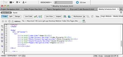
First, let’s start by creating the basic structure of our navbar. You will need a
- element to hold the list items, and each list item will be an individual menu item. For example, if you want to have three menu items, you should have three
- Creating a simple navigation bar
- Navbar settings
- Hide/Show Mobile Menu
- Navbar animation
- Collapse navbar
- Adding new elements
- Step 2 – Style the Navigation Bar
- Navigation menu styles
- 1. Basic style – Desktop version
- 2. Dropdown menu style
- 3. Full-height menu style
- 4. Sidebar menu style
- Dropdown Menu Styles
- Right menu styles
- Fixed Navbar
- Vertical Navigation Bar
- Example
- Full-height fixed Vertical Navbar
- Video:
- How to make a responsive navbar with tailwind css | tailwind css tutorial
- ) representing a menu item. For example:
Next, you can style the navigation bar using CSS. You can set the width, height, background color, and other properties to make it look like a navigation bar. For example:
.navbar {
background-color: #333;
height: 50px;
}
.menu-bar li {
display: inline-block;
margin-right: 10px;
}
.menu-bar li:last-child {
margin-right: 0;
}
In the above example, the navigation bar has a black background color (#333) and a height of 50 pixels. The menu items are displayed horizontally with a margin of 10 pixels between them. The last menu item does not have a right margin to avoid spacing issues.
To make the navigation bar responsive, you can add a hamburger icon to collapse the menu on smaller screens. This can be achieved using CSS and JavaScript. Here is an example:
In the above example, we have added a checkbox input and a label with a class of “menu-icon”. When the label is clicked, it toggles the visibility of the menu using the CSS “:checked” selector. The dropdown menu is created using the nested
- and
- elements, with the class “dropdown” added to the parent menu item. The child menu items are hidden by default and are shown when the parent menu item is hovered over or clicked.
By following the above steps, you can create a simple navigation bar for your website. You can further style and customize the navigation bar according to your needs. Adding images, icons, and animations can enhance the user experience and make the navigation bar more visually appealing.
Navbar settings
In this section of the tutorial, we will learn about the different settings that can be adjusted for a navbar. These settings allow you to customize the appearance and behavior of your navbar to fit the specific needs of your website.
There are several settings that you can use to modify your navbar:
- Menu width: You can change the width of the menu bar by setting the
max-widthproperty of the menu bar element. This will determine how wide the menu bar should be on different screen sizes. - Menu height: You can adjust the height of the menu bar by modifying the
heightproperty of the menu bar element. This will determine how tall the menu bar should be. - Menu visibility: You can toggle the visibility of the menu bar using the
visibilityproperty. Setting it tovisiblewill make the menu bar visible, while setting it tohiddenwill hide it. - Menu positioning: You can control the positioning of the menu bar by using CSS selectors. For example, you can use the
:nth-child(1)selector to target the first child element of the menu bar and adjust its styles. - Menu styling: You can apply various styles to the menu bar, such as changing the background color, font style, or adding borders. These styles can be applied using CSS selectors and properties.
- Menu collapse: You can create a collapsible menu bar that expands or collapses when clicked. This can be achieved by using JavaScript to add an event listener to the menu bar element and toggling the visibility of the menu content.
- Dropdown menus: You can add dropdown menus to your navbar by creating a nested structure of list items and using CSS to style them. This allows you to create a menu with submenus that expand when hovered or clicked.
- Mobile version: You can create a mobile-friendly version of your navbar by applying responsive styles that adjust the appearance and behavior of the menu bar for smaller screens.
These are just some of the settings that can be adjusted for a navbar. Depending on your specific needs, you can use these settings or others to create a navbar that suits your website’s design and functionality.
Hide/Show Mobile Menu
When adding a dropdown menu to your navbar for mobile navigation, you may want to hide the dropdown when the screen size is larger than a certain breakpoint. This can help in decluttering the navigation bar and providing a better user experience.
First, let’s take a look at the basic structure of the navbar. The navbar will typically have a container (usually a
divelement) with two main sections: the left container and the right container. The left container contains the logo or brand name, while the right container holds the navigation items.In this example, we’ll be working with a basic navbar that includes a dropdown menu. Here’s the HTML structure:
In order to hide the dropdown menu on larger screens, we can use CSS media queries and the
displayproperty. By default, we’ll set the dropdown menu to be hidden usingdisplay: none;. Then, using a media query, we’ll define styles for screens with a maximum width that should display the dropdown menu.In the above code, we’re using a media query with a max-width of 768px. This means that the styles inside the media query will only be applied to screens with a maximum width of 768 pixels. We’re targeting the
.dropdown-menuclass, which is the dropdown menu element that we want to hide.Next, we’ll need to add JavaScript code to handle the opening and closing of the dropdown menu when the user clicks on the dropdown link.
In the above code, we’re adding an event listener to the dropdown link element. When the link is clicked, we check the current value of the dropdown menu’s
displayproperty. If it’s set tonone, we change it toblock, making it visible. If it’s set toblock, we change it tonone, hiding it. This creates a toggle effect for the dropdown menu.Now, when you test your navbar on a mobile device or resize your browser window to a smaller size, you should see the dropdown menu hidden by default. When you click on the dropdown link, the dropdown menu should slide open, and clicking on it again will slide it closed.
Navbar animation
In this tutorial, we will learn how to create a simple navbar with animation effects. The navbar is an essential part of any website as it provides easy navigation between different sections.
To start with, let’s create the basic structure of the navbar. We will use an unordered list (
- ) with list items (
- ) to represent each menu item. For example:
Next, we can style the navbar using CSS. We can start by giving the navbar a fixed height and a background color. We can also add some padding and change the font color to make it more visible. Here is an example:
nav {
background-color: #f1f1f1;
height: 50px;
padding: 10px;
}
nav ul {
list-style-type: none;
margin: 0;
padding: 0;
display: flex;
justify-content: space-between;
}
nav ul li {
display: inline;
}
nav ul li a {
text-decoration: none;
color: #333;
padding: 10px;
}
Now, let’s add an animation effect to the navbar. We can do this by adding the
transitionproperty to thenavelement. We can specify the duration and the property that should change during the animation. In this example, we will make the navbar slide in from the right. Here is the updated CSS code:nav { background-color: #f1f1f1; height: 50px; padding: 10px; transition: max-width 0.5s ease-in-out; max-width: 200px; } nav:hover { max-width: none; }Finally, we can add a dropdown menu to the navbar. This can be done by adding another nested
ulelement inside alielement. The dropdown items can be hidden by default using thedisplay: noneproperty. When the user hovers over the parentliitem, the dropdown menu should open and the items should become visible. Here is an example:nav ul li ul { display: none; position: absolute; background-color: #f1f1f1; min-width: 150px; } nav ul li:hover ul { display: block; } nav ul li ul li { display: block; } nav ul li ul li a { padding: 10px; color: #333; text-decoration: none; }This is a basic example of how you can create a navbar with animation effects in HTML and CSS. You can modify the styles and animation properties to fit your specific needs. Have fun!
Collapse navbar
If you have a long menu that takes up too much space on your navbar, you can add a collapse feature to hide and show the menu. This is especially useful for mobile screens where space is limited.
To create a collapse navbar, you need to add a few different elements and styling. Here’s an example:
– Create a section to contain your navbar elements. This can be a
- Menu width: You can change the width of the menu bar by setting the
- elements, with the class “dropdown” added to the parent menu item. The child menu items are hidden by default and are shown when the parent menu item is hovered over or clicked.
elements. To style the navbar, we can use CSS selectors to target specific elements and apply different styles to them. Next, let’s add some more style to the navbar. You can customize the height, width, background color, font size, and other settings to make the navbar look exactly how you want it. For example, you can use the max-width property to limit the width of the menu bar, or you can set the height to make it full-height on desktop screens.
If you want to add a dropdown menu to your navbar, you can use the
- and
elements to create a nested structure. The menu item that will have a dropdown should have a class or ID assigned to it, and the dropdown menu should be placed inside a
element with a class or ID. You can then use CSS selectors to target the dropdown menu and show/hide it when the user clicks on the dropdown link. Lastly, let’s make the navbar responsive. This means that the navbar should adjust its layout and styling based on the screen size. For example, on mobile screens, the navbar can be collapsed and hidden behind a hamburger menu icon, while on larger screens, it can be fully visible and span across the entire width of the page. You can achieve this by using media queries and CSS animations to change the style and layout of the navbar.
Creating a simple navigation bar
To create a simple navigation bar for your website, you can use a combination of HTML and CSS. In this tutorial, we will show you how to create a basic navigation bar that can be used for both desktop and mobile screens.
First, you should start by adding the HTML structure for your navigation bar. The navigation bar can be created using an unordered list (
- ) with each list item (

