Prototyping is an essential part of the design process, allowing you to test and refine your ideas before diving into production. But what if you’re not a designer or don’t have the time to learn complex graphical software? That’s where paper prototypes come in. They are easy to make, time-consuming and cheap, yet highly effective at getting feedback from users. In this article, we’ll show you how to make a paper prototype and why it’s a valuable tool in the early stages of design.
So, what exactly is a paper prototype? It’s a low-fidelity representation of your system or interface that allows you to test out interactions and gather feedback from users. Unlike wireframes or mock-ups, paper prototypes don’t have any graphical elements. They are simply sketches of the screens or pages of your interface, with clickable areas to simulate interactivity. This makes them quick and easy to create, while still providing a true test of how your users will interact with your content.
One major advantage of paper prototypes is their low fidelity, which means that they don’t look or feel like a real product. This can actually be a good thing, as it encourages users to focus on the functionality rather than the visual design. By removing the distraction of high-quality graphics, you can learn more about what works and what doesn’t in your interface.
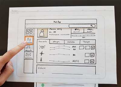
Creating a paper prototype is a straightforward process. All you need is some paper, a pen, and a few hours of your time. Start by sketching out the screens or pages of your interface, paying attention to the layout and content placement. You don’t need to worry about getting every detail perfect – the goal is to get a rough representation of your interface that can be easily understood by others.
Once your sketches are done, it’s time to add interactivity to your prototype. This can be done by using clickable elements such as buttons or links, which you can either draw directly on your sketches or cut out from separate pieces of paper. By simulating the interactions that users will have with your interface, you can test how intuitive and user-friendly it is.
Now that your paper prototype is ready, it’s time to put it to the test. Find a willing person to act as a user and ask them to perform certain tasks or scenarios using your prototype. Observe their actions and gather feedback on what works well and what could be improved. This hands-on approach to testing allows you to quickly iterate and refine your design based on real user input.
- Learn Sketch: build a clickable prototype and test it on your mobile
- Paper prototyping
- Paper prototype vs wireframe
- Interactive Paper Prototypes
- Advantage: Getting to the next stage of fidelity
- Disadvantage: Time-consuming production in case of complex interactions
- How to Make a Mobile Paper Prototype
- Sources
Learn Sketch: build a clickable prototype and test it on your mobile

Unlike a paper prototype, a Sketch prototype is interactive. Users can click on elements on the page and see how they would behave in a real system. This fidelity makes it a great tool for getting feedback from customers before moving on to the production stage.
To build a Sketch prototype, you start by creating wireframes of your interfaces. This helps you define the layout and content of each screen. Then, you design the graphical elements and add interactions using Sketch’s built-in tools.
One disadvantage of Sketch prototyping is that it can be time-consuming. Building interactive prototypes takes more time than creating static wireframes or simple mock-ups. However, the end result is worth the effort, as it allows users to test your design in a more realistic way.
When your prototype is ready, you can test it on your mobile device. Sketch allows you to export your prototype as a clickable file that can be opened on a mobile device. This way, you can see how the interactions feel on a real device and test the usability of your design.
Learning Sketch and prototyping with it can help you create high-quality interfaces and improve the overall user experience of your product. So, if you’re wondering how to make a paper prototype, consider using Sketch and take advantage of its interactivity and usability testing features.
Paper prototyping
Paper prototyping is a method used in the design process to create a real, tangible representation of a digital interface. When building a website or mobile app, it’s important to test ideas and gather user feedback early on. Creating paper prototypes allows you to quickly and easily show users what the final product will look and feel like, without the time-consuming process of coding.
By using paper and sketches, you can simulate interactions and test the usability of your design. It doesn’t require any graphical elements or complex content – just simple drawings and basic shapes. This low-fidelity approach forces you to focus on the core elements of your design and helps you learn how users will interact with it.
One advantage of paper prototypes is that they are easy and quick to make. You can build a basic paper prototype in just a few hours, allowing you to test your ideas and make improvements before moving into the production phase. This can save you time and resources in the long run.
Another advantage is that paper prototypes offer a higher level of interactivity compared to wireframes or mock-ups. With paper prototypes, you can create clickable elements and simulate different interactions, allowing users to test and provide feedback on the functionality of your interface.
However, paper prototyping also has its disadvantages. One disadvantage is the lack of visual fidelity. Since paper prototypes are hand-drawn sketches, they may not accurately represent the final look and feel of the product. This can sometimes lead to miscommunication between designers and customers.
In complex projects where the graphical quality of the interface is important, paper prototyping may not be the best choice. In such cases, using digital tools and high-fidelity mock-ups might be more suitable.
Overall, paper prototyping is a valuable method to test and iterate your design ideas. It allows you to involve users early in the design process, gather feedback, and make improvements. Whether you use paper prototypes as a standalone testing method or as part of a larger prototyping system, they can help you save time and resources while creating a user-friendly interface.
Paper prototype vs wireframe
When it comes to prototyping interfaces, there are two popular methods: paper prototypes and wireframes. While both are effective tools for testing and improving usability, they have their own advantages and disadvantages.
A paper prototype is a low-fidelity mock-up of a system. It is designed to be quick and easy to create, typically using pen and paper or sketches. Paper prototypes are often used in the early stages of the design process to explore ideas and test concepts. They allow designers to get feedback from users on the overall layout, flow, and interactions of a system, without spending hours building a complex interactive prototype.
One of the main advantages of paper prototypes is their low cost and quick turnaround time. It doesn’t require any technical skills or production tools, which means anyone can make them. This makes it an accessible method for designers who want to test their ideas and get feedback from users early on in the design process.
However, the low fidelity of paper prototypes also has its limitations. As they are just sketches or simple drawings, paper prototypes don’t show the true graphical elements or interactivity of a system. They can’t be tested on real devices, and users can’t actually click on anything. This makes it difficult to test complex interactions or to test how customers will actually use the system in a real-world setting.
On the other hand, wireframes are a more high-fidelity and interactive type of prototype. They are often created using software tools like Adobe XD or Sketch, and they aim to show more realistic representations of the final design. Wireframes can include clickable elements and interactive features, allowing users to navigate through screens and test the system’s functionality.
The advantage of using wireframes is that they provide a clearer picture of what the final product will look like and how it will work. With wireframes, designers can test the usability of a system, check the flow of information, and assess the quality of the content. Wireframes also allow for more detailed and complex interactions to be tested, which can be particularly useful in the case of mobile interfaces or complex systems.
However, wireframes also have their disadvantages. Creating wireframes can be more time-consuming and requires technical skills and software knowledge. They may not be as accessible for designers who are not familiar with design tools. Additionally, since wireframes are more realistic than paper prototypes, they may give users a higher expectation of the final product, which can influence their feedback.
In summary, paper prototypes are a quick and easy way to get feedback on early design concepts, while wireframes offer a more realistic representation of the final product and allow for more detailed testing of interactions. The choice between paper prototypes and wireframes depends on the stage of the design process, the complexity of the system, and the time and resources available. Ultimately, both methods can help designers learn more about their users and create better interfaces.
Interactive Paper Prototypes
In the early stages of designing digital interfaces, paper prototypes are a popular tool among designers. These prototypes are essentially hand-drawn sketches of screens and interactions on a piece of paper or a sketchbook. They are easy to create, require minimal effort, and can quickly show the overall flow and structure of a system.
However, the main disadvantage of paper prototypes is their lack of interactivity. Because they are static and not clickable, they cannot simulate the actual interactions that users will have with the system. This makes it difficult to test how the interface will feel and behave in a real-life scenario.
To overcome this problem, designers have come up with the concept of interactive paper prototypes. Instead of using static sketches, interactive paper prototypes incorporate elements of interactivity into the design. This can be achieved by adding clickable areas to the paper, using adhesive notes to simulate pop-up windows, or creating foldable paper screens for mobile interfaces.
By adding interactivity to paper prototypes, designers can test the usability of their designs more effectively. Users can interact with the prototypes by clicking on the clickable areas or folding different parts of the paper to reveal new screens. This allows designers to gather feedback on the interface’s usability and make necessary improvements before moving on to the next stage of production.
Creating interactive paper prototypes does require more time and effort compared to traditional paper prototyping. Designers need to carefully plan and design the interactive elements, ensuring that they accurately represent the desired interactions and content. However, the advantages of interactive paper prototypes outweigh the extra time and effort needed.
Interactive paper prototypes bridge the gap between low-fidelity paper sketches and high-fidelity digital prototypes. They allow designers to test the overall flow of the interface and gather feedback on the usability of the system without spending hours building complex graphical mock-ups. This saves time and money in the long run by helping identify any issues early on in the design process.
So, if you’re in a situation where you want to test the interactions and usability of your interface but don’t have access to a digital prototyping tool, interactive paper prototypes can be a great alternative. They provide a tangible and tactile experience for both designers and users, allowing for quick iterations and improvements before moving on to the next stage of production.
Источники:
– https://www.nngroup.com/articles/paper-prototype-testing/
– https://uxdesign.cc/the-value-of-interactive-paper-prototypes-7635c7019b27
– https://blog.experientia.com/how-to-make-interactive-paper-prototypes/
Advantage: Getting to the next stage of fidelity
When it comes to prototyping, there are different stages of fidelity that you can aim for. In the initial stages, you might start with simple sketches or wireframes to get an idea of your system’s layout and content. However, these low-fidelity prototypes don’t show the true interactions and graphical interfaces of the final product.
That’s where paper prototypes come in. With paper prototyping, you can build interactive and clickable prototypes that allow users to test and experience the system in a more realistic way. This next stage of fidelity helps you get closer to what the final product will look and feel like, making it easier to learn from users’ interactions and feedback.
One advantage of getting to the next stage of fidelity is that it helps you work more efficiently. By using paper prototypes, you can quickly design, test, and iterate on screens and interactions. It doesn’t require complex software or hours of production time to make changes – simply sketch, test, and learn.
Another advantage of using paper prototypes is that it helps you show your work to others. When you’re working on a mobile app or website, it’s not always easy to communicate your ideas and designs to stakeholders or customers. Paper prototypes make it easier to share your vision, as they provide a tangible representation of your ideas that others can easily understand and provide feedback on.
Furthermore, paper prototyping can be a time-consuming process, but it also has its advantages. Unlike digital mock-ups or high-fidelity prototypes, paper prototyping allows you to quickly create and test ideas without investing too much time or resources. It’s a cost-effective way to get feedback and make improvements early on in the design process.
In conclusion, getting to the next stage of fidelity with paper prototypes has several advantages. It helps you create more interactive and realistic prototypes, allowing users to test and provide feedback on your designs. It also helps you work more efficiently and effectively, as you can quickly iterate on screens and interactions. So, if you’re looking to build high-quality prototypes that bridge the gap between sketches and production-ready systems, paper prototyping can be a valuable tool to have in your design process.
Disadvantage: Time-consuming production in case of complex interactions
One of the main disadvantages of paper prototyping is that it can be time-consuming to create prototypes with complex interactions. When designing interactive interfaces, it’s important to show users how the system will work and how they can interact with it. However, when using paper prototypes, you can only sketch out the screens and elements, but you cannot make them clickable or test the interactivity.
This disadvantage becomes apparent when you have a system or mobile app with a high level of interactivity. Users might not be able to fully understand or appreciate the true content and functionality of the system from low-fidelity paper sketches. They need to see and test the interactive elements to get a feel for how the real system will work.
In the case of complex interactions, it might take hours or even days to design and build the paper prototype. This is because you have to sketch out each screen and every possible interaction that the user can perform. Additionally, testing and iterating on the prototypes can also be time-consuming.
Another challenge is that paper prototypes don’t provide the graphical quality and fidelity that customers may expect. The lack of graphical elements and realistic mock-ups can make it difficult for users to visualize the final product. This can lead to misunderstandings or misaligned expectations between the designers and the users.
Despite this disadvantage, paper prototyping still has its advantages. It allows designers to quickly sketch out ideas, gather feedback, and make iterations before investing time and resources into high-fidelity digital prototypes. It’s a valuable tool in the early stages of the design process where the focus is on learning, testing, and refining the user experience.
So, if you’re using paper prototyping, it’s important to consider the complexity of the interactions and the level of fidelity needed for your specific project. If the interactions are simple and can be easily understood through sketches, then paper prototyping can be a quick and effective method. However, for more complex interactions, consider using other prototyping methods that provide higher fidelity and interactivity.
In conclusion, while paper prototyping is a useful and accessible way to create prototypes, it may not be the best choice for projects with complex interactions. Understanding the limitations of paper prototypes will help you make better decisions about when and how to use them in your design process.
How to Make a Mobile Paper Prototype
When it comes to testing out a mobile app or website, creating a paper prototype can be a great way to get valuable feedback from users without investing too much time or effort into development. In this article, we’ll show you how to make a mobile paper prototype and the advantages it brings.
One of the main advantages of creating a paper prototype is how easy and quick it is to make changes. If users don’t like certain elements or interactions, you can simply modify or swap them out with new ones. This allows you to iterate and improve the prototype in real time, getting closer to a design that users will love.
Another advantage of using a paper prototype is that it doesn’t require any graphical design or coding skills. You can simply sketch the screens and interactions using pen and paper, focusing on the content and layout rather than visual quality. This helps you to concentrate on the core aspects of your mobile app or website, such as the user flow and the information architecture.
Creating a mobile paper prototype is also a great way to test the usability and overall feel of your app or website. By making the prototype interactive, users can click on elements and navigate through the different screens, giving you valuable feedback on how they expect the actual product to behave. This allows you to identify any potential issues or confusing interfaces early on in the design process.
So, how do you make a mobile paper prototype? First, start by sketching out the different screens of your app or website on separate sheets of paper. Make sure to define the interactions and include any clickable elements. Next, create a storyboard or a set of instructions that guide the user through the different screens and interactions.
Once you have all the necessary sketches and instructions, you can start testing your paper prototype with real users. Sit down with a person who is representative of your target audience and explain to them how the prototype works. Then, ask them to complete certain tasks using the prototype and observe their reactions and feedback. This will help you to identify any usability issues and refine your design.
It’s important to keep in mind that creating paper prototypes can be a time-consuming process, especially if your app or website has complex interactions or multiple screens. However, the benefits of prototyping far outweigh the time and effort invested at this stage. By getting feedback and refining your design early on, you can save valuable time and resources in the later stages of production.
In conclusion, making a mobile paper prototype is a great way to test the usability and overall feel of your app or website before diving into production. It’s a cost-effective and efficient way to gather feedback from users and refine your design. So, if you’re looking to learn more about your customers and improve your product, give paper prototyping a try!
Sources
When it comes to paper prototyping, there are various sources you can turn to for guidance, inspiration, and learning. Here are some key sources that can help you in your prototyping journey.
- Books: There are plenty of books available that offer insights into the world of prototyping. Some recommended titles include “The Art of Paper Prototyping” by Carolyn Snyder and “Paper Prototyping: The Fast and Easy Way to Design and Refine User Interfaces” by Carolyn Snyder.
- Online tutorials: The internet is filled with helpful tutorials on how to make paper prototypes. Websites like Smashing Magazine, UX Mastery, and Nielsen Norman Group provide step-by-step guides that can assist you in creating effective paper prototypes.
- Online communities: Joining online communities such as UX Stack Exchange or UX Design Forum can connect you with experienced designers who can offer advice, share best practices, and answer your questions about paper prototyping.
- Workshops and courses: Attend workshops or take online courses that focus on prototyping. Platforms like Udemy, Coursera, and Lynda.com offer comprehensive courses on prototyping that can teach you the necessary skills and techniques.
- Templates and resources: There are numerous downloadable templates and resources available that can help you get started with paper prototyping. Websites like UI8, Mockplus, and Sketch App Sources offer a wide range of templates and resources for prototyping.
These sources provide valuable insights, tips, and resources to help you enhance your paper prototyping skills. By learning from experts and leveraging available materials, you can improve the quality and effectiveness of your prototypes.
