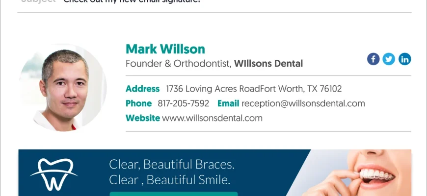
If you want to boost the impression of your emails and effectively showcase your product or service, then creating email banners should be a key part of your marketing plan. Email banners are a great way to catch the attention of your audience and build a professional and visually appealing email campaign that grabs the reader’s attention right from the header.
But what should you keep in mind when designing email banners? Here are 7 simple and valuable tips to follow.
- Know your audience: Before you start designing your email banner, it’s important to understand who your target audience is. This will help you decide what type of banner will best resonate with them and grab their attention.
- Use high-quality images: The quality of the images you use in your email banners is crucial. Make sure to use good quality images that effectively showcase your product or service. If you don’t have your own images, there are free stock image sources you can access without losing much of your valuable time.
- Keep it simple: Email banners should be clean and uncluttered. Try to avoid using too many graphics or objects, as this can overwhelm the reader. Stick to a single main message and focus on effectively delivering that message.
- Choose the right banner maker: There are many email banner makers available, but not all of them provide the same features or quality. Do some research and choose a banner maker that is easy to use, has a good review, and offers the features you need.
- Consider mobile devices: With a large portion of the audience accessing emails on their mobile devices, it’s important to create email banners that are responsive and look good on all screen sizes. Make sure to test your email banners on different devices before sending them out.
- Use a professional template: If you don’t have graphic design skills, using a professional email banner template can be a time-efficient and effective solution. Many banner makers offer pre-designed templates that you can customize to fit your needs.
- Collaborate and review: Before finalizing your email banner, consider collaborating with your team or getting feedback from others. This can help you catch any mistakes or improve the overall design before sending it out to your customers.
By following these simple tips, you can create email banners that not only grab attention but also effectively communicate your message to your audience. So, get started with an email banner maker, unleash your creativity, and watch your email campaign drive more traffic and generate better results!
- 4 tips to create an efficient email banner
- 1. Keep it simple
- 2. Use high-quality graphics
- 3. Make it mobile-friendly
- 4. Include a call to action
- Your email newsletter header is the first thing your audience will see – Make it awesome
- 7 Best Practices For Designing Email Headers With Examples
- Macro Code
- Sources
4 tips to create an efficient email banner

When it comes to designing emails, a great banner can make all the difference. Your email banner is the first thing your audience will see, so it’s important to make a good impression. Here are 4 tips to help you create an efficient email banner:
1. Keep it simpleWhen designing your email banner, it’s best to keep it simple. A banner that is too long or crowded with graphics can be overwhelming and may not grab the reader’s attention. Focus on showcasing the value your product or newsletter offers and use a design that is both creative and easy to understand. |
2. Use high-quality graphicsGraphics can add a lot of visual appeal to your email banner, but make sure to choose high-quality images. Avoid using stock photos that look generic and instead opt for unique graphics that align with your brand. This will help your banner stand out and give a more professional impression. |
3. Make it mobile-friendly
In today’s world, people are accessing their emails from a variety of devices, so it’s important to ensure that your email banner looks good on both desktop and mobile. Use responsive design practices and test your banner on different devices to make sure it displays correctly. |
4. Include a call to actionDon’t forget to include a call to action in your email banner. Whether it’s to click a link, sign up for a free trial, or take advantage of a special offer, a clear and compelling call to action will help drive customer engagement. Use action-oriented language and make it easy for the reader to take the desired action. |
By following these tips, you’ll be able to create an efficient email banner that grabs attention, builds interest, and drives action. Remember to review your email banner before sending it out to ensure that it looks good and aligns with your brand. With a little creativity and attention to detail, you can create awesome email banners that support your marketing efforts.
Your email newsletter header is the first thing your audience will see – Make it awesome
When it comes to designing an email banner, you want to create something that will immediately grab your readers’ attention. Your header is the perfect opportunity to make a great first impression and showcase the value your email has to offer. By following a few best practices and using the right tools, you can effectively boost your click-through rate and give your email traffic a great first impression.
One approach to designing your email banner is to use your own images. By uploading an image from your own collection, you can create a unique and personalized header that reflects your brand. This will also give you more control over the look and feel of your email, making it stand out from the crowd.
If you don’t have any images of your own, there are plenty of sources where you can find stock photos that will work well for your header. Websites such as Pixabay and Unsplash offer thousands of high-quality, royalty-free images that you can use without losing the rights to your email.
For those who are more artistically inclined, graphic design tools such as Canva and PicMonkey give you access to advanced editing features and templates that can help you create a beautiful and eye-catching email banner.
When designing your header, it’s important to consider the limitations of different devices and email clients. Make sure your banner is responsive and looks great on both desktop and mobile devices. You can do this by using media queries or taking an approach that relies on a single, long image that will scale down gracefully on smaller screens.
Another option is to collaborate with a graphic designer who can create a custom email banner for you. Platforms like Fiverr and Upwork offer a wide range of talented designers who can bring your vision to life.
Before finalizing your design, it’s a good idea to review examples of email banners that have been successful in the past. This will give you inspiration and help you understand what works and what doesn’t. Take note of any macro or anchor links that might be beneficial to include in your header as they can direct readers to specific sections of your email.
Lastly, make sure to consider the storage and loading time of your email banner. Using large images can slow down the loading speed of your email, which can have a negative impact on your readers’ experience. Compress your images and aim for a file size that is optimized for both quality and performance.
In conclusion, by giving your email newsletter header the attention it deserves, you can create an awesome first impression that will engage your audience and drive more traffic to your email. Whether you choose to use your own pictures, stock photos, or collaborate with a designer, the key is to make sure your header is visually appealing, on brand, and effectively communicates the value you have to offer.
7 Best Practices For Designing Email Headers With Examples
Designing an effective email header is crucial for grabbing your audience’s attention and showcasing the value of your newsletter. With people receiving hundreds of emails every day, you need to make sure your email header stands out and entices the reader to click and engage with your content. Here are 7 best practices for designing email headers:
- Keep it simple and concise: Your email header should be simple, clean, and limited to a single banner. Avoid clutter and keep the design clean to make it more reader-friendly.
- Use eye-catching graphics: Incorporate beautiful images or graphics that align with your newsletter’s theme. Use graphic design tools like Picmakers or Canva to create stunning designs that will leave a lasting impression on your readers.
- Include a call to action: Give your header an action-oriented element to encourage readers to engage and take the next step. Whether it’s a “Read more” button or a “Shop now” link, make sure it stands out in your header.
- Choose the right colors: Colors play a vital role in creating an impactful email header. Use colors that align with your brand and appeal to your target audience. Keep in mind that different people may view your emails on various devices, so choose colors that will look great on different screens.
- Make it mobile-friendly: With more people accessing emails on their mobile devices, it’s essential to ensure your email header looks great on both desktop and mobile screens. Test it on different devices to ensure it renders effectively.
- Plan for limited storage: Emails typically have limited storage, so keep your email header and images optimized for faster loading. Compress your images and use advanced coding techniques to make your header more efficient and reduce file sizes.
- Showcase the value: Your email header should effectively communicate the value of your newsletter to the recipient. Highlight the benefits or exclusive content they can expect by subscribing to your newsletter.
By following these best practices, you can create email headers that effectively grab your audience’s attention, showcase the value of your newsletter, and encourage them to click and engage with your content. Remember to keep your headers simple, engaging, and optimized for different devices to ensure maximum impact.
Macro Code
In order to effectively create an email banner, you should consider using a macro code. A macro code is a tool that is used to automate repetitive tasks in order to save time and make the email creation process more efficient.
One of the most popular macro code libraries for email design is PicMakers, which offers a wide range of features and functionalities to help you create beautiful and professional-looking email banners. With the help of PicMakers’ macro code, you can easily build and customize email designs without the need for advanced computer skills or graphic design knowledge.
Using PicMakers’ macro code, you can access a vast library of stock pictures and graphic objects to use in your email banners. This allows you to showcase your products or offers effectively and grab the attention of your audience. You can also collaborate with others and easily share and store your designs in the cloud.
The following macro code example is a simple code snippet that demonstrates how to create a basic email banner:
- Enter the size of the banner you want to create, such as 600×200 pixels.
- Decide on the pictures and graphics you want to include in your banner.
- Make sure to keep the banner design simple and easy to see on different devices.
- Use a template or create your own design from scratch.
- Once you have your email banner design ready, use the macro code to insert it into your email.
By using macro code to create email banners, you can effectively boost the traffic to your website or newsletter. Email banners with eye-catching designs are more likely to grab the attention of readers and make them click through to your website or take the desired action.
If you’re not familiar with macro code, don’t worry! PicMakers’ macro code editor has a user-friendly interface that makes it easy to understand and work with. You don’t need to be an advanced computer user or a professional email designer to use macro code effectively.
So, if you want to make your email banners more professional and impactful, consider using macro code with PicMakers. It’s a great tool that can help you create stunning email banners that will impress your customers and boost your email marketing efforts.
Sources
When it comes to creating email banners, there are several sources you can use to make your design stand out and effectively grab the attention of your readers.
1. Graphic Design Software: If you have advanced design skills, you can use graphic design software such as Adobe Photoshop or Illustrator to create stunning email banners. This allows you to be creative and build custom designs that will really wow your audience.
2. Stock Images: If you’re not a graphic design expert, don’t worry! There are plenty of free stock image websites where you can find high-quality images to use in your email banners. This can help you create beautiful headers and give your emails a professional feel.
3. Image Upload: If you have your own images that you want to use in your email banners, you can simply upload them to a file storage service or your email server. This way, you have easy access to your pictures and can use them whenever you want.
4. Online Editors: If you’re limited on time or don’t have graphic design experience, you can use online email banner editors. These tools provide a simple and user-friendly interface that allows you to create stunning email banners in just a few minutes. They often come with pre-designed templates and resources to help you get started.
5. Collaborate: Another thing you can do is collaborate with a graphic designer. If you have a specific plan or idea in mind, working with a professional can really help bring your vision to life. They can take care of the design aspect while you focus on the content and call to action.
By using these sources effectively, you can create email banners that not only catch the reader’s attention but also help boost engagement and support your marketing goals. Whether you’re a beginner or an advanced designer, there are tools and resources available to help you make awesome headers and keep your customers coming back for more.
