If you have a website, you may want to consider adding banners to draw attention to important information, advertise your products or services, or simply add visual interest to your site. Banners are a popular option for website owners because they allow you to easily customize and create eye-catching graphics that can be placed anywhere on your site. In this article, we will walk you through the steps of creating a banner for your website.
First, you will need to choose the right format for your banner. There are various options available, such as static or dynamic banners, which allow you to display different images or messages depending on the user’s interaction. You can also pick from different sizes and placements, such as top or bottom of the page, floating banners, or sidebar banners.
Once you have decided on the format, you can start creating your banner. You can either use a ready-made template or create a custom design from scratch. If you’re using a template, you will have the option to modify the colors, text, and images to fit your website’s style and branding. If you’re creating a custom design, you will need to have some graphic design skills or hire a designer to create the banner for you.
When you have your design ready, you can upload it to your website. If you’re using WordPress, you can easily do this by going to the “Appearance” menu and selecting “Customize.” From there, you can find the option to upload your banner and adjust its placement and size. If you’re not using WordPress, you can simply upload the image file to your site’s server and insert it into the desired location using HTML or CSS.
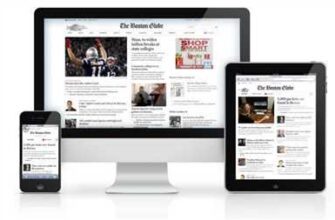
Lastly, you will need to make any necessary adjustments to ensure that your banner is responsive and looks good on all devices. This means that the banner should automatically adjust its size and layout to fit different screen sizes, from desktop to mobile. You can do this by using CSS media queries or by choosing a responsive banner plugin that offers this feature.
That’s it! You’ve just learned how to build a banner for your website. By following these steps and implementing some tips and best practices, you can create eye-catching banners that will grab your audience’s attention and drive them to take action, whether it’s to click on the banner, subscribe to your email list, or make a purchase. Good luck!
- How to Display the Dynamic Banners – P2 – Using Meta Box and Bricks
- Banner ad templates – what are they?
- Banner Design Tips
- 6 Steps
- 1 Create your block type
- 2 Create your fields
- 3 Create responsive image styles Landscape on Desktop Portrait on Mobile
- 4 Create a Twig file with the flexibility to have different options
- 5 Create an SCSS to theme your component accordingly
- 6 Put all steps together and into practice
- Sources
How to Display the Dynamic Banners – P2 – Using Meta Box and Bricks
In the previous tutorial, we learned how to create a dynamic banner using WordPress and the Bricks plugin. Now, in Part 2, we will learn how to display these banners on our website using the Meta Box plugin.
Before we start, make sure you have Meta Box and Bricks installed and activated on your WordPress site. If you haven’t done so yet, you can find these plugins in the WordPress repository.
Step 1: Creating the Meta Box
The first step is to create a meta box that will hold all the necessary settings for our dynamic banner. We’ll use the Meta Box plugin to do this. Once you have the plugin installed, go to the “Meta Box” menu in your WordPress dashboard and click on “Add New”.
In the meta box settings page, you can choose the location where you want to display the meta box on the “Screen Options” tab. You can also adjust the size and position of the meta box according to your preference.
Step 2: Adding Meta Box Fields
Next, we’ll add the necessary fields to our meta box. We’ll add fields for the banner image, message, colors, and other options. You can choose the field types according to your design and the information you want to display in your banner.
Step 3: Connecting Meta Box with Bricks
Once the meta box is ready with all the necessary fields, we need to connect it with the Bricks plugin. You can do this by adding an action in your theme’s functions.php file. This action will call a function that will display the dynamic banner on the site.
Step 4: Displaying the Dynamic Banner
Now, we can display the dynamic banner on our website. To do this, we’ll use the template file where we want to display the banner. We’ll add a custom Twig function that will fetch the banner settings from the meta box and display the banner accordingly.
Step 5: Making the Banner Responsive
If you want the banner to be responsive and adjust according to the screen size, you can add some CSS rules to hide or show certain elements based on the screen size. This will ensure that your banner looks good on both desktop and mobile devices.
Step 6: Testing and Adjustments
Once everything is set up, make sure to test the banner on different devices and screen sizes to ensure that it looks good and functions properly. Make any necessary adjustments according to your customers’ feedback or your own preferences.
That’s it! You have now learned how to create and display dynamic banners using Meta Box and Bricks on your WordPress site. With this flexibility, you can create eye-catching banners that will grab your visitors’ attention and increase your conversion rates.
If you want to take it a step further, you can also add an opt-in form or a floating element to your banner to better engage your audience.
Remember, practice makes perfect. Play around with different banner templates and styles to find the one that works best for your site and target audience. Share your banners and templates with others to get feedback and improve your design.
Now it’s your turn! Go ahead and install Meta Box and Bricks, create your dynamic banner, and start displaying it on your website.
Banner ad templates – what are they?

When it comes to advertising, banner ads are a popular choice for businesses of all sizes. These ads are designed to catch the attention of your audience and entice them to take action, whether it’s visiting your website, making a purchase, or signing up for your newsletter. But creating a banner ad from scratch can be time-consuming and challenging, especially if you don’t have much design experience.
That’s where banner ad templates come in. A banner ad template is a ready-made graphic file that you can use as a starting point for your own ads. These templates are available in different sizes and formats, allowing you to choose the one that best suits your needs. Whether you’re targeting mobile devices or desktop users, there’s a template that will work for you.
Using a banner ad template offers several advantages. First, it saves you time and effort. Instead of starting from scratch, you can simply upload the template file and make any necessary adjustments to fit your brand and message. Second, it provides flexibility in design. With a template, you have the freedom to change colors, fonts, and other elements to make the ad more appealing to your audience. Finally, it ensures consistency and professionalism. Since templates are designed by experts in the field, you can be sure that your ads will look polished and well-crafted.
When choosing a banner ad template, consider your target audience, the type of offer you want to promote, and the theme of your website or landing page. Make sure to choose a template that aligns with your brand’s style and communicates your message effectively. Whether you prefer a simple and clean design or a more dynamic and eye-catching one, there are templates available that will suit your needs.
Once you have selected a template, you can customize it according to your needs. Change the text, add your logo, and adjust the colors to match your brand’s identity. Make sure to follow best practices in advertising design, such as including a clear call to action and using attractive images. If you’re not familiar with graphic design software, there are online tools and platforms that offer easy-to-use editors for customizing templates.
Sharing your banner ads with the world is easy too. Once you’re done customizing, simply save the file and upload it to your advertising platform or website. Some platforms even provide demo options, so you can see how the ad will look before publishing it. This way, you can make any final adjustments to ensure that your ad looks its best and achieves the desired results.
In conclusion, banner ad templates are a valuable tool for businesses that want to create professional-looking ads without the hassle of starting from scratch. By using these templates, you can save time, take advantage of pre-designed styles, and ensure consistency across your advertising campaigns.
Banner Design Tips
When it comes to creating an effective advertising banner, there are several design tips you should keep in mind. Whether you’re designing banners for email campaigns, websites, or social media ads, these tips will help you create visually appealing and engaging banners that grab the attention of your audience.
- 1. Choose the right format: Depending on where you’re going to display your banner, you need to choose the appropriate format. Landscape banners are best for websites, while portrait banners work well on mobile devices.
- 2. Use ready-made templates: If you’re not a graphic design expert, don’t worry! There are plenty of ready-made banner templates available that you can easily customize with your own text, logo, and colors. This will save you time and ensure your banner looks professional.
- 3. Keep it simple: Don’t overcrowd your banner with too much text or images. Keep your message clear and concise, and make sure to include a strong call to action.
- 4. Consider your audience: Think about who your target audience is and design your banner accordingly. Use colors, fonts, and images that will appeal to your customers and align with your brand identity.
- 5. Add an optin box: If you’re using your banner to drive traffic to a landing page, consider adding an optin box where visitors can enter their email address or contact information. This can help you capture valuable leads.
- 6. Make it dynamic: Instead of using a static banner, consider creating a banner with animation or movement. This will grab the viewer’s attention and make your banner more engaging.
By following these tips, you’ll be able to create eye-catching banners that effectively convey your message and drive action from your audience. Remember to always test and iterate on your designs, and don’t be afraid to switch things up if something isn’t working. Happy banner designing!
6 Steps
Creating a banner for your WordPress site can be a straightforward process if you follow these 6 steps:
1. Install a banner plugin: Start by finding and installing a banner plugin that allows you to create and manage banners on your site. There are many options available in the WordPress plugin directory, so choose one that suits your needs.
2. Choose a banner template: Once you have installed the plugin, you will find ready-made banner templates that you can choose from. These templates can be customized based on your preferences and the design of your site.
3. Upload your desired image: To create a visually appealing banner, upload a high-quality image or graphic that represents your message or offer. Make sure the image is in a format that is supported by the plugin.
4. Customize the banner content: The plugin will provide fields where you can add text, adjust colors, and make other design adjustments to the banner. Fill in these fields with the desired content and make sure the banner is responsive and displays well on all devices.
5. Set the banner display rules: Determine where and when the banner should be displayed on your site. For example, you can choose to show the banner on specific pages, in a sidebar menu, or as a floating element on the page. Adjust the settings according to your audience and site layout.
6. Save and share your banner: Once you are satisfied with the design and settings, save the banner and it will be ready to be displayed on your site. If you wish to share it via email or on social media, you can simply copy and paste the banner’s HTML or find the shortcode provided by the plugin.
By following these 6 steps, you will have a customized banner for your WordPress site that captures attention and effectively communicates your message or offer to your audience.
1 Create your block type
If you want to build a banner for your website, the first step is to create a block type. This can be done using a plugin or by using the options provided by your theme. The block type is a design element that is designed to be placed in various locations on your website, such as the header, sidebar, or bottom of the page.
When creating a block type, you have the flexibility to choose what the block will look like on different devices. For example, you can set the block to be responsive, meaning it will adjust its size and layout based on the device it’s being viewed on. This is important because what looks good on a desktop may not look good on a mobile device.
A block type can include various components, such as an image, text, colors, and a logo. You can also add additional features, such as a floating box or a menu. It all depends on how you want your banner to look and what message you wish to convey to your audience.
Once you have created your block type, you can then move on to the next step of designing your banner. This involves creating a template for the banner using a template engine like Twig. The template will include all the necessary code and settings for displaying your banner.
In addition to the template, you must also upload the necessary assets for your banner, such as images and fonts. These assets will be used to make your banner look visually appealing and professional. Make sure to choose the right image sizes and colors that complement your website’s theme.
If you’re using WordPress, there are many plugins available that offer a simple way to create and display banners. One popular option is the Optin P2 plugin, which allows you to create optin banners that can be shown in various locations on your website. This plugin offers a step-by-step process for creating and customizing your banner.
When creating your banner, keep in mind the purpose of the banner and the message you want to convey. Whether it’s for advertising or simply adding a decorative element to your website, make sure it aligns with your goals and target audience.
2 Create your fields
Once you have a design ready-made for your banner, it’s time to create the fields that will allow you to customize and display the banner according to your needs. Here’s how:
- Pick a plugin or tool: There are many WordPress plugins and online tools available that allow you to create custom banners. Choose one that best suits your needs and audience.
- Create your banner template: Using the plugin or tool, create a new banner template. This template will serve as the base for all your banner designs.
- Choose your banner size: Depending on where you plan to display the banner, pick the appropriate sizes for desktop, mobile, and other devices. Consider the different sizes and formats allowed by advertising platforms or your website’s design.
- Create fields for different content: Decide what elements you want to be customizable in your banner. For example, you may want to have fields for the banner’s headline, image, call-to-action button, meta data, and more. Make sure to provide clear labels for each field.
- Create responsive fields: If you want your banner to look good on all devices, create fields that allow you to make adjustments for responsive design. For example, you may want to have fields for adjusting the font size, hiding certain elements on mobile, or changing the layout for landscape or portrait orientation.
- Upload and manage custom files: If you want to use custom graphics or images in your banner, create a field that allows you to upload and manage these files. This way, you can easily update or change the visuals of your banner.
- Add floating fields: To create dynamic and eye-catching banners, consider adding floating fields. These fields will allow you to display content that moves or appears on top of the banner as users scroll down the page.
- Set display rules: Define when and where the banner should appear on your website. You can set rules based on specific pages, user actions, or site-wide settings.
- Put it all together: Once you have created all the necessary fields, it’s time to put them together in your banner template. Make sure to arrange and style the fields according to your design. Preview and make any necessary adjustments.
- Exit and done: After you have completed all the above steps, exit the plugin or tool, and your custom banner is ready to go! You can now easily create and display banners with custom content that will attract and engage your audience.
Remember, these are just some general steps and tips to help you create your banner fields. The exact process may vary depending on the plugin or tool you are using and the specific requirements of your website or advertising goals. Practice, experiment, and find what works best for you!
3 Create responsive image styles Landscape on Desktop Portrait on Mobile
If you want to create a responsive image that looks different on desktop and mobile devices, here are the steps you need to follow:
- Choose an image file that is suitable for both landscape and portrait orientations. This file will be used as the background for your banner.
- Create two image sizes for your banner: one for desktop and one for mobile. You can use an image editing software or an online tool to create these sizes.
- Once you have your image sizes ready, upload them to your website’s media library.
- Create a new HTML component or block on your website where you want the banner to be displayed.
- In the HTML component or block, use CSS to set the background image using the respective sizes for desktop and mobile. You can do this by adding a class or inline styles.
- Create responsive CSS rules that will adjust the background image size and position according to the device’s screen size and orientation. You can use media queries in an external SCSS file or inline styles.
By following these steps, you will be able to create a responsive image banner that looks great on both desktop and mobile devices.
4 Create a Twig file with the flexibility to have different options
Once you have all the necessary components ready, it’s time to create a Twig file that will display different options for your banner. This step is crucial because it allows you to customize the look and format of your banner based on the needs of your audience.
Instead of just having a static banner that offers no choice to your customers, you can use Twig templates to create a dynamic element that will adjust based on the option chosen by the user. For example, if you’re advertising different colors for your product, you can use a Twig template to display a color picker where users can choose their preferred color.
To start, make sure you have the Twig templates in place. If you’re using WordPress, you may need to install a Twig plugin or find ready-made templates online. Once you have the templates, create a new file called “banner.twig” and open it in your preferred text editor.
In this Twig file, you will define the different options and settings for your banner. For example, if you want to allow users to upload their own image for the banner, you can create a file upload box using the “file” type in HTML. You can also include other options such as text input fields for the banner headline, meta tags, or adjustments for the banner size.
Take care to define the rules and format of your Twig file. It’s important to follow the correct syntax and structure of Twig so that it works properly with your advertising page. You can also include practice steps for your customers to follow, such as “Step 1: Choose the banner size” or “Step 2: Upload your custom image”.
Together with the Twig file, you will also need to create a SCSS file to style the banner component. This file will define how the banner will look on the desktop and mobile devices, as well as any floating or popup actions that may be included. Make sure to include the necessary CSS rules to make the banner visually appealing to your audience.
Once you’re done with the Twig and SCSS files, you can move on to the next step of integrating them into your website or advertising page. This may involve using WordPress plugins or a custom development approach depending on your technical skills and preferences.
By creating a flexible Twig file, you give your customers more options and control over how they want to interact with your banner. This can lead to better engagement and conversion rates, as users feel empowered and connected with your brand. So don’t shy away from offering different options and making your banner something more than just another static ad.
5 Create an SCSS to theme your component accordingly
To make your banner fit into the overall design of your website, you can create a separate SCSS file to theme your component accordingly. SCSS (Sassy CSS) is a CSS preprocessor that allows for more flexibility and control over your styles.
Here are the steps to create an SCSS file for your banner component:
- Create a new SCSS file. You can name it anything you want, but it’s best to choose a descriptive name that relates to your banner component.
- Open the SCSS file using a text editor or an SCSS compiler.
- Start by defining variables for the different options you want to have in your banner. For example, you can define a variable for the background color, font family, font size, etc.
- Use the variables to style your banner component accordingly. For example, you can use the background color variable to set the background color of your banner.
- Take advantage of SCSS features like nesting and mixins to make your styles more organized and reusable. For example, you can create a mixin for the banner message styles and reuse it throughout your SCSS file.
By using SCSS to theme your banner component, you can easily switch between different designs or adapt it to different page layouts. It also allows for easier maintenance and updates as changes can be made in a single SCSS file.
Once you have your SCSS file ready, you can compile it into a regular CSS file using an SCSS compiler. Then, you can include the CSS file in your HTML or website template to apply the styles to your banner component.
In practice, you can have multiple SCSS files for different banner sizes or layouts. This gives you the flexibility to create responsive banners that adapt to different screen sizes. For example, you can have separate SCSS files for landscape and portrait banners or for desktop and mobile banners.
Creating an SCSS file for your banner component is a best practice in web design and development. It allows you to easily update the styles and keep them consistent across your website.
6 Put all steps together and into practice
Now that you have done all the necessary preparations, it’s time to put everything together and start creating your banner. Follow these steps to build a banner for your website:
- Choose a ready-made banner template or design a custom one according to your needs and wishes.
- If you are using WordPress, install a banner plugin that suits your requirements. There are many available options, so choose the one that best fits your site.
- Upload the banner image to your website. Make sure the size and format are suitable for the advertising space you have.
- Create a compelling call-to-action (CTA) message that will grab the attention of your audience. Choose the right text and colors that will make your banner stand out.
- Make your banner responsive. This means it should adjust to different screen sizes and devices. Use CSS rules or SCSS to make your banner look great on any device.
- Add an optin form or any other dynamic content you wish to display on your banner. This can be done using HTML, CSS, or a specific plugin that allows you to add custom content.
- Choose the position of your banner. You can place it at the top, bottom, left, or right side of the page. Alternatively, you can make it a floating banner that follows the user as they scroll.
- Once all the steps above are done, take a look at your banner and make any necessary adjustments. Make sure it looks appealing and captures the essence of your brand or theme.
- Put your banner into action! Activate it on your website and start advertising your products or services to your target audience.
Following these steps will help you create a professional and effective banner that will attract attention and drive action from your website visitors. Remember to regularly update your banner with fresh content and new designs to keep it interesting and engaging!
Sources
When creating a banner, there are several sources you can use to make the process easier and more efficient:
1. Templates: If you want a quick and easy way to create a banner, using pre-designed templates is a great option. These templates offer a range of designs and formats, allowing you to pick the one that suits your needs best.
2. Image upload: If you have a specific image or logo you wish to use, you can simply upload it to the banner creation tool. This gives you more flexibility and allows you to display your own content.
3. Demo page: Many banner creation tools offer a demo page that showcases different banner options. This is a great way to see what the tool can do and get ideas for your own banner design.
4. WordPress plugin: If you’re using WordPress, there are plugins available that make creating banners even easier. These plugins allow you to add banners to your website with just a few simple steps.
5. Optin boxes: Optin boxes are a popular choice for advertising banners. They allow you to display a message or offer to your customers and encourage them to take action.
6. Dynamic elements: If you want to create a banner that changes based on user actions or website settings, using dynamic elements is a great option. This allows your banner to adapt to different devices and offer a personalized experience.
By using these sources, you can create a banner that not only looks great but also effectively conveys your message to your target audience.
