If you’re looking to create a donation website, you’ve come to the right place. Donations play a crucial role in supporting various projects and initiatives, and having an online platform that makes it easy for people to donate is essential. In this article, we will walk you through the process of creating a donation website step by step.
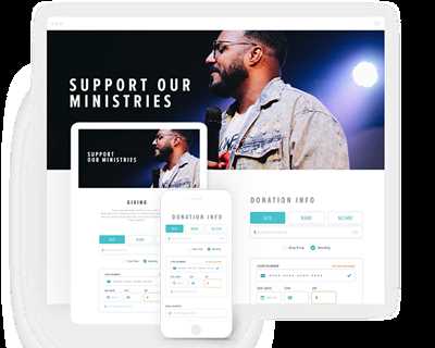
The first step is to choose a platform or tool that allows you to create a secure and user-friendly website. There are several website builders and platforms available, but it’s important to choose one that suits your specific needs. For instance, Funraise’s nonprofit platform is a popular option that offers customizable templates and features specifically designed for donation websites.
Next, you’ll want to start the website creation process by setting up the necessary pages and fields. Most donation websites include a donation form, which allows users to enter the amount they want to donate and select a specific project or cause to support. It’s also important to include fields for personal information, such as name and email address, so you can keep in touch with your donors and provide them with updates on your organization’s progress.
When creating your donation form, be sure to highlight why people should donate and what their contributions will support. Clear and compelling messaging can make a big difference in motivating people to donate. You can also include features like progress bars, showing how close you are to your fundraising goal, to create a sense of urgency and excitement.
Another important aspect to consider is making your website mobile-friendly. With more people accessing the internet on their mobile devices, it’s crucial that your donation website is optimized for mobile viewing. This means ensuring that your pages load quickly and are easy to navigate on smaller screens.
Once your website is set up, it’s time to focus on marketing and promotion. After all, if people don’t know about your donation website, they won’t be able to contribute. Utilize social media channels, email marketing, and other appropriate channels to spread the word about your cause and your website. You could also consider partnering with corporate organizations that align with your mission to further expand your reach.
When it comes to processing donations, make sure you choose a reliable and secure payment gateway. This ensures that your donors’ information is kept safe and their transactions are processed smoothly. Offer multiple payment options, including credit/debit cards and popular online payment platforms, to accommodate different preferences.
Lastly, be transparent and disclose how you will use the donated funds. Clearly communicate your organization’s goals and how the funds will be spent. Additionally, provide regular updates to your donors to show the impact their contributions are making.
By following these best practices and utilizing the right tools, you can create a donation website that is both effective and engaging. Remember to keep your website up to date and continue to refine your fundraising efforts as you gain more experience. With time and effort, your donation website will likely become a key driver of success for your nonprofit organization.
- Why you should use Appy Pie’s AI Website Builder for a Donation Website
- Best Practices for Creating Online Donation Forms
- Compelling Content on Donation Pages
- 12 Highlight matching gifts on your donation page
- 13 Feature compelling imagery on your donation page
- 14 Include a compelling “Why”
- 15 Customize donation page content fields
- 16 Disclose how donations are used
- How to create a fundraising website with Funraise’s nonprofit website builder
Why you should use Appy Pie’s AI Website Builder for a Donation Website
Donations are a critical component of nonprofit organizations’ success in accomplishing their mission and purpose. If you want to start a donation website to support your cause, it is essential to have a user-friendly and secure platform that can effectively market your organization, keep your donors engaged, and make the donation process as seamless as possible. This is where Appy Pie’s AI Website Builder comes in.
With Appy Pie’s AI Website Builder, you can create a donation website that not only meets the eligibility requirements, but also provides a completely customized and optimized experience for your patrons. The platform offers a wide range of features to help you offer a user-friendly interface where your donors can clearly see what projects they are supporting and how their donations can make an impact.
One of the most compelling features of Appy Pie’s AI Website Builder is the ability to create custom donation forms. With over 14 different field options to choose from, you can tailor your forms to include specific fields that are relevant to your organization and the type of donations you want to receive. You can also customize the look and feel of your forms to match your branding and create a seamless experience for your users.
Furthermore, Appy Pie’s AI Website Builder ensures that your donation website is mobile-friendly, making it easy for users to access and donate from their smartphones or tablets. This is crucial, as more and more users are now giving through mobile devices.
Appy Pie’s AI Website Builder also helps you create a compelling “why” banner that communicates the purpose of your organization and the impact their donations can have. This banner serves as a clear call-to-action for your viewers, encouraging them to support your cause.
In addition to these features, Appy Pie’s AI Website Builder includes support for contact forms, shareable buttons, and social media integration. These features make it easy for your visitors to get in touch with you, share your donation website with others, and stay connected with your organization.
Lastly, Appy Pie’s AI Website Builder ensures the privacy and security of your donors by providing the option to integrate payment gateways that meet industry standards. This helps build trust and confidence among your donors, increasing the likelihood of receiving larger and more frequent donations.
In conclusion, if you’re looking to create a donation website, Appy Pie’s AI Website Builder is the optimal choice. Its features and functionality are specifically designed to help nonprofits start their fundraising journey on the right foot and achieve their fundraising goals. Don’t make it difficult for your donors to support your cause – use Appy Pie’s AI Website Builder and create a donation website that is simple, secure, and impactful.
Best Practices for Creating Online Donation Forms
When it comes to creating online donation forms, there are several best practices you should follow to ensure a smooth and successful donation process. These practices include:
1. Asking the Right Questions:
Keep your form concise and focused by asking only relevant questions. This will make it easier for donors to complete the form and increase the chances of successful donations.
2. Breaking the Form into Sections:
Divide your form into smaller sections or steps to make it less overwhelming for donors. This will help them navigate through the form easily and complete the donation process.
3. Highlighting the Purpose:
Clearly communicate the purpose and impact of the donations, so potential donors have a clear understanding of why they should give.
4. Making Donations Shareable:
Include social media sharing links on your form so that users can easily share their donations with friends and family, encouraging them to contribute as well.
5. Offering Customization:
Give donors the option to customize their donations by allowing them to choose the specific projects or causes they want to support.
6. Keeping the Form Simple:
Avoid adding too many fields or requirements to your form. Keep it simple, asking for just the necessary information to avoid overwhelming donors and ensure higher completion rates.
7. Providing Clear Contact Information:
Include a contact section on your form where donors can reach out with any questions or concerns they may have. This will ensure a better donor experience and build trust.
8. Using Compelling Content and Images:
Make your donation form visually appealing by using compelling content and images that highlight the impact of donations. This will engage viewers and encourage them to give.
9. Building Trust with Privacy and Security:
Include a privacy statement and ensure that your donation forms are secure. This will reassure donors that their personal and financial information is protected.
10. Offering Multiple Donation Amounts:
Provide a range of donation amounts for users to choose from. This gives donors flexibility and allows them to contribute an amount that feels comfortable for them.
11. Using a Donation Form Builder:
Consider using a donation form builder or platform like Funraise or Formsite to create your online donation forms. These tools offer features like AI matching, logo customization, and automated donation processing.
12. Making the Donation Button Stand Out:
Use contrasting colors and a compelling call-to-action to make your donation button stand out on the page. This will attract users’ attention and encourage them to contribute.
13. Posing the “Why” Question:
Include a field where donors can share why they chose to give to your cause. This will help you gather valuable feedback and testimonials to showcase the impact of your organization.
14. Keeping the Form Short and Simple:
Avoid overwhelming potential donors by keeping your form short and asking only essential questions. This will ensure a smoother donation process and higher completion rates.
15. Automating the Donation Process:
Use automation tools to automatically send donation receipts and thank-you emails. This will save you time and effort while providing a better donor experience.
16. Matching Corporate Gifts:
If your organization offers corporate matching gifts, clearly indicate this on your donation form. This will encourage donors to check if their employer offers this program and potentially double their donation.
By following these best practices, you can create compelling and user-friendly online donation forms that attract donors, make the donation process seamless, and support your organization’s goals and projects.
Compelling Content on Donation Pages
When creating a donation website, it’s important to include compelling content on your donation pages to encourage visitors to give and to ensure an optimal giving experience. This can be done through the use of the right tools, impactful imagery, and clear and concise messaging.
The first step is to clearly state your purpose and the causes you support. This helps potential donors understand where their money will be going and how it will make an impact. Make sure to include a single, compelling “why” statement that communicates the value of their contribution.
Including images and videos that showcase the work your organization does can also be a powerful tool. Visuals help tell your story and can evoke emotions, providing viewers with a deeper connection to your cause. Use high-quality imagery that reflects the impact of your work.
Privacy is a concern for many donors, so make sure to offer a secure donation process and clearly communicate how donor information will be used. This can help build trust and encourage more giving.
Another feature that can make your donation pages more compelling is the use of social proof. Including testimonials or social media posts from satisfied donors can help show potential patrons that others trust your organization and have had a positive experience donating.
Additionally, consider offering shareable giving options, such as the ability to make a donation in someone’s honor or to share their contribution on social media. This can make the act of giving feel more meaningful and can also help increase awareness of your cause.
Finally, be sure to include a clear call-to-action button that stands out on the page. This button should make it easy for visitors to give by clearly stating what action they need to take and where their donation will go.
In conclusion, when creating a donation website, it’s important to create compelling content that explains the purpose of your organization, showcases the impact of your work, and offers an easy and secure way for visitors to make a donation. By following these guidelines and incorporating the features discussed, you will be able to create a donation page that resonates with your audience and helps drive more giving.
12 Highlight matching gifts on your donation page
When it comes to fundraising, one of the key goals is to make it as easy as possible for patrons to contribute to your cause. This means clearly highlighting the options available to them and providing a seamless donation experience. One often overlooked feature that can greatly impact the success of your fundraising efforts is the ability to match gifts.
Matching gifts are donations made by a company to a non-profit organization that matches the amount a donor contributes. This can greatly increase the impact of individual donations and encourage more people to donate. However, many potential donors may not be aware of this option or may not know if their employer offers matching gifts.
By highlighting matching gifts on your donation page, you accomplish several things. Firstly, you let people know that this option is available to them, which can lead to more contributions. Secondly, you make the process of disclosing matching gift information easy by including a checkbox or field where donors can enter their employer’s name. Finally, customizing your donation page to clearly display matching gift information creates a more personalized experience for customers and shows that you value their support.
There are several ways to highlight matching gifts on your donation page. One option is to include a specific section or field where donors can enter their employer’s name. This can be as simple as adding a field with a label that says “Matching Gifts” or “Employer Name.” Another option is to include a logo or link to a list of companies that commonly offer matching gifts.
For instance, you can add a section titled “Double the Impact of Your Donation” and provide a link to a page that lists companies known to offer matching gifts. Alternatively, you can integrate a codeless form from a third-party service like Double the Donation or Gift Matching Services. These services allow you to embed a form directly into your donation page without having to write any code.
The final step in highlighting matching gifts on your donation page is to provide confirmation and follow-up contact for donors who indicate that their employer offers matching gifts. This can be as simple as a thank you message on the confirmation page and a follow-up email with instructions on how to submit the matching gift request.
By making it easy for donors to take advantage of matching gift programs, you not only increase the likelihood of receiving larger donations, but you also create a positive and personalized experience for your users.
13 Feature compelling imagery on your donation page

You’ve done the difficult part of setting up your donation page, now it’s time to make it visually appealing to your donors. One of the best means to do this is by featuring compelling imagery.
When it comes to creating a donation website, smaller nonprofits or those just starting out often find it difficult to customize their pages or don’t have the resources to hire a web designer. However, with the use of AI and codeless website builders, customizing your donation page becomes easy.
But why should you feature imagery on your donation page? Well, including images that clearly show the impact of donations can be a powerful tool to engage your viewers. Compelling visuals can tell the story of your cause and inspire potential donors to take action.
Here are a few things to keep in mind when adding imagery to your donation page:
1. Use high-quality images: Make sure the images you use are clear, well-lit, and of a good resolution.
2. Show the people you’re helping: Including photos of those who will benefit from donations can help donors connect on a more personal level.
3. Highlight the impact: Use images that demonstrate the positive change that donations will make.
4. Include images of your team or volunteers: Show the individuals behind your nonprofit, building trust and credibility.
5. Display the name and logo of your nonprofit: Make it clear who the viewer is supporting.
6. Customize the donation button: Make sure the button stands out and grabs attention.
7. Use labels and clear instructions: Clearly indicate where donors should input their details or how they can customize their gift.
8. Feature an image banner: Use a captivating banner image to draw attention to your donation page.
9. Follow best practices for online privacy and data processing: Clearly explain how you’ll handle donors’ personal information and reassure them that it’s secure.
10. Include sections on eligibility and requirements: Clearly communicate who can qualify for your assistance and any specific criteria they need to meet.
11. Showcase the impact of matching gifts: Highlight the potential multiplication of your donors’ gifts through matching programs.
12. Make customizing donation options easy: Allow donors to choose their preferred donation amount or frequency.
13. Never forget to thank your donors: Display a thank you message or follow-up email to express gratitude for their support.
14 Include a compelling “Why”
For instance, if your nonprofit works to provide clean water to communities in need, you can include a “Why” statement such as: “Your donation will help bring clean drinking water to thousands of people who currently lack access to this basic necessity. With your support, we can create a lasting impact and improve the lives of those in need.”
Some donors are often motivated by the ability to have their gifts matched by corporate or individual donors. Including information about any matching gift programs can also be an effective way to motivate donors to give. You can include a checkbox on your donation form where donors can indicate if their gift is eligible for a matching donation.
Customizing your donation forms and fields can also help create a better donor experience. For example, you can allow donors to choose the amount they want to donate or include preset amounts for them to choose from. Providing confirmation pages and confirmation emails can also give donors peace of mind and help them feel more secure in their decision to donate.
Don’t forget to include your nonprofit’s logo, contact information, and privacy policy on your donation page. This information should be easily accessible and should be prominently displayed to help build trust with your viewers.
When creating your donation website, it’s important to use codeless website builder platforms whenever possible. These platforms offer simple and easy-to-use features that allow even those with no coding experience to create professional-looking websites. This makes it much easier to customize your website and tailor it to your specific requirements.
Finally, consider including links to social media channels or other sources where people can learn more about your organization and the impact your work has. This can help potential donors get a better idea of who you are and what you do, and may even inspire them to become donors themselves.
15 Customize donation page content fields
When it comes to processing donations, you’ve got a lot of options. Donate buttons, fundraising platforms like Funraise, custom code, and more. But what happens when it’s time to customize the actual donation page content fields?
Funraise’s Codeless Builder makes it simple to customize your donation page content fields, regardless of your technical skill level. Here’s how to do it:
1. Follow the following links: Google > Funraise > Code > Accomplish > Build > Customizing
2. Incorporate your logo to make the donation page feel like it’s a part of your website.
3. Add sections or custom fields that disclose why donors should contribute and the impact their donation will have.
4. Use compelling imagery, such as photos or banners, to offer a visual representation of your cause.
5. Personalize the field labels to better align with your branding and marketing efforts.
6. Include a short “why” section to highlight the purpose of your organization and explain the need for donations.
7. Provide options for donors to choose the specific giving levels or amounts they’d like to contribute.
8. Consider adding a matching gift feature to encourage donors to give more.
9. Include fields for donors to input their name and contact information.
10. Customize the layout and design of the donation form to match your website’s aesthetic.
11. Ensure that the donation page is mobile-friendly and responsive.
12. Make sure your donation page meets any legal requirements for collecting donor information.
13. Offer a “pay now” button that allows donors to easily complete their donation.
14. Use Appy AI to generate custom fields based on the specific needs of your organization.
15. Keep experimenting and testing to find the best combinations of customization for your donation page.
By customizing your donation page content fields, you can create a more engaging and personalized experience for donors. This can have a significant impact on your overall fundraising success.
16 Disclose how donations are used

When donors give to your cause, they want to know how their contribution will be used. Being transparent about how donations are used is crucial for building trust and encouraging continued support. Here are some best practices to follow when disclosing how donations are used:
- Clearly define your goals: Be specific about the purpose of your fundraising efforts and the impact you hope to accomplish.
- Create a pie chart: Visual representations, like a pie chart, can give donors a clear look into how their donations will be allocated among different projects or initiatives.
- Use simple language: Avoid jargon and technical terms when explaining how donations will be used. Keep it easy to understand for everyone.
- Highlight success stories: Share success stories or testimonials from individuals or communities who have benefited from previous donations. This can help donors see the tangible impact of their support.
- Customize your donation page: Use a donation form builder that allows you to add custom fields and labels. This way, you can include specific information about how donations will be used, right on the donation form.
- Provide contact information: Make it easy for donors to reach out to you with any questions or concerns about how their donations will be used. Include your contact information prominently on your website.
- Follow privacy requirements: While it’s important to be transparent, also respect privacy regulations. Don’t disclose personal information about your recipients or donors without their consent.
- Create a mobile-friendly website: Make sure your website is optimized for mobile devices, as more and more people are using their phones to browse and donate.
- Automate payment processing: Using a platform that automatically processes payments can make the donation process easier for donors and ensure that funds are allocated correctly.
- Declare your purpose: Clearly state your organization’s purpose and mission on your website, so donors know that their contributions are going towards causes they care about.
- Be mindful of smaller donors: Even small gifts can make a big impact, so make sure to disclose how donations of all sizes will be used.
- Use impact labels: Attach impact labels to specific fundraising projects or initiatives to show donors the direct impact their donations will have.
- Open up your financials: Consider sharing financial information, such as annual reports or audited statements, to demonstrate how donations are allocated and managed.
- Include a “How It Works” section: Provide a step-by-step guide on how donations are received, processed, and used to give donors a clear understanding of the entire process.
- Keep your website up to date: Regularly update your website to reflect the latest projects and initiatives that donations are supporting.
- Ask for feedback: Encourage donors to provide feedback on how their donations were used and use their input to improve your transparency and communication.
By following these guidelines, you can ensure that your donors have a clear understanding of how their contributions will be used, increasing their trust in your organization and making them more likely to give.
How to create a fundraising website with Funraise’s nonprofit website builder
If you’re a nonprofit organization looking to create a powerful and effective fundraising website, Funraise’s nonprofit website builder is the answer you’ve been searching for. With this easy-to-use platform, you can create a website that not only looks professional but also helps you accomplish your fundraising goals.
One of the key features of Funraise’s nonprofit website builder is its codeless and AI-powered design, which means you never have to worry about writing a single line of code. With a few simple clicks, you can customize your website to match your organization’s branding, including uploading your logo and customizing the colors and labels of your donation forms.
Funraise’s website builder also makes your website shareable, mobile-friendly, and secure. This means that your supporters can easily access your website and make donations from their mobile devices, and you can rest assured that all donations and donor information are kept private and secure.
When using Funraise’s nonprofit website builder, you have access to a range of features that can help you succeed in your fundraising efforts. For example, you can create donation forms that allow donors to choose their own gift amount or set up recurring donations. You can also set fundraising goals and track your progress in real-time, which provides transparency and a sense of accomplishment for your donors.
In addition to these features, Funraise’s website builder also offers the following tools to optimize your fundraising website:
- Customizable donation pages: Funraise’s website builder allows you to create custom pages for specific fundraising campaigns or causes. This means you can tailor your messaging and imagery to match the purpose of each campaign and appeal to donors who are passionate about those causes.
- Corporate matching gifts: With Funraise’s website builder, you can enable a corporate matching gift feature, which encourages donors to increase their impact by having their donation matched by their employer. This can be a powerful incentive for donors and can help you raise even more funds.
- Confirmation and thank-you emails: Funraise’s website builder automates the process of sending confirmation and thank-you emails to your donors. This not only saves you time but also ensures that your donors feel appreciated and informed about the impact of their gift.
Whether you’re a small nonprofit just starting out or an established organization, Funraise’s nonprofit website builder is designed to help you build a successful and effective fundraising website. By using this powerful tool, you can create a website that not only looks professional but also drives donations and supports your mission.

