

Showing a responsive menu on a website is essential in today’s mobile-friendly era. However, creating a custom responsive menu can be a daunting task that requires knowledge of HTML, CSS, and JavaScript. In this article, we will explore a step-by-step guide on how to make a menu responsive using different options.
One great way to achieve a responsive menu with cool animations is by using plugins. Fullpage.js is an excellent option that allows you to create animated full-page sections where you can place your menus. Adding the necessary code to your WordPress or other CMS website is easy, and you can customize the colors, icons, and placement of the menu elements.
When it comes to the code implementation, one common approach is to use a hamburger icon as a toggle button. This button will activate or deactivate the mobile menu when clicked. By using a checkbox element and some CSS, you can create this effect. Additionally, with a bit of JavaScript, you can add interactivity and change things like the background color or icons when the menu is active.
To make your menus responsive, you will need to change how they are displayed on different devices. You can use CSS media queries to specify different styles for different screen sizes. For example, on larger screens, the menu can be displayed as a horizontal navigation bar, while on smaller screens, it can be shown vertically, utilizing the entire screen width.
In conclusion, creating a responsive menu for your website is crucial to provide a great user experience on mobile devices. By using plugins, CSS, and JavaScript, you can add cool animations and interactivity to your menu. Remember to test your menu thoroughly and make any necessary adjustments to ensure it works well on various devices.
How to Create Mobile-friendly Responsive Menu
Creating a mobile-friendly and responsive menu for your website is essential in today’s digital age. With the increasing number of users accessing websites through their mobile devices, it is crucial to provide a seamless navigation experience on smaller screens. In this article, we will discuss how to create a mobile-friendly responsive menu step by step.
Step 1: Plan your menu options
Before you start coding, you should first decide what menu options you would like to include in your mobile-friendly responsive menu. Take into consideration the important pages or sections of your website that should be easily accessible for mobile users. Remember to include any sub-menus or dropdown options you would like to add as well.
Step 2: Use plugins or code snippets
There are many plugins and code snippets available that can help you create a mobile-friendly responsive menu. One popular option is to use a hamburger icon button, which expands the menu when clicked. You can find ready-made plugins or code snippets for this purpose that you can easily integrate into your website. This allows you to save time and effort in creating the functionality from scratch.
Step 3: Customize the menu

Once you have chosen a plugin or code snippet, you can customize the menu according to your needs. This includes changing the placement, colors, animations, and other options to make it more in line with your website’s design. You can also add icons or other cool elements to enhance the visual appeal of the menu.
Step 4: Ensure interactivity and responsiveness
When creating a mobile-friendly responsive menu, it is important to ensure that it is interactive and responsive. Test the menu on different screen sizes and devices to make sure that it adapts well to different resolutions. This includes checking the layout, functionality, and overall user experience.
Step 5: Test and make adjustments
After implementing the menu on your website, it is crucial to test it thoroughly. Check for any bugs, issues, or layout problems that may arise. Make any necessary adjustments or changes to ensure that the menu functions as intended on all devices and screen sizes.
In conclusion, creating a mobile-friendly responsive menu is vital for providing a great user experience on your website. By following the steps outlined above, you can easily create a menu that is not only functional but also visually appealing and user-friendly. So make sure to incorporate a mobile-friendly responsive menu into your website and enjoy the positive impact it will have on your users’ navigation experience.
Step 2: Adding Interactivity

Now that we have our responsive menu structure in place, it’s time to add some interactivity to make it functional. In this step, we will focus on adding the necessary code to make our menu responsive and mobile-friendly.
To begin, we will need to create a hamburger icon button that will activate the menu when clicked. This button will serve as the trigger for displaying and hiding the menu on mobile devices. We can use an HTML checkbox element to achieve this functionality.
The checkbox element will act as a toggle switch, allowing us to show and hide the menu when it’s checked or unchecked. Its placement within the HTML structure is crucial, as it determines where the menu will appear when toggled on mobile devices.
In addition to the checkbox element, we will also need to include the appropriate CSS code to style the hamburger icon. This can be done by using CSS pseudo-elements and animations to create a visually appealing icon that changes when the menu is active.
Once we have the hamburger icon and checkbox element in place, we can then add the necessary JavaScript code to handle the interactivity. This code will listen for when the checkbox is checked or unchecked, and apply the appropriate CSS classes to show or hide the menu accordingly.
To make the menu responsive, we can use media queries to modify the layout and appearance of the menu at different screen sizes. This allows us to customize the menu’s behavior and appearance on desktop, tablet, and mobile devices.
There are many plugins and code snippets available that can help with creating responsive menus, such as the popular WordPress plugin “Responsive Menu”. These plugins offer additional options and functionalities that can enhance the responsiveness of your menu even further.
In the final step, we can add additional customizations to our menu, like changing the background colors, adding cool animations, or showing/hiding sub-menus. The possibilities are endless, and you can customize your menu to fit your website’s design and navigation needs.
By adding interactivity to our menu, we have transformed it from a simple static navigation into a dynamic and user-friendly element. With the right code and plugins, you can create a responsive menu that looks great on any device and provides an optimal user experience.
Final Result
After following all the steps and adding the necessary code and plugins, you should now have a fully responsive and mobile-friendly navigation menu. The final result will be a cool-looking menu that will change its placement and interactivity depending on the screen size.
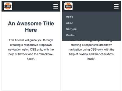
On smaller screens, the menu will be collapsed and hidden behind a hamburger button. When the button is clicked, the menu will slide into view, showing all the menu options in a vertical layout. Additionally, the background color of the menu will change to indicate that it is active.
If you have sub-menus, they would be displayed by clicking on the parent menu item. You can add custom icons or animations to enhance the interactivity and make the menu more engaging for the users.
With the final result in place, you can now enjoy a great user experience on your website, with a responsive and visually appealing menu that adapts to different devices. Whether you are using WordPress or any other CMS or coding from scratch, the principles and steps we have discussed should be applicable.
Remember that menus play a crucial role in the overall user experience, and having a responsive and user-friendly menu is essential for the success of your website. So make sure to invest time and effort in creating a well-designed and efficient navigation element.
Now that you have learned how to make your menu responsive, you can explore other options like adding colors, animations, or even using plugins such as fullPage.js to create unique and interactive menus.
So go ahead and make your menus responsive and mobile-friendly! Your users will appreciate the effort, and it will definitely contribute to the success of your website.
Image sources: Shutterstock, Unsplash
Sources
When it comes to creating a responsive menu, there are many options and sources available. Depending on your needs and preferences, you can choose the option that suits you best.
If you are using a WordPress website, there are many plugins available that can help you create responsive menus. Some popular ones include “Responsive Menu” and “Max Mega Menu”. These plugins provide a user-friendly interface to create and customize menus, allowing you to change things like colors, icons, and placement.
If you prefer to create a custom menu from scratch, you can use HTML, CSS, and JavaScript to achieve the desired result. There are many great tutorials and code snippets available online that can guide you through the process.
Another option is to use CSS frameworks like Bootstrap or Foundation, which provide pre-built responsive menu components that you can customize to fit your needs.
In terms of interactivity and animations, you can use CSS transitions and JavaScript libraries like jQuery or GSAP to add cool effects to your menus. For example, you can add smooth animations to show or hide sub-menus, or create a hamburger menu with an animated “hamburger” icon that transforms into a “close” icon when the menu is active.
If you want to go a step further and create a full-page scrolling menu, you can use libraries like fullPage.js, which provide a complete solution for creating mobile-friendly menus with full-page navigation.
When it comes to responsive menu design, it’s important to consider mobile devices. Mobile-first design principles suggest that you should prioritize the mobile experience and then adapt it to larger screens. This means that your menu should be easily accessible and usable on small screens, like smartphones and tablets.
In conclusion, there are many sources and options available for creating responsive menus. Whether you are using plugins, custom code, or CSS frameworks, it’s important to consider the interactivity, placement, and responsiveness of your menu to create a great user experience.


