
Responsive web design is a crucial concept in modern web development. With the variety of devices and screen sizes available today, it’s important to ensure that your website looks and functions well on all of them. In this guide, we will show you how to make a responsive page using CSS and some simple techniques.
One of the first things to consider when creating a responsive layout is the viewport meta tag. This tag tells the browser how to render the page on different devices. By specifying the initial-scale and width=device-width, you can ensure that your website adapts to the size of the screen it is being viewed on. This allows your site to be flexible and look great on both small and large screens.
One popular method for creating responsive layouts is using the CSS Flexbox. Flexbox provides a simple yet powerful way to create flexible and responsive designs. By using the flex property along with the flex-grow, flex-shrink, and flex-basis properties, you can control how the elements within a container should grow and shrink based on the available space. This is especially useful when dealing with different screen sizes and orientations.
Media queries are another important tool for creating responsive designs. Media queries allow you to apply CSS rules based on the size of the device or the characteristics of the device screen. Whether you’re targeting specific device sizes or creating a layout that adjusts based on orientation, media queries can help you achieve the desired result. By using the @media rule, you can specify the conditions under which certain styles should be applied. These conditions can be based on screen size, device type, or any other CSS property.
One technique that combines the power of both flexbox and media queries is the use of the “mobile first” approach. This means designing your website with the smallest screens in mind and then gradually adding styles and layout adjustments for larger screens. By starting with the most basic layout and gradually enhancing it, you can ensure that your website looks great on all devices, from mobile phones to large desktop screens.
In conclusion, making a responsive page requires careful consideration of various factors such as layouts, viewport settings, CSS techniques like flexbox and media queries, and the use of a mobile-first approach. By following the guidelines and techniques outlined above, you can create a responsive website that will adapt to different screen sizes and provide a great user experience across all devices.
- How to make a responsive website for all devices (closed)
- CSS Media Queries
- Step 3 Enlarge our HTML Sections To Fullscreen
- Grid Layout
- Table of Contents
- 1. Introduction
- 2. Understanding Responsive Layouts
- 3. Media Queries
- 3.1. Min-width Queries
- 3.2. Max-width Queries
- 4. Flexbox and Grid
- 4.1. Flexbox Layout
- 4.2. CSS Grid Layout
- 5. Responsive Images
- 6. Creating a Responsive Navigation
- 6.1. Mobile-first Approach
- 6.2. Hamburger Menu
- 7. Responsive Tables
- 8. Fullscreen Backgrounds
- 9. Conclusion
- Источники
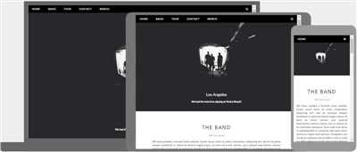
How to make a responsive website for all devices (closed)
Having a responsive website is crucial in today’s digital age, as users access websites from various devices with different screen sizes and resolutions. In this guide, we will show you how to make your website layout flexible and adaptable to any device.
One popular approach is using CSS media queries, which allow you to specify different styles for different screen sizes. With media queries, you can define rules that will be applied only when certain conditions are met, such as when the viewport width is smaller than a specific value or larger than another value.
Using media queries alone may not be enough, as it only changes the appearance of your website based on screen size. To truly create a responsive layout, you need to design your website with a flexible grid system. This means dividing your website into sections and placing the contents within those sections in a way that adapts to different screen sizes.
One popular method for creating a flexible grid layout is by using CSS flexbox. Flexbox allows you to distribute space between items in a container smoothly. By specifying the properties of the flexbox container and its items, you can create a responsive layout that adjusts its contents and spacing automatically.
Another option is using CSS grid, which provides more control over the positioning and size of elements. CSS grid is a two-dimensional layout system that allows you to define grid lines and create flexible layouts based on those lines. With CSS grid, you can create complex layouts that adapt to different devices while still maintaining a clean and organized look.
When designing a responsive website, it’s important to consider not only the size of the devices but also the capabilities and limitations of each device. For example, if a device has a small screen size, you may want to prioritize the most important content and hide secondary elements. On the other hand, if the device has a large screen size, you can take advantage of the extra space to show more content at once.
When writing media queries, it’s also important to keep in mind the “mobile-first” approach. This means designing your website with mobile devices in mind, and then gradually enhancing the layout for larger screens. By starting with a mobile-friendly layout and adding more features as the screen size increases, you ensure that your website is accessible and usable on all devices.
In conclusion, creating a responsive website requires careful planning and consideration for different devices and screen sizes. By using CSS media queries, flexbox, and CSS grid, you can create a flexible and adaptable layout that looks great on any device. Keep in mind the mobile-first approach and design your website with the user experience in mind.
CSS Media Queries
Media queries are a powerful tool in CSS that allows you to show different styles or layouts based on the size of the viewport or device. They are particularly useful for creating responsive websites that look great on all devices, from small mobile screens to large desktop monitors.
Media queries work by specifying certain conditions or rules that apply when the device meets certain criteria. For example, you can use media queries to specify that certain sections of your website should be displayed as a flexbox layout when the viewport is larger than a certain size. This means that they will be flexible and adjust their layout to fit the available space well.
Media queries are written within a CSS stylesheet and are identified by the @media declaration followed by a set of curly braces. Inside the braces, you can define the rules that should apply when the specified conditions are met. The most common condition used in media queries is based on the min-width property, which allows you to specify a minimum width at which the rules will take effect.
Here’s an example of how media queries can be used to create a responsive table layout:
@media (min-width: 768px) {
table {
display: grid;
grid-template-columns: 1fr 1fr;
}
}
In the above example, the table will be displayed as a grid layout with two columns when the viewport width is 768 pixels or above. Below that size, the table will use its default layout. This allows the table to adapt its layout based on the available space, making it more responsive on different devices.
Media queries are incredibly useful and powerful when it comes to creating responsive designs. By using them effectively, you can ensure that your website looks and functions optimally across a wide range of devices and screen sizes.
Step 3 Enlarge our HTML Sections To Fullscreen
Now that we have created a responsive layout for our website, it’s time to make it even more flexible by enlarging our HTML sections to fullscreen.
Enlarging our sections to fullscreen means that they will take up the entire viewport of the device, no matter the size. This is important because different devices have different screen sizes, and we want our website to look good on all of them.
To enlarge our sections, we can use the flexbox system in CSS. Flexbox is a set of CSS rules that allows us to create flexible layouts. It’s like a guide that tells the browser how to display the contents within a container.
To specify that our sections should take up the entire viewport, we need to add some CSS rules to our style sheet. Here’s how you can do it:
section {
display: flex;
flex: 1;
min-height: 100vh;
}
.container {
flex: 1;
}
Let’s break down what each of these rules means:
display: flex;– This means that our sections will use the flexbox system for layout.flex: 1;– This tells the browser to distribute the available space evenly among the sections. It’s like saying, “Hey, browser, take as much space as you need to display the sections.”min-height: 100vh;– This sets the minimum height of each section to be 100% of the viewport height. This ensures that the sections take up the entire screen height, even if their content is not enough to fill the space..container { flex: 1; }– This rule applies to a specific class, which you can name whatever you like. It means that the contents within this class will take up the remaining space within the section.
With these CSS rules in place, our sections will now resize dynamically to fit the screen of any device. Whether you’re on a small mobile phone or a large desktop monitor, the sections will always come in fullscreen!
That’s it for step 3! Now you know how to make your HTML sections responsive and enlarge them to fullscreen. Open your HTML file in a browser and see how your website looks on different devices.
Grid Layout
The grid layout is a flexible system for arranging contents within sections of a webpage. It allows you to create responsive layouts that adapt to different device sizes and screen orientations. With grid layout, you can specify how each section of your webpage will show up based on the size of the viewport.
When designing a responsive layout, the question often comes up of how to make content fit well on all screen sizes. This is where grid layout comes in handy. With grid layout, you can create a layout that will automatically adjust and resize based on the size of the viewport. For example, if you’re designing a fullscreen website, you will need a layout that takes up the entire space of the viewport. On the other hand, if you’re designing something for a smaller device, you may want to create a layout that is based on a min-width.
Grid layout works with CSS media queries, which are rules that specify different styles based on the device’s screen size. By using media queries in conjunction with grid layout, you can create a responsive design that adapts to different devices. For example, you can specify that on smaller devices, the grid layout should display as a single-column table, whereas on larger devices, it should display as a 3-column grid.
Grid layout uses the display: grid; property in CSS to specify that an element should be treated as a grid container. Within this container, you can define rows and columns using CSS properties such as grid-template-rows and grid-template-columns. You can also specify the size of each grid item using properties such as grid-row-start, grid-row-end, grid-column-start, and grid-column-end.
One important thing to note about grid layout is that it only works within the closed domain of the grid container. This means that if you have a grid item that is larger than the available space within the container, it will overflow and not be visible. To avoid this, you can use CSS properties such as overflow and white-space to specify how the content should be displayed.
In conclusion, grid layout is a powerful tool for creating responsive designs that adapt to different device sizes. By using media queries in combination with grid layout, you can create flexible and responsive layouts that look good on all screen sizes.
| Name | URL |
|---|---|
| MDN Web Docs – CSS Grid Layout | https://developer.mozilla.org/en-US/docs/Web/CSS/CSS_Grid_Layout |
| CSS-Tricks – Complete Guide to Grid | https://css-tricks.com/snippets/css/complete-guide-grid/ |
| W3Schools – CSS Grid Layout | https://www.w3schools.com/css/css_grid.asp |
Table of Contents
In this guide, we will show you how to make a responsive page using HTML and CSS.
1. Introduction
What is a responsive page and why do you need it for your website?
2. Understanding Responsive Layouts
How do responsive layouts work and what rules do they follow?
3. Media Queries

How and when to use media queries to specify different layouts based on device size?
3.1. Min-width Queries
Using min-width queries to specify layouts for screens above a certain size
3.2. Max-width Queries
Using max-width queries to specify layouts for screens within a certain size range
4. Flexbox and Grid
An introduction to flexbox and grid systems, and how they can make your layouts more flexible
4.1. Flexbox Layout
A look at the flexbox layout system and how to use it in HTML and CSS
4.2. CSS Grid Layout
An overview of the CSS grid layout system and its benefits
5. Responsive Images
How to handle images in a responsive design and ensure they display correctly on all devices
6. Creating a Responsive Navigation
Step-by-step guide on how to create a responsive navigation menu
6.1. Mobile-first Approach
Exploring the mobile-first approach for responsive navigation designs
6.2. Hamburger Menu
Implementing a hamburger menu for smaller screens
7. Responsive Tables
Best practices for creating responsive tables that display well on all devices
8. Fullscreen Backgrounds
How to create fullscreen background images or videos that adapt to different screen sizes
9. Conclusion
A summary of the key concepts covered in this guide and next steps to take
That’s the end of the table of contents. Let’s get started on your responsive page!
Источники
When building a responsive page, you will need to consider all the different devices and screen sizes that your site will be displayed on. That’s where media queries come in. Media queries are a CSS feature that allow you to specify different styles based on the size of the device’s display.
In order to make your page responsive, you can use a grid system like Flexbox or CSS Grid. These layout systems allow you to create flexible layouts that can adapt to different screen sizes. You can specify how many columns you want in your layout, and when the viewport size gets smaller, the columns will automatically resize and reflow to fit the available space.
Another option is to use CSS media queries within your HTML document. Media queries are written inside curly braces {} and they allow you to specify rules that will only apply when certain conditions are met. For example, you can specify that a certain section of your page should be closed by default, but when the viewport size is above a certain value, the section should be open.
There are many resources available that can guide you through the process of making a responsive page. Some well-known sources include the Mozilla Developer Network (MDN), W3Schools, and CSS-Tricks. These websites provide tutorials, examples, and documentation on how to use CSS media queries and different layout techniques to create responsive designs.
It’s important to note that having a responsive page is not only about making it look good on different devices. It also means providing a good user experience by ensuring that the content is easily accessible and readable. This can include enlarging text when the viewport size is smaller, repositioning elements to make them easier to interact with on touch devices, or adding alternative layouts for fullscreen or tablet-sized screens.
| – | Media queries | Responsive layouts | Grid systems |
| 1 | MDN | Flexbox | Flexbox guide |
| 2 | W3Schools | CSS Grid | CSS Grid guide |
| 3 | CSS-Tricks | Responsive design | Responsive design guide |

